Friday, July 22, 2016

The Turbine Hall: how the Tate made a spectacle of itself


Special reports

The Turbine Hall: how the Tate made a spectacle of itself

Tate Modern’s signature post-industrial space has prompted some of the most memorable works of recent years. Here are some highlights
by Ben Luke  |  15 June 2016
The Turbine Hall: how the Tate made a spectacle of itself
Tate Modern's Turbine Hall


2000: I do, I undo, I redo

Who: Louise Bourgeois, then about to reach her 90th birthday.
What: At the east end of the Turbine Hall, three steel towers—I Do, I Undo and I Redo—each nine metres high, with spiral staircases, mother-and-child sculptures, and vast circular mirrors around and within them. On the bridge over the space, a giant steel spider, Maman, with marble eggs in its belly.

Louise Bourgeois, I do, I Undo, I Redo in the Turbine Hall. The Unilever Series 2000. Photo: Tate Photography
The artist said: “I Do is an active state. It’s a positive affirmation. I am in control, and I move forward towards a goal or a wish or a desire. The Undo is the unravelling. The torment that things are not right and the anxiety of not knowing what to do. The Redo means that a solution is found to the problem. It may not be the final answer, but there is an attempt to go forward.”
The critics said: “The spider is silly, but the towers are solidly visionary pieces, with a touch of fairground, too—stupendous in scale, and frankly like helter skelters. Exactly the right note.” — Tom Lubbock, The Independent
“The sculptures are awful. Previously a neglected artist, Ms Bourgeois is now vastly overrated.” — Michael Kimmelman, The New York Times
Miscellany: Bourgeois never saw her creations in the flesh at Tate Modern. Her trusted assistant, Jerry Gorovoy, installed them according to scale models she had created in her studio in New York.

Anish Kapoor, Marsyas, 2002. Stretched the full length of the hall. Photo: Tate Photography
2002: Marsyas

Who: Anish Kapoor, then yet to be renowned as the creator of gargantuan public art that he is today.
What: An enormous, blood-red form stretching the full 155m length of the Turbine Hall, and variously compared to a blood vessel, bodily organs and a trombone. Its title came from Titian’s The Flaying of Marsyas.
The artist said: “The work forms itself between three very large steel rings—it is stretched between them like a flayed skin. I am concerned with the way in which a language of engineering can be turned into a language of body. It is important that you can never get a view of the whole piece. It is jammed into the building so as to not allow anything but a partial view. The work must maintain its mystery and never reveal its plan. Perhaps then it becomes unobtainable. I want to make things that remain secret.”
The critics said: “You could say that Marsyas is playful, but it is like wrestling the world's biggest tapeworm. It manages something difficult—to be at once stupid and unforgettable.” — Adrian Searle, The Guardian
“This work is about glimpsing unspecific mysteries, standing in the presence of some enigma far greater than oneself. It is about the conjuring up of some nebulous and yet palpable feeling.” — Rachel Campbell-Johnston, The Times
Miscellany: Early in the installation, the red PVC membrane was installed inside out: it had to be peeled back so the process could be restarted, losing precious installation time.

2003: Eliasson's The Weather Project. © Olafur Eliasson. Photo: © Tate Photography Marcus Leith/Andrew Dunkley
2003: The Weather Project

Who: Olafur Eliasson, the Danish-Icelandic artist who was highly rated in the art world but hardly known to a broader public. How this would change.
What: A mirrored ceiling, a semi-circle formed from hundreds of mono-frequency lamps, and dry ice. These unpromising raw materials led to a sublime mystical spectacle of a sun over a misty duotone industrial cathedral, prompting all manner of spontaneous public gatherings. Eliasson’s project remains perhaps the best loved of all the Turbine Hall projects.
The artist said: “I would like to see The Weather Project at the Tate as raising a host of questions about how we see and experience ourselves and our institutions as such: about what art is in a museum, what a museum is in a city, what a city is in a country.”
The critics said: “Late on a Saturday or Sunday afternoon, when hundreds of people stand mesmerised in the face of the glowing disc, the work becomes truly frightening — a modern interpretation of one of John Martin's or Francis Danby's apocalyptic visions of the end of the world.” — Richard Dorment, The Telegraph
“[Eliasson is] from Iceland originally, and the scale being employed has been learned from looking across lakes and gazing at glaciers. The mood, meanwhile, created by dark mists pumped silently into the space is a twilit Norse miserableness that combines with the sublime size of the spectacle to achieve something genuinely impressive.” — Waldemar Januszczak, The Sunday Times
Miscellany: Eliasson conducted a survey of Tate staff, asking them questions about the weather. Questions included: “Do you think the idea of the weather in our society is based on nature or culture?” In case you’re interested, 47% said culture, 53% said nature. This and other stats appeared in the posters for the exhibition.


Höller’s slide: The folly of a populist museum?
2006: Test Site

Who: Carsten Höller, the Belgian artist who had come to prominence alongside other exponents of Relational Aesthetics in the 1990s but had not until then had a major show in London.
What: Five metal slides, emerging from Tate Modern’s boiler house into the Turbine Hall—two slides on the second floor, and one slide each on the three floors above. Höller had first created these slides in 1998 in Berlin, but these were his most dramatic yet.
The artist said: “It would be a mistake to think you have to use the slide to make sense of it. Looking at the work from the outside is a different but equally valid experience, just as one might contemplate The Endless Column 1938 by Constantin Brancusi… Slides deliver people quickly, safely and elegantly to their destinations, they’re inexpensive to construct and energy-efficient. They’re also a device for experiencing an emotional state that is a unique condition—somewhere between delight and madness.”
The critics said: “He says they are art and not art, these already famous fairground rides: but only a fanatic would find them more than artful. The G-force in the highest is frightening. Even the lowest sends you hurtling side to side. Slick as fireman's poles, undeniably exciting, they are simply the fastest exit from the pleasure dome.” — Laura Cumming, The Observer
“To a certain kind of cultural pessimist it might seem this is the final folly of a populist museum – to just turn itself into a chic fairground. Perhaps a bit of Höller is that cultural pessimist, for his intervention possesses an unresolved satirical ambiguity that makes it far and away the most intelligent [of the Turbine Hall installations].” — Jonathan Jones, The Guardian
Miscellany: Höller has long had bigger ambitions for his slides. He commissioned an architectural study for the show’s catalogue, assessing their use elsewhere in London. Their forthcoming permanent appearance on Anish Kapoor’s Orbit tower in the former Olympic Park in East London seems a natural, spectacular conclusion.


Doris Salcedo, Shibboleth (2007) © Loz Pycock
2007: Shibboleth

Who: The Colombian artist Doris Salcedo had already shown her poetic-political sculptures at Tate Britain in 1998, but in the intervening years had begun to make larger sculptural statements.
What: A jagged crack running the length of the Turbine Hall, at points stretching to a foot wide, with steel mesh fence visible in the subterranean fissure. Much speculation focused on how it was made. While much jollity was had as people posed with the work, it had a serious message. The shibboleth relates to the gruesome Old Testament massacre of the Ephraimites; Salcedo used the term to reflect divisions in our own age.
The artist said: “It represents borders, the experience of immigrants, the experience of segregation, the experience of racial hatred. The space which illegal immigrants occupy is a negative space. And so this piece is a negative space."
The critics said: “After I left the hall, Shibboleth rattled around in my head all day, and it haunts me still. When I ask myself why, I realise it is because it looks like a wound, a gash that can't heal. It offers no hope, leaving you feeling as empty as the abyss it opens up beneath your feet.” — Richard Dorment, The Telegraph
“The rule is: the bigger the spectacle, the more it’s in danger of seeming simply a spectacle, the more inexpressibly significant it must be – in compensation, so to speak. And I can hardly tell you all the things that the crack in Tate Modern turns out to mean. But if you consult the accompanying Tate literature, you'll find it holds a real festival of the interpreter's art.” — Tom Lubbock, The Independent
Miscellany: When the crack was filled in following the closure of the exhibition, it left a permanent scar on the Turbine Hall floor.

Sunflower Seeds alludes to the cultural revolution, when sharing sunflower seeds was a community activity amid hunger. Photo: Tate Photography © Ai Weiwei
2010: Sunflower Seeds

Who: Ai Weiwei, six months ahead of his arrest in Beijing and long incarceration.
What: A bed of more than 100 million porcelain sunflower seeds, each hand made, occupying the east end of the Turbine Hall. Intended to allude to the “Made in China” phenomenon, and to the cultural revolution, during which sharing sunflower seeds was a community activity amid poverty and hunger.
The artist said: “It is a work about mass production and repeatedly accumulating the small effort of individuals to become a massive, useless piece of work. China is blindly producing for the demands of the market… My work very much relates to this blind production of things. I am a part of it, which is a bit of a nonsense.”
The critics said: “It will no doubt have a huge audience at Tate Modern, one that might see it as no more than an entertaining spectacle and treat it like a day at the beach. Yet Sunflower Seeds is contingent, oddly moving and beautiful. It is like quicksand.” — Adrian Searle, The Guardian
“[The seeds] form a fragmented world, something atomised, smashed to rubble. And maybe that's what they're truly meant to portend: the fall of China's old guard, the dismantling of the totalitarian system, which will take place as surely as every tide will always turn.” — Andrew Graham-Dixon, The Sunday Telegraph
Miscellany: Visitors were meant to walk on the seeds, but the work was cordoned off just after it opened to the public, due to potentially hazardous ceramic dust. For six months, Ai’s work was neutered.


Tino Sehgal and participants of These Associations outside Tate Modern. Photo courtesy Johnny Green
2012: These Associations

Who: Tino Sehgal, jostling with Theaster Gates for the title of world’s most buzzy artist following his triumph at Documenta 13.
What: A crowd of people, all volunteers trained by Sehgal. They would run in flocks, engage visitors in conversation and gather for ominous chants based on philosophical texts. Appropriately, given that it was opened alongside the new Tanks at Tate Modern, it was the first live work in the Unilever Series.
The artist said: “I’m always asking: ‘What can we do instead of objects?’ And the museum is the right backdrop to do that, because when you see my work you think, ‘There’s not a giant sculpture in the hall but a large group of people doing stuff.’ So you have this comparison.”
The critics said: “Attention is what it is all about, this precious thing we scarcely give one another and which is both the substance and the object of Sehgal's work. We often speak of art as life-changing; this event truly has that potential in all its fullness and humanity. One learns about other people, and one learns about oneself. I shall never forget it.” — Laura Cumming, The Observer
“The work is less radical than it would like to be… To me the work, though enjoyable, felt polite, not anarchic. The artist has injected pleasing shots of energy and exuberance into the Tate, but the prevailing mood is that of a parlour game, not manning the barricades.” — Alistair Sooke, The Telegraph
Miscellany: Photography and filming were not permitted; official images of the work feature Sehgal with his performers in front of the Tate. Stopping the millions who saw the work from capturing it proved futile, however. Google is awash with images and video of the event.


Thursday, July 21, 2016

Renzo Piano designs glass "organic creature"


to house Pathé Foundation

| 26 comments
Categories:
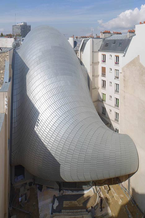
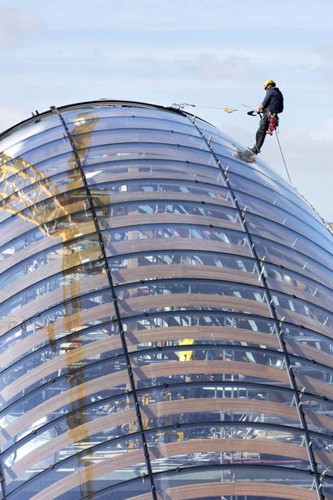
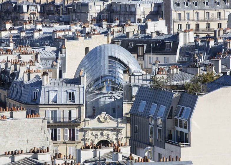
These photographs show the bulbous form of Renzo Piano's almost-complete Fondation Jérôme Seydoux-Pathé, which nestles within a Parisian urban block.
Pathe Foundation installation in Paris by Renzo Piano
Renzo Piano Building Workshop designed the "organic creature" in the courtyard of a 19th-century block to house the new headquarters of the Fondation Jérôme Seydoux-Pathé – dedicated to preserving the history of French film company Pathé and promoting cinematography.
Pathe Foundation installation in Paris by Renzo Piano
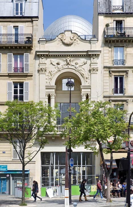
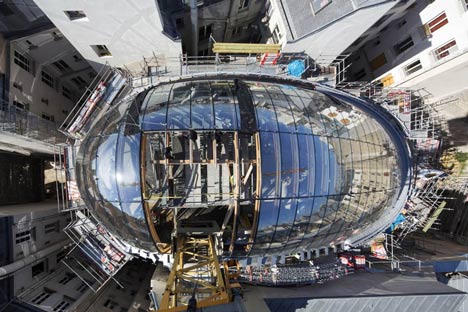
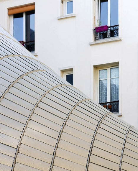
The egg-shaped form connects to the surrounding Haussmann-era buildings at four points. Its form curves away from the existing buildings and its top peeks over the roofline.
Pathe Foundation installation in Paris by Renzo Piano
"The peculiar design of this building is determined by the site's major limits and requirements," said the workshop. "While respecting the distances with the surrounding buildings, the building improves the neighbour's access to natural light and air."
Pathe Foundation installation in Paris by Renzo Piano
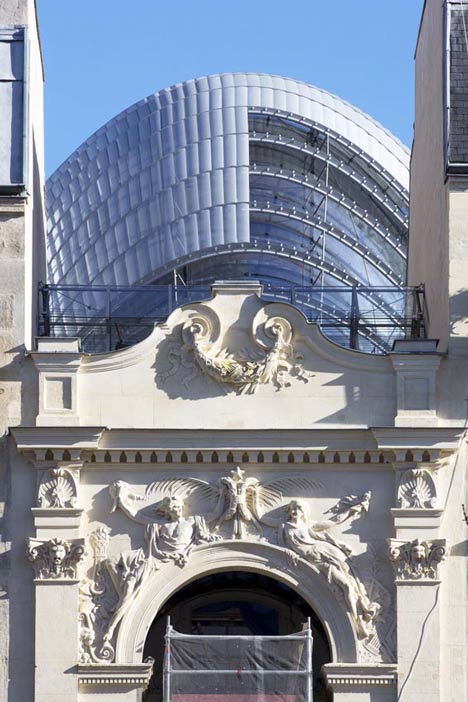
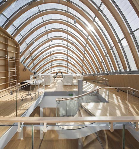
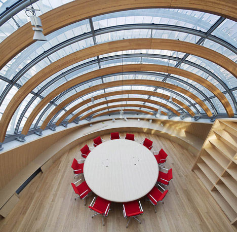
Arching engineered timber ribs guide and support the layer of curved glass panes that form the shape of the building.
Pathe Foundation installation in Paris by Renzo Piano
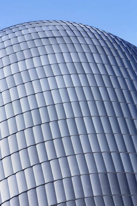
An external skin of translucent glass tiles envelops the entire structure, creating the effect of an armadillo hide over the humped form while letting softened light into the upper storeys.
Pathe Foundation installation in Paris by Renzo Piano
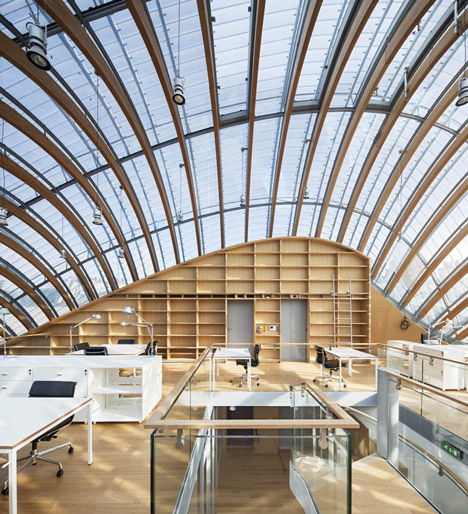
Once complete, the building will contain offices for the foundation, spaces for temporary exhibitions and the Pathé archive.
Pathe Foundation installation in Paris by Renzo Piano
A 70-seat cinema will be installed in the basement and a planted garden will surround the base of the structure.
Pathe Foundation installation in Paris by Renzo Piano
The building stands on the site of a 19th-century theatre, which was converted into one of Paris' first cinemas. Two buildings that previously stood in the courtyard were demolished to make way for the new structure.
Pathe Foundation installation in Paris by Renzo Piano
Visitors and employees will enter through the facade along the Avenue des Gobelins, which features sculptures by Auguste Rodin, and is undergoing restoration.
Pathe Foundation installation in Paris by Renzo Piano
"The art of inserting a building into an historical city block means engaging in an open, physical dialogue with those already there," said the workshop. "Building onto an extant structure also presents an opportunity for a more widespread renovation project, a reclaiming of space."
Behind the stone frontage is a glass atrium, in which a metal circulation core connects to the bulbous structure via a series of bridges at the lower levels. A spiral staircase links the upper floors of the main building.
Pathe Foundation installation in Paris by Renzo Piano
Renzo Piano Building Workshop, which also designed the Shard skyscraper in London and the extension to the Kimbell Art Museum in Texas, expects the project to complete in September. See more architecture by Renzo Piano »
Read on for more information sent by Renzo Piano Building Workshop:

Fondation Pathé
The art of inserting a building into an historical city block means engaging in an open, physical dialogue with those already there. Building onto an extant structure also presents an opportunity for a more widespread renovation project, a reclaiming of space. The new headquarters of the Fondation Jérôme Seydoux-Pathé is an unexpected presence, a curved volume one glimpses floating in the middle of the courtyard in which it sits, anchored on just a few supports. On the ground, there is a stand of birch trees, a floral island set in the dense mineral context of the city.

Pathe Foundation installation in Paris by Renzo Piano
Basement plan - click for larger image
The Fondation Jerôme Seydoux-Pathé is an organisation dedicated to the preservation of Pathé’s heritage, and to the promotion of the cinematographic art. Its new headquarters [sits at the centre of a block in the XIII arrondissement, where an old mid-19th century theatre - transformed into a cinema (one of the first ones in Paris) in the mid-1900s and then radically transformed again in the 1960s - once stood].

Pathe Foundation installation in Paris by Renzo Piano
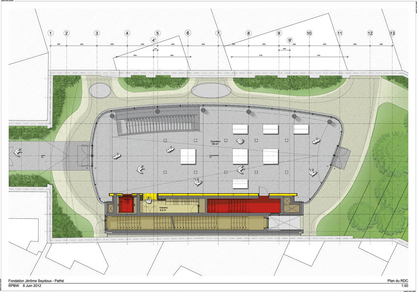
Ground floor plan - click for larger image
The new building, [which will be finished over the next few months], will house Pathé's archives, some (spaces for temporary exhibitions as well as for the permanent collection) (including a 70-seat screening room), and the offices of the Foundation.

Pathe Foundation installation in Paris by Renzo Piano
First floor plan - click for larger image
The project called for the demolition of the two existing buildings to create an organic "creature" that better responds to the restrictions of the site. [The idea was to respond to the functional and representative programme requested by the Fondation, while at the same time increasing the quality of the space surrounding the new building] The facade on the avenue des Gobelins has been restored and preserved, due to its historical and artistic value. Decorated with sculptures by [a young] Auguste Rodin, it is not only a historical landmark, but also an iconic building for the Gobelins area.

Pathe Foundation installation in Paris by Renzo Piano
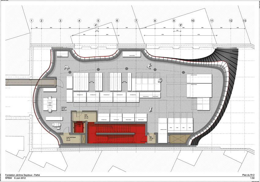
Second floor plan - click for larger image
A new transparent building just behind the facade functions as the foundation's public access. Looking like a greenhouse, it offers a view on the interior garden through the transparent ground floor of a second building in the central court that houses the project's main functions.

Pathe Foundation installation in Paris by Renzo Piano
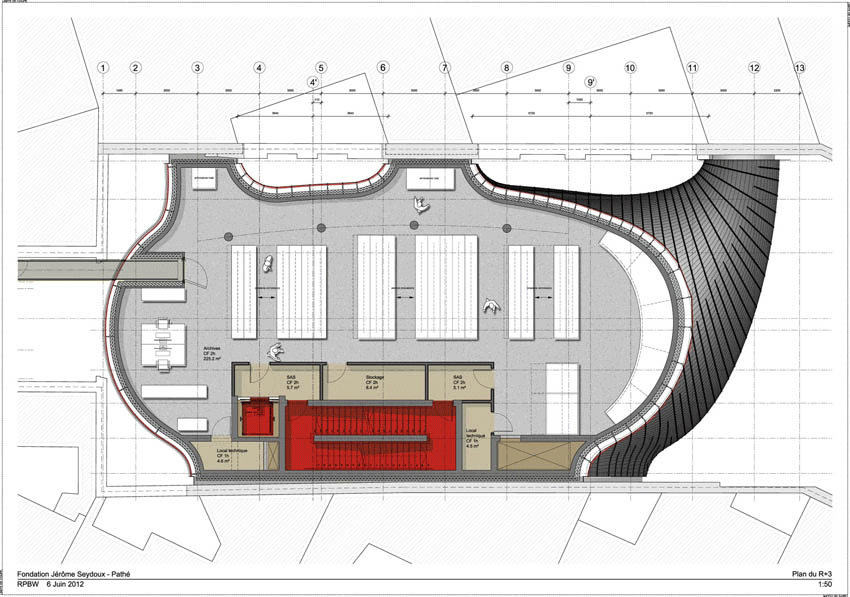
Third floor plan - click for larger image
The peculiar design of this building is determined by the site's major limits and requirements. While respecting the distances with the surrounding buildings, the building improves the neighbour’s access to natural light and air. By reducing the footprint, the project creates space for a garden in the back of the site.

Pathe Foundation installation in Paris by Renzo Piano
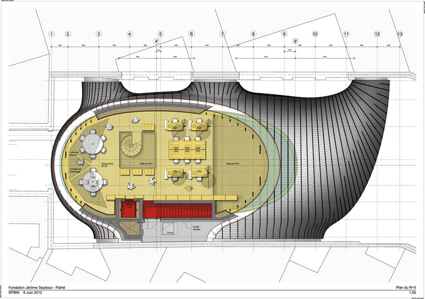
Fourth floor plan - click for larger image
The upper part of the building is made of glass, providing natural light for the office spaces of the Foundation.

Pathe Foundation installation in Paris by Renzo Piano
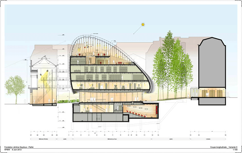
Section - click for larger image
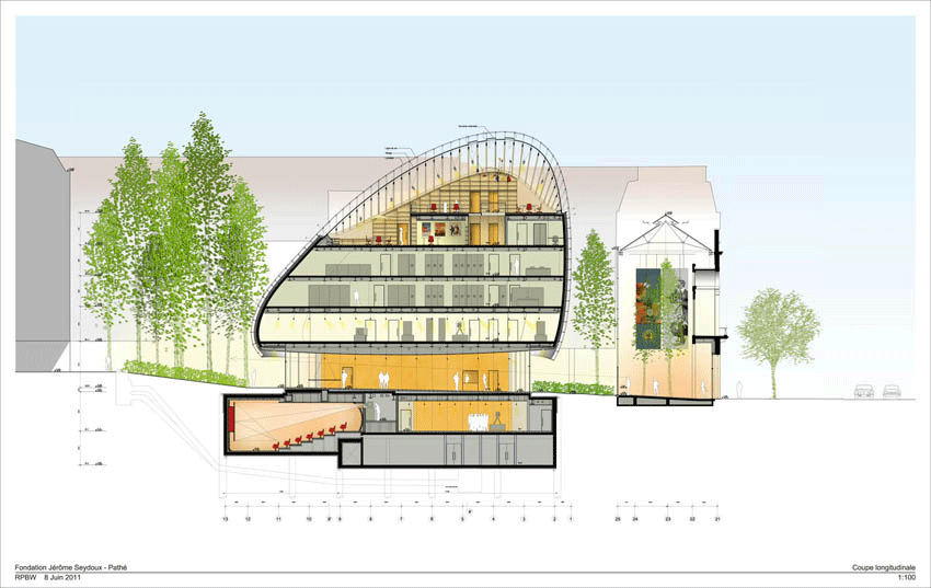
From the street the building is only perceived through, and over, the restored facade like a discreet presence during the daytime, while it will be softly glowing at night.

Pathe Foundation installation in Paris by Renzo Piano
Section - click for larger image


Kiki Willems for Simone Rocha FW 16.17 Campaign by Colin Dodgson


Wednesday, July 20, 2016

A Movement in a Moment: Postmodernism

  FOLLOW US

A Movement in a Moment: Postmodernism

Discover how a group of late 20th Century artists undermined fast-held beliefs about meaning and authorship
Untitled (cowboy) (1989) by Richard Prince
SHARE THIS PAGE

Related

In the summer of 1970 the US artist John Baldessari burned almost all of his paintings. He chose to incinerate the works in a Californian crematorium, and baked some of the ashes into biscuits, in a series of actions the artist called The Cremation Project.
This act of destruction did not signal the end of Baldessari’s artistic life, but, in a way, marked the beginning of it. As we explain in The Art Book, “The Cremation Project announced his transition to text-based art and photography. Blending influences from Dada, Surrealism, Pop and Conceptual art, his subsequent works explored the interrelationships between language and visual art, always interrogating the nature of art itself.”
Up until this point Baldessari had at least abided by the old modernist ideal of an artist as expressive genius, revealing noble truths via his work. However, after destroying his paintings, he was free to use simpler, less personal forms of image making, from shooting his own photos, to appropriating found pictures, and commissioning simple, illustrative paintings from commercial artists. Baldessari combined pictures with texts that, far from acting as captions, skewed or raised questions about the artworks.

The Cremation Project (1970) by John Baldessari

The Cremation Project (1970) by John Baldessari
In this way, Baldessari’s post-incineration work helped give rise to an artist movement known today as Postmodernism. “Postmodernism of the late 1970s and 1980s called into question purely aesthetic considerations in art, distinctions between high and low art, and notions of authorship,” explain our editors in our book Art In Time. “It had its roots in Dada, Pop art and Conceptual art, and was influenced by a new wave of art theory and cultural theory, particularly the largely French philosophy known as Post-Structuralism.”
Both postmodern theorists and artists asserted that the meaning of a cultural idea or a work of art is never fixed “but is generated in relation to various sign systems within culture, which can include those employed by art, language, the academy or advertising.”
Postmodernism offers a provocative and often critical view of those sign systems by recombining, appropriating and re-presenting familiar images. Artists tended to address themes of consumer culture, the art market, history gender and race.

Untitled Film Still 58 (1980) by Cindy Sherman

Untitled Film Still 58 (1980) by Cindy Sherman
A Jackson Pollock painting, for example, seen from one viewpoint serves as an expression of a single artist’s inner turmoil, yet viewed from another perspective, as in Louise Lawler’s 1984 photo, Pollock and Tureen, Arranged by Mr and Mrs Burton Tremaine, Connecticut, becomes a simple trophy.
This process goes both ways, as a younger group of artists, some influenced by Baldessari, went on to prove. When Cindy Sherman produced her late seventies series, Untitled Film Stills, she didn’t attempt to pass these pastiches of black-and-white movie set-ups as entirely original or genuine, but in playing both the photographer and the model, opened the image up to a wide range of considerations, creating a new and exciting form.
Fellow photo artist Richard Prince carried out a similar exercise when he produced his famous Cowboy series by re-photographing Malboro ads, cropped in such a way that all the logos and straplines are excised, leaving just the image in place. Appropriation was a method of re-presenting familiar images in a new context in order to alter or subert their original meanings.
“Thus we look past the over commercial message and consider the underlying American myths of masculinity and rugged individualism that the ad covertly reinforced,” write our editors in Art and Time.

Pollock and Tureen, Arranged by Mr and Mrs Burton Tremaine, Connecticut (1984) by Louise Lawler

Pollock and Tureen, Arranged by Mr and Mrs Burton Tremaine, Connecticut (1984) by Louise Lawler
This breaking down of old assurances wasn’t restricted to fine art. The hodgepodge of old and new, colourful and ornamental in the postmodern architecture and design of Ettore Sottsass and his Memphis collective went against the old accepted wisdoms of form following function, with almost no call for ornamentation.
It could even be argued that the technical opportunities opened up by sampling technology led to a kind of postmodernism in music, where a loop from a funk record, or a snatch of dialogue from an old TV show found new life in house and rap records.
Not everyone took to postmodernism with equal degrees of enthusiasm. The great American modernist critic Clement Greenberg believed the term and the accompanying ideas were a kind of anti-modern philistinism, dressed up in “in high-flown art jargon;” and there certainly is a certain nihilism about an art movement where nothing is certain or sacred.

Untitled (Couple) (1977-1979) by Richard Prince

Untitled (Couple) (1977-1979) by Richard Prince
Yet, perhaps the most notable aspect of Postmodernism today is how little we feel obliged to refer to the term. There was a period a decade or two ago, when the most boorish TV anchor or talk-show host could deride this or that highbrow scheme, by describing it in a sneering sort of way as “postmodern”.
Today the term is used much less, while the ideas mixed authorships, shifting meanings and open-endedness of interpretation feel thoroughly embedded into our culture. Perhaps we are over Postmodernism because we have fully accepted it.
To find out more order a copy of Art in Time here; for more on Cindy Sherman get this concise overview; for more on Richard Prince consider this Contemporary Artists series book; for more on Ettore Sottsass buy this beautiful book; and for more on all these artists and plenty more too order a copy of The Art Book here.
SHARE THIS PAGE