As a schoolboy in Soviet Russia in the 1960s, my hands were almost never clean. Don’t get me wrong – I washed them as much as anyone else. But the school rules made us practise our penmanship in ink, which came in violet. It was the only colour of ink allowed, and it was precariously stored in a small jar, along with a wooden pen with replaceable metal nibs. Ink jars had a bad habit of constantly falling over, squirting my hands, face, uniform, notebooks and textbooks with violet blots that stayed for days. The blots, and my endless violet scribbles, are the main memories of my early education. Why did the USSR’s Communist Party leaders opt for violet ink to teach the young generation? That’s a mystery we might never be able to crack.
In contrast, though, outside of school, violet was hard to find, be it in paintings or everyday life. I am a painter, and early in my career I noticed that neither the teachers in my painting classes nor my fellow students used violet pigments.
Decades later, walking along Oxford Street in London one rainy day in the late 1990s, I was stunned to see that shops were brimming with women’s clothing in a myriad of violet shades. My mind went back to my Soviet childhood and those everlasting violet smudges on my hands, and to my art classes. I realised that, in my childhood, I’d never seen anyone in a violet blazer, shirt, tie or dress, holding a violet umbrella.
Intrigued, I went to the National Gallery in central London and, after checking the entire collection, found just one violet painting made before the Impressionist era began in 1863. Strangely, it looked like the greatest artists of the past epoch had ignored this colour – until the French Impressionists embraced it. Why so? I decided to find out.
Over the past 20 years, I visited 193 museums in 42 different countries. Equipped with 1,500 Munsell colour chips – the world-standard samples for colour science – I examined 139,892 works of art, searching for violet. I concluded that there were indeed only a very few artworks before the 1860s that contained this colour from my childhood. But from the second half of the 19th century, violet became very popular. This striking conclusion made me wonder why the status of violet had changed so drastically, at such a well-defined point in time? Clearly, more research was needed, and I was determined to do it.
Along with two colour scientists, Eric Kirchner and Elena Fedorovskaya, I selected 14 of the world’s largest art museums that had made large parts of their collections available in high resolution online. We collected hi-res digital photographs from a total of 4,117 paintings. We included objects from ancient civilisations, and from the Middle East and Asia, dating from the 4th century up to the mid-19th.
Until the mid-19th century, the colour violet had appeared in fewer than 4 per cent of paintings
We also needed a definition of violet. Developments in colour science led to reliable image analysis tools to recognise the colour categories red, orange, yellow, green and blue. However, no such algorithm existed yet for violet. To make matters worse, international surveys showed that people tend to be unsure about exactly what constitutes the colour violet. The same person who describes an object’s colour as violet today might describe it as purple, blue, magenta, fuchsia or burgundy tomorrow. Language plays a role, too – there’s a difference even between British English and American English. The colour beyond blue on the spectrum is called purple in the US, but violet in the UK. Reddish-purple is sometimes called violet in the US, but hardly so in Britain. The complete range of colours between red and blue is often called purple in British texts, but sometimes the word violet is used, too.
Our research led us to a first working definition for the colour violet: all mixtures of red and blue for which blue dominates. We observed more than 1,500 colour chips from the Munsell colour system in a light-booth, ensuring well-defined light, and selected 51 colour chips that we thought of as violet.
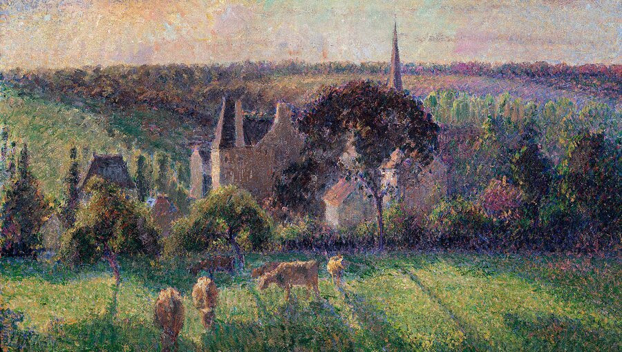
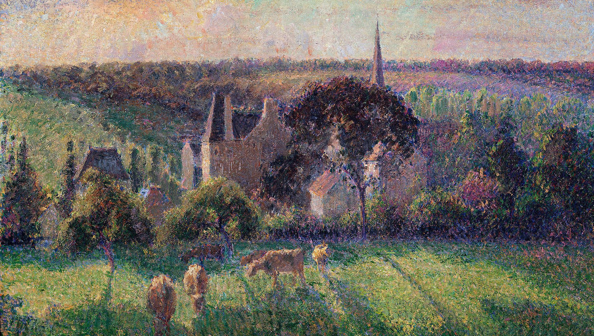
As we examined paintings using this definition, we confirmed my prior findings. Until the mid-19th century, the colour violet had appeared in fewer than 4 per cent of paintings. But in the second half of the 19th century, this rate quickly rose to 37 per cent, and spiked to 48 per cent in the 20th century. We still didn’t know what sparked that sudden change, so we looked for some explanations.
First, we considered that colours might have faded over the centuries. But the colours in paintings from ancient Egypt, Mesopotamia and the medieval Islamic cultures survived especially well in their extremely dry climates. And they had no violet in them at all.
Second, we thought that violet colouring was expensive before the early 1860s. Yet some purple and ultramarine blue pigments had been very expensive back then, and this never stopped artists from using those colours.
A third potential explanation was that, from 1855 to 1870, chemists forged a range of violet dyes and pigments for the garment industry. However, we found that the Impressionist painters didn’t make much use of them – because they had already been using their own violet hues, which they made by mixing blue and red.
It turned out that it wasn’t the garment industry that stimulated Impressionists to embrace the violet colour, but rather the science of colour itself. First, it was the French chemist Michel Eugène Chevreul who discovered the law of simultaneous contrast: colours appear to be more intense when placed next to their complementary colour. Then, in 1864 the influential French art critic Charles Blanc wrote an article in which he applied Chevreul’s law to Eugène Delacroix’s paintings. Blanc described how violet, produced by mixing red and blue, is intensified by placing it next to yellow. In 1867, Blanc further elaborated on this example in his book The Grammar of Painting and Engraving, a prominent treatise for artists in late-19th-century France. It would directly inspire painters such as Georges Seurat, Vincent van Gogh, Camille Pissarro and indirectly also Claude Monet, Paul Signac and many others.
I can’t help wonder if a muon shower enhanced our ability to see violet midway through the 19th century on Earth
It was only fitting that the Impressionists embraced violet. In the natural world, violet colours are fairly rare, so it’s not surprising that ancient or medieval painters seldom used violet on their canvas. But the Impressionists and Post-Impressionists no longer tried to imitate the colours of the world. Aiming at producing colour impressions instead, they were much more flexible than earlier painters in creating and using colours. When searching for contrast to yellow sunlight, for example, Blanc’s description led them to create mixtures of red and blue, often resulting in violet.
Impressionist painters used the colour violet so prolifically that critics accused them of violettomania. And as they educated others through their paintings and art classes, the public began to appreciate violet too, so the colour spread into fashion, interior and industrial design. We recently published these findings in the paper ‘Computational Evidence of First Extensive Usage of Violet in the 1860s’.
As a scientist, however, I kept wondering if there were also other forces that enabled us to see and appreciate the colour violet. We distinguish colours because receptors in the eye’s retina react to the different wavelengths of light. Notably, the retina is actually an extension of the brain, formed embryonically from neural tissue and connected to the brain by the optic nerve. These complex structures, which enable us to see the rainbow of colours – and also to distinguish and comprehend those colours – formed over millions of years of evolution, often in response to changes in our planetary environment and planetary light.
Over the millennia, the light reaching our planet might have changed, causing our retinas to adapt accordingly. The idea drives the zoologist Andrew Parker’s ‘light switch’ theory, which suggests that, when atmospheric oxygen increased during the Cambrian explosion, this in turn boosted the amount of light reaching our planet, increasing the evolutionary benefits of vision too. As a result, the eyes of the creatures that populated Earth back then rapidly developed. That ancient process seems to be confirmed by the biologist Shozo Yokoyama at Emory University in Atlanta, who has studied the evolution of vision from the monochromatic perception of our early ancestors to the rainbow of colours we humans see today.
But what could have caused us humans to embrace the colour violet so recently in our history? One theory comes from the American astrobiologist Adrian Melott at the University of Kansas, who has suggested that cosmic rays produced by supernovae can alter ionisation of the atmosphere, resulting in showers of subatomic particles called muons; the muons in turn might induce genetic mutations in Earth’s inhabitants, including us. Low levels of ionising radiation can cause biological molecules to mutate slightly, which can promote genetic variation. This fosters small and gradual changes in living things, allowing them to develop better survival traits and adapt to their changing environments. Our planet is still ploughing through the debris of ancient supernovae, and I can’t help but wonder whether a muon shower might have enhanced our ability to see violet midway through the 19th century on Earth.
As the Ukrainian American geneticist Theodosius Dobzhansky wrote in 1973: ‘Nothing in biology makes sense except in the light of evolution.’ From a literal perspective, a key might be the evolution of planetary light. I’m just trying to shed a little light on the situation. It’s intriguing to think that cosmic rays might have enlightened us to see that vibrant violet colour that I wore on my hands as a kid.


