ON TREND
Wall Power: Murals in Two Chelsea Shows, Ephemeral as Mayflies, Subvert the Sky-High Real Estate Market
As more luxury high-rises muscle in on Tenth Avenue and more mid-level Chelsea galleries flee to the Lower East Side and Brooklyn, two summer shows in the neighborhood look especially pertinent. Both feature the medium of wall painting, and both comment, in ways deliberate and not, on the interdependency of art and real estate.
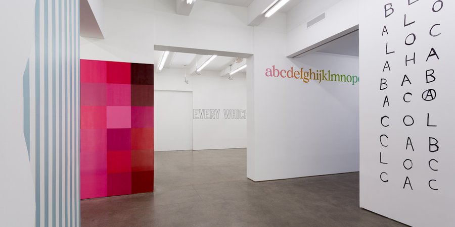
Mel Bochner made that connection explicit in his “Measurement” pieces of the late 1960s, demarcating the dimensions of the gallery with black tape on its walls, windows, and doors. So it makes sense that “Hello Walls,” which fills Gladstone Gallery’s two branches in Chelsea, opens with another of Bochner’s early works: the white-on-black text piece Forgetting Is the Only Continuum, originally from 1969, in which the title words appear scrawled in white on a black stripe that runs nearly the length of the 24th Street gallery’s largest room.
 Installation view of "Hello Walls" at Gladstone Gallery, New York, June 26-July 31, 2015. Courtesy Gladstone Gallery, New York and Brussels. Photograph by David Regen.
Other artists associated with the conceptual wall painting and drawing of that era are also in the mix: Sol LeWitt, in an immersive piece from 1980 of red and yellow crayon on a dreamy Mediterranean-blue background, and Lawrence Weiner, with a typically ambiguous text in his signature sign-painter’s lettering. So are heirs to that tradition like Karl Holmqvist, whose Bebe Coca wall drawing looks like a word puzzle and connects to his poetry and spoken-word performances, and Ricci Albenda, whose vinyl wall transfer maps the alphabet onto the color spectrum so as to make synaesthetes of us all.
 Installation view of "Hello Walls" at Gladstone Gallery, New York, June 26-July 31, 2015. Courtesy Gladstone Gallery, New York and Brussels. Photograph by David Regen.
For all these references to the scrappy history of conceptual wall art (not to mention the plaintive Willie Nelson song from which it draws its title), “Hello Walls” is ultimately a show that's tailored to the current moment in Chelsea—which is to say, some of its wall paintings find artists doing what they normally do on an inflated scale. The wall becomes just another canvas.
It’s especially apparent at the 21st Street branch, where the gallery took the strange step of building a freestanding structure in the middle of the gallery to house the paintings and left the surrounding walls untouched. There, Michael Craig-Martin’s To Go, an inkjet print on coated polyester fabric that blows a plastic coffee-cup lid up to heroic proportions, even seems to wink at wall painting's associations with the ephemeral, disposable, and site-specific.
 Installation view of "Hello Walls" at Gladstone Gallery, New York, June 26-July 31, 2015. Courtesy Gladstone Gallery, New York and Brussels. Photograph by David Regen.
Meanwhile, all of the seven wall paintings in “Anthems for the Mother Earth Goddess” at Andrew Edlin are scheduled to be destroyed at the end of the show—and not because they are being painted over for the next exhibition. The walls themselves will be coming down, as the four-story building at 134 Tenth Avenue is demolished to make way for—what else?—a high-rise condo. (The gallery will be moving to 212 Bowery this fall, after 13 years in Chelsea.)
The show’s putative theme is the environment, and the artists attack it with various degrees of focus. At one extreme is Peter Fend, whose hallway painting unfolds as a detailed, step-by-step proposal for adapting Russian nuclear-missile submarines for the collection of algae and plastic in the world’s oceans. At the other is Kevin Sampson, whose strident, symbol-rich Fruit of the Poisonous Tree leaps from climate change to police violence, transgender rights, and a host of other topics in the current news cycle.
 Peter Fend, Olya: An Algae/Plastic Harvesting and Biofuel Production Submarine based on a Russian Nuclear-Missile Submarine Design, 2015.
The future of Chelsea looks especially grim in Chris Doyle’s homage to Thomas Cole’s portentous painting cycle “Course of Empire.” Doyle’s flattened, street-art-style version, Everhigher, shows huge waves sloshing through the neighborhood—“an imaginary Chelsea as a water park,” in the artist’s words, which sounds fanciful but is no joke to those who were in the area during Hurricane Sandy.
 Chris Doyle, Everhigher, 2015.
Wall painting, for most of these artists, is primarily a way of telegraphing urgency. Few of them seem to be thinking about other reasons for painting on the wall, or contemplating the new options for distribution and documentation offered by social and digital media.
One exception is the veteran San Francisco street artist Rigo 23, whose concise info-graphic at Edlin shows the remaining nations on earth without mandatory paid maternity leave (placing the United States in the company of Micronesia and Papua New Guinea). “It can be ‘cultural landscape painting or ‘minimalist text and data painting,’” his statement reads, “but it is also a mural painted in 2015 on the wall of an Art Gallery in the heart of Earth’s leaders in fashion and advertising.” It's a piece that's designed to live on both Facebook walls and the brick-and-mortar variety.
 Rigo 23, Present Tense, 2015.

 Images courtesy of Pantone; Huffington Post


 Images courtesy of Pantone; Pinterest


 Images courtesy of Pantone; Pinterest


 Images courtesy of Pantone; The Real Estate Conversation


 Images courtesy of Pantone; Fresh Home
