How Feminist Artists Reclaimed Futura from New York’s Mad Men
What do the Nazi Party, NASA, Wes Anderson, Forever 21, Louis Vuitton, Ed Ruscha, and Barbara Kruger have in common? All of them have favored the same font—Futura, the geometric sans-serif typeface designed in 1924 by German designer Paul Renner.
It was the first commercial font to combine the classical proportions of the letters on Roman monuments with the simple geometry of the circle, triangle, and square. “Renner wanted to design a typeface specifically for the industrial age, stripping away all ornament,” says Douglas Thomas, a designer, historian, and assistant professor of graphic design at Brigham Young University. “He was trying to answer many of the same questions as his contemporaries in the Bauhaus such as Josef Albers and Herbet Bayer, who also made experimental typefaces based on geometry.”
Several years ago, Thomas began to wonder: Why had Helvetica—another trusty sans-serif—landed in the spotlight, while the cultural impact of Futura remained largely unexamined? Futura, he notes, was more historically popular, more closely linked with modernism, and, in the eyes of many, a more beautiful alphabet.
So Thomas decided it was time to give the font its due. His forthcoming book, Never Use Futura, is titled after a frequent graphic design school admonition. Students are instructed to avoid the typeface, in order to keep their work from seeming derivative or cliché. But, charmed by its perfectly circular O and dagger-sharp M, many of them go on to use it anyway.
On the surface, it seems strange that a typeface as heavy with historical baggage and as widely used as Futura is still irresistible to designers. More than 90 years after its creation, it is a fixture of Western visual culture—appearing everywhere from book covers to butter wrappers to BEWARE OF DOG signs.
 Courtesy of Never Use Futura.
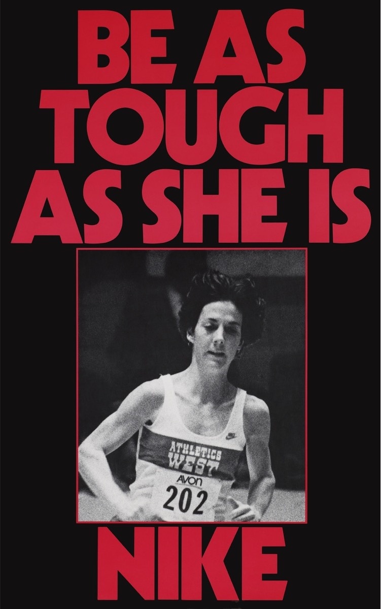 Courtesy of Nike.
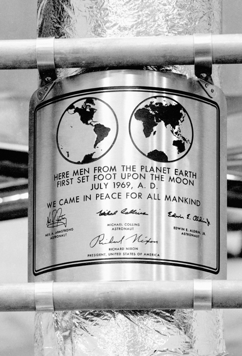
Futura is the Forrest Gump of typefaces, a silent witness to an improbable number of the 20th century’s greatest triumphs and most terrible foibles. It appears on a military order announcing the internment of Japanese-American citizens during World War II and a Nazi labor permit dated 1943; decades later, the first men on the moon deposited a plaque that proclaimed, in all-caps Futura, “WE CAME IN PEACE FOR ALL MANKIND.”
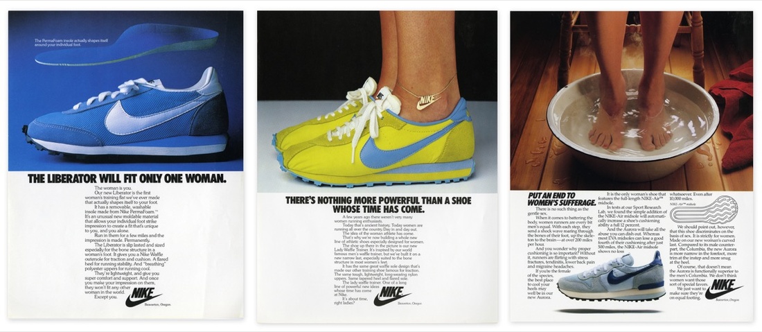
By the late 1980s and early ‘90s, Futura had become so ubiquitous—particularly in advertising and corporate identity—that a group of fed-up art directors took out a full-page ad calling for the industry to boycott Futura Extra Bold Condensed. They labeled it “the most overused typeface in advertising history.” (Nike and Absolut Vodka were a few of the biggest offenders.)
 Courtesy of Nike.
This oversaturation in the commercial sphere, says Thomas, made it a perfect tool for artists criticizing runaway capitalism. “Futura is the lingua franca of 20th-century advertising,” he explains. “So if you’re trying to critique commercialism, what better than to use the same visual language as the advertisers themselves?” Women artists were particularly adept at using the tools of advertising (including their typefaces) to critique its structures. “I think it’s a helpful corrective,” Thomas continues. “If you think of 1950s ‘Mad men’ using Futura to target women in a stereotypical housewife mold, I think it’s very significant that in the 1980s and ’90s, Barbara Kruger, Jenny Holzer, and the Guerrilla Girls were turning these typographic messages back on advertisers.”
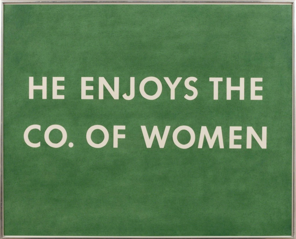
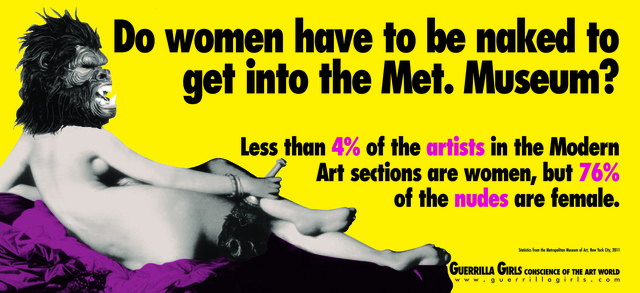
The Guerrilla Girls did this explicitly by creating posters with headlines like “When Racism & Sexism Are No Longer Fashionable, What Will Your Art Collection Be Worth?” and “Do women have to be naked to get Into the Met Museum?” (both from 1989). Using a potent mix of humor, statistics, and Futura Bold Extra Condensed, the Guerrilla Girls aimed for a wide audience. Like advertising, their work was mass-market, provocative, and ultimately disposable.
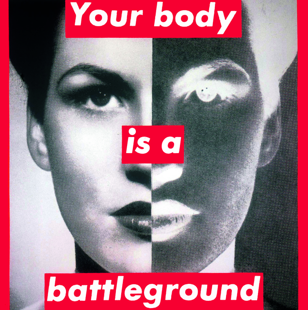
Kruger is less thorough in her embrace of advertising techniques than the Guerrilla Girls, but no less forceful in her feminist and anti-capitalist critiques. Once a graphic designer at Condé Nast, she is well-versed in the visual language of print advertising. Her short messages (“I shop therefore I am”; “We don’t need another hero”) suit the slickness of Futura Bold Oblique, and can initially be mistaken for cheeky ad copy. Her signature visual style, adopted in the early 1980s, situates white text inside a red box overlaying close-cropped, black-and-white photographs of women. By borrowing the visual tropes of advertising, then subverting them, Kruger draws our attention to both the tools and the underlying messages of consumerism.
“Kruger’s use of language is sharp and astute, but what if she’d used Times New Roman or Comic Sans instead?” says Thomas. “Her work would still be witty, but it wouldn’t have that same punch. It wouldn’t immediately tie back to the original advertisements by using the typeface of so many mass consumer brands. By using Futura, she makes that connection clearer and the criticism all the more pointed.”
In the end, it seems that Kruger was right to ignore that design-school maxim: “Never use Futura.”
—Ariela Gittlen