Tuesday, February 6, 2024

MANNERISM WEIRD?


> TELEPHONE US 212.355.5710
   Menu

THE STYLISH STYLE: WHY IS MANNERISM WEIRD?

January 17, 2024

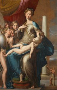
If you go to the Uffizi Gallery in Florence, you will see many wonderful things. You might recognize Artemisia Gentileschi’s Judith Slaying Holofernes or the portrait of Medusa’s head by Caravaggio. Most people will instantly go towards the major Botticelli works on display, like The Birth of VenusPrimavera, and The Adoration of the Magi (which includes the artist’s self-portrait on the right-hand side). However, few people will be ready for a rather strange painting on display at the Uffizi. It’s a Madonna and Child painting, but there’s something off: the Christ Child has an oddly long torso, with a large head and very pale skin. There is a herd of androgynous figures off to the left side, while a random, standalone column dominates the background. After looking at it for a minute, you then begin to see the weird, elongated features of the Virgin Mary, particularly her long neck. Well, that’s the reason the painting is called Madonna dal Collo Lungo, or Madonna with the Long Neck. And it’s okay to say that the painting is weird. It’s sort of meant to be weird. And that is the main thing you need to understand about Mannerism.

A very strange-looking Madonna and Child painting.

Madonna with the Long Neck by Parmigianino

Many people’s perception of art history typically involves the idea that the Renaissance brought about a renewed interest in classical art and philosophy, and it was nothing but perfect naturalism from then until the Impressionists. However, in the same way that people today are often very aware of generational differences, prioritizing naturalism in the visual arts has ebbed and flowed over the centuries. At the height of the Renaissance in Italy, between 1480 and 1520, many up-and-coming artists seemed to believe that with so many legendary masters running around, there was nothing truly great for them to do. Michelangelo, Leonardo, Raphael, and Botticelli, as well as earlier masters like Donatello, Paolo Ucello, and Giotto, had all made great artistic innovations and breakthroughs, leaving little for everyone else. Young artists certainly tried to copy and imitate the great masters, but they realized this would not get them anywhere. Vasari, in fact, once attributed a quote to Michelangelo, where he once said, “Anyone who follows others never passes them by, and anyone who does not know how to do good works on his own cannot make good use of works by others.” Of course, he was commenting on imitating the ancient master sculptors. Still, he could have just as easily been commenting on the new generation of artists honing their craft through making studies of the Sistine Chapel ceiling.

But rather than stick to imitation, some of this new generation of artists decided to blaze a new trail. They saw the renewed classical ideals in Raphael’s paintings and Michelangelo’s sculptures and chose to reject them. Plus, with the Protestant Reformation kicking off in 1517, perfection and naturalism no longer reflected their world. Europe was becoming increasingly chaotic, so these artists diverged from naturalism, trying to create something bolder and more stylized. By around 1530, with many of the great Renaissance masters having passed away, these new artists were creating some of the most unique paintings of the day. But this uniqueness meant a complete disregard for anatomical correctness and perspective, which almost always throws off people unfamiliar with the Madonna with the Long Neck.

Created in the 1530s by the painter Francesco Mazzola, known as Parmigianino, Madonna with the Long Neck is the quintessential Mannerist painting. It rejects the Renaissance ideals of anatomical naturalism in several ways. The Christ Child’s torso is far too long, and its head too large. His skin is pallid and gray, almost like that of a corpse. Some art historians have noted his limp left arm and how it resembles Michelangelo’s sculpture Pietà. The Virgin Mary’s body is oddly elongated, with a curving torso, spindly fingers, and long neck possibly serving as an example of the Mannerist figura serpentinata, or the posing and distortion of the body to evoke movement. Furthermore, the androgynous angels on the left show that the Madonna is incredibly tall, nearly twice their size. And finally, the lone column in the background. Among the ideals of the Renaissance was not just beauty and balance but logic. Things had to make sense. A single column not holding up anything, not serving any structural or architectural purpose, makes no sense and would seem out of place in an earlier painting.

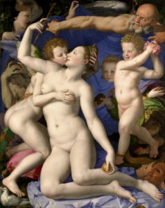
A group of nude figures against a blue background surrounded by objects like theater masks and doves

Venus, Cupid, Folly & Time by Bronzino

One of the other hallmarks of Mannerism was the greater inclusion of allegory and symbolism. Parmigianino does this very well in Cupid Making His Bow. The Mannerist distortion of proportion is again on display here, as Cupid’s legs seem far too long and his head too small. He carves his bow from a cherrywood branch while stepping on some books for support, representing the triumph of love over knowledge. Other artists also chose to include such symbolism, including Bronzino. When it comes to masterworks of Mannerism, Madonna with the Long Neck is often uttered in the same breath as Brozino’s Venus, Cupid, Folly, and Time. While Bronzino is known mainly as a portraitist, this allegorical painting is often considered one of the great works of Mannerist painting. Cupid kisses his mother, Venus, laying his hands on her in an overtly erotic fashion. Meanwhile, Folly approaches them to shower them in rose petals, accidentally stepping on the rose bush’s thorns. The bald male figure, Time, rushes to hold up a blue sheet to shield the scene from whoever is supposed to be in the background. All the figures have some sort of distortion, whether Cupid’s odd, elongated body and his uncomfortable pose, Time overextending his arm, and Folly, a cherub-like figure contorted into the Mannerist figura serpentinata. While Bronzino’s portraits are often incredibly calm and stoic, that cannot be said for Venus, Cupid, Folly, and Time. The lack of background and the figures’ layout makes everything seem chaotic and claustrophobic. Everything is all over the place, with bright colors contrasting, throwing the earlier Renaissance ideals like balance and harmony out the window. Scholars have long debated the meaning of the painting, with some saying it’s about forbidden passion while others claim it’s about syphilis.

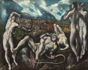
A painting of an older man and several younger men, all nude, being strangled by snakes

Laocoön by El Greco

The word ‘Mannerism’ derives from the Italian word maniera, meaning ‘manner’ or ‘style’. It is, therefore, sometimes called “the stylish style.” I’m not sure if that’s supposed to be a literal translation, or possibly a euphemism because of its relative strangeness. But sometimes, rejecting a previous generation’s values is a good thing. People have good reason to question why we do things a certain way. And while Parmigianino and Bronzino’s works described above can serve as an example that going out on your own can produce some rocky results, it’s often just because some kinks need to be worked out. In the end, Mannerism did produce many truly marvelous works. One of Parmigianino’s earliest Mannerist experiments is a self-portrait he made at the age of 21, showing him reflected in a convex mirror his barber used; when Mannerism plays with perspective and form without seeming too strange. This is what the later great Mannerist painters did, like El Greco and the lankiness of his portraiture subjects and the stylized poses in his historical and religious works, or Tintoretto and his play on perspective in his Last Supper or use of allegory and symbolism like in Origin of the Milky Way.

Yes, I still think Mannerism is weird. But there’s a certain beauty in its weirdness, which I always have respect for.

  • MORE ARTICLES


  • HUMOR IN THE ARTS


    > TELEPHONE US 212.355.5710
       Menu

    MANET’S ASPARAGUS: HUMOR IN THE ARTS

    January 3, 2024

    I took an elective class for my arts requirement when I was at school. It was called Laughter and the Fine Arts and looked into humor and comedy in everything from Aristophanes to Modern Family. People have been making humorous art for millennia, but I feel like when thinking of this, we don’t often consider the modern masters of the last two centuries. Everything for them was very serious, yet they were all as human as anyone and could be silly, playing practical jokes and inserting laughter into their work.

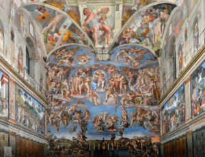
    Michelangelo’s Last Judgment

    The wall behind the Sistine Chapel's altar, showing the Last Judgment.

    The Last Judgment by Michelangelo

    Michelangelo Buonarotti’s work in the Sistine Chapel was incredibly long and arduous. It took the artist four years to complete the ceiling, plus another five years to create the fresco, The Last Judgment, behind the altar. Michelangelo brought the nude human form, the idealized figures of classical sculpture and statuary, into the heart of Western Christianity, which didn’t sit well with everyone. One of the most well-known stories about the Last Judgment‘s creation was when Pope Paul III entered the chapel to view Michelangelo’s progress. This was when the pope’s master of ceremonies, Biagio Martinelli da Cesena, expressed his objections to the amount of nudity in the scene. According to Giorgio Vasari’s Lives of the Most Excellent Painters, Sculptors, and Architects, Biagio said that “it was a very disgraceful thing to have made in so honorable a place all those nude figures showing their nakedness so shamelessly, and that it was a work not for the chapel of a pope, but for a bagnio [bathhouse] or tavern.” In response to these criticisms, Michelangelo did make one noticeable change. In the bottom right corner of the enormous fresco, we see damned souls being ushered to Hell. Among them is Minos, the judge of the underworld, surrounded by a horde of demons. As his revenge, Michelangelo gave Minos his critic’s likeness. Additionally, he gave him donkey ears while a serpent bites at his genitalia. According to the chronicler Ludovico Domenichi, when Biagio saw this and complained, Pope Paul told him that there was nothing he could do about it since he was responsible for guiding souls to heaven and, therefore, could not do anything about what happens in Hell.

    Manet’s Asparagus

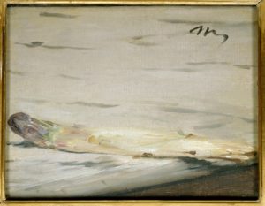
    A small still-life painting of a single stalk of white asparagus on a countertop.

    A Sprig of Asparagus by Édouard Manet

    Édouard Manet is considered one of the greatest European artists of the nineteenth century for having carved out his own variety of modernism between the Paris Salon and the nascent Impressionist movement. Because of the importance of his work, we often look at it through a rather strict academic lens. However, in some of his paintings, we see touches of lighthearted humanity. This is most apparent in a pair of paintings commissioned by the critic and collector Charles Ephrussi. In 1880, Ephrussi promised Manet 800 francs for a still-life of asparagus. Manet delivered on his commission, giving us Une botte d’asperge, a good-sized look at a bundle of white asparagus with purple tips laying upon a bed of greenery, much like a Paris grocer might display his inventory at the time. Research on the canvas has since revealed that Manet created the work painting wet on wet, meaning that he likely created the whole painting in a single sitting. Ephrussi enjoyed the painting so much that he paid Manet 1,000 francs. Manet was known for being an affable, witty personality in the Paris art scene, so he took the opportunity to make a little joke. Having been paid more than what he was commissioned, Manet went to work and created a separate, smaller asparagus still-life painting. While the original bundle measured 18 by 21 ½ inches, the smaller canvas was only 6 ½ by 8 ½ inches, showing a single stalk of asparagus on a tabletop. When he sent it to Ephrussi, he attached a note reading, “There was one missing from your bundle.” Unfortunately, viewing the two paintings side-by-side isn’t possible right now. While the single stalk is kept at the Musée d’Orsay in Paris, the original bundle now hangs at the Wallraf-Richartz Museum in Cologne.

    Brueghel’s Flatterers

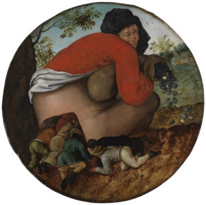
    A surreal depiction of a large man holding a bag of money while a crowd of smaller people rush to enter his backside as an allegory on flattery.

    The Flatterers by Pieter Brueghel the Younger

    Art historians often differentiate Pieter Brueghel the Elder from the Younger by referring to him as the Peasant Brueghel since he gained fame in his own time through depictions of peasant life in the Low Countries. However, it’s not like Brueghel the Younger completely abstained from peasant themes. Some of his most interesting work involves representations of common sayings and proverbs, which sometimes can be confused for simple representations of peasant life. For example, there’s a young man with a knife and some bread, which is sometimes associated with the proverb “The man who cuts wood and meat with the same knife.” He also had his interpretation of the classic “blind leading the blind” allegory. Then, there’s a depiction of a drunk man being forced into a pigsty by the rest of the village, often associated with the popular saying, “The pig must go into the stall.” In translating contemporary morality onto the panel or the canvas, Brueghel the Younger often required a bit of humor, and nowhere is that more apparent than in the painting known as The Flatterers. It shows a large man with a bag of money, pouring the coins out onto the ground while a group of smaller men make their way up his backside. It has a touch of the surreal, but the meaning becomes a parent when you understand the popular proverb it invokes: “Because so much money creeps into my sack, the whole world climbs into my hole.” It’s a rebuke of what we would now call brownnosing. Brueghel even includes a man in a long, brown robe in his crowd of ass-kissers, like that of a Franciscan friar, showing that even the seemingly-lofty among us can fall victim to greed and other vices. Even though the work is meant to convey a serious moral lesson, viewers at the time and even today can’t help but chuckle. There’s a hint of silliness, which I think only enhances the work’s message.

    Rothko’s Seagrams Murals

    A black-and-white photograph of Mark Rothko.

    Mark Rothko

    Now for a bit of dark humor… in more than one way, I suppose. In 1958, the Canadian beverage company Seagram was about to move into its new headquarters at 375 Park Avenue in New York. The structure, known as the Seagram Building, was designed primarily by Ludwig Mies van der Rohe and is one of the finest examples of the international style of architecture. Seagrams wanted a restaurant in the building, with works by a prominent artist for the interior. They picked Mark Rothko for the job at the recommendation of Alfred H. Barr Jr., director of the Museum of Modern Art. Rothko was well-known then but was only starting to become successful. He was looking for an excuse to create a large series of works experimenting with a darker color palette.

    The Seagrams commission would give Rothko that opportunity and a space where he would show them all. He was hesitant, however, because of his dislike of materialist consumption, of which the new Seagram Building and its fancy restaurant would be symbols. He was only meant to make seven large paintings but created thirty, from combinations of red and orange to black and burgundy. After over a year of work, Rothko began to grow tired of the commission, to the point that he felt he was actively creating something intentionally antithetical to the eventual exhibition space. In 1959, he admitted to journalist John Fischer, “I accepted this assignment as a challenge, with strictly malicious intentions. I hope to ruin the appetite of every son of a bitch who ever eats in that room […]. If the restaurant would refuse to put up my murals, that would be the ultimate compliment.” At least Rothko was able to find a bit of humor in what he was doing. It was almost like a practical joke on big-headed businessmen. However, in 1960, Rothko was invited to dine in the new restaurant, the Four Seasons. It seems that was a breaking point for him, and not long after, he chose to cancel the initial contract. Rothko reclaimed all 30 paintings in the series and returned the money given to him. He later complained to his studio assistant, “Anybody who will eat that kind of food for those kind of prices will never look at a painting of mine”. The Seagram murals, as they came to be known, were locked up in storage. They have since been sold and scattered, with nine being shipped off to the Tate Gallery in 1969.

    Yves Klein’s Blue Surprise

    A monochromatic painting of a deep ultramarine known as International Klein Blue

    IKB 191 by Yves Klein

    Yves Klein was a French artist in the immediate postwar period. He was foundational in what later became the nouveau réalisme school and was incredibly influential in developing minimalism, pop art, and performance art. However, many people who know his name will associate him not with a specific work but with a color. He developed International Klein Blue (IKB), a deep, dark shade of blue close to ultramarine, which he used extensively in his work. One of his most well-known paintings, IKB 191, is simply a monochrome painting consisting solely of a canvas painted with synthetic resin and then dusted with the paint’s dry pigment. However, there is a select group of people for whom the color is unforgettable because of an incident in April 1958. That month, Klein opened a new exhibition at the Galerie Iris Clert called Specialization of Sensibility from the State of Prime Matter to the State of Stabilized Pictorial Sensibility. This exhibition would later become known as the Void. The gallery’s windows were entirely painted with IKB, while a canopy of the same color was installed over the door. Twenty-five hundred people showed up to the opening. The gallery served the guests blue gin-and-Cointreau cocktails, which they drank before being let in about ten at a time. There, they saw the entire gallery completely cleared out and painted white. That’s it; nothing was on display or hanging from the walls. According to Klein, he had rendered all of his paintings immaterial, which in The Void could allow you to concentrate and get your mind to do all the creative heavy lifting. However, the show wasn’t over yet. When the gallery-goers returned home, they were in for a little surprise. The blue cocktails got their color from methylene blue, a saline solution used as a dye and a medication. Many guests urinated International Klein Blue for up to a week after the show. I’m not sure if it was intentional, but that’s what I call branding.

  • MORE ARTICLES