Friday, January 4, 2019

Web Traffic Is the New Foot Traffic


Web Traffic Is the New Foot Traffic: Why Galleries Are Investing Big to Chase Digital Natives

In the face of dwindling foot traffic and rising fair costs, galleries are devoting more and more resources to their digital presence.
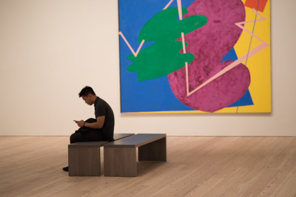
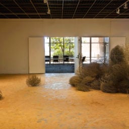
Photo from Ryder Ripps's Phone Pix series. Courtesy of the artist.
Is a gallery’s homepage more important than its storefront?
As foot traffic to brick-and-mortar spaces dwindles, a growing number of dealers are hiring experts to overhaul their websites and social media accounts. Some are now even monitoring web traffic as carefully as online publications do.
While dealers say the majority of sales are still consummated in person, often in the framework of long-term relationships, the seeds of those relationships are increasingly being sown online, rather than through traditional routes like art fairs and referrals. The stakes are high: Galleries’ long-term survival may ultimately depend on building up a robust digital presence.
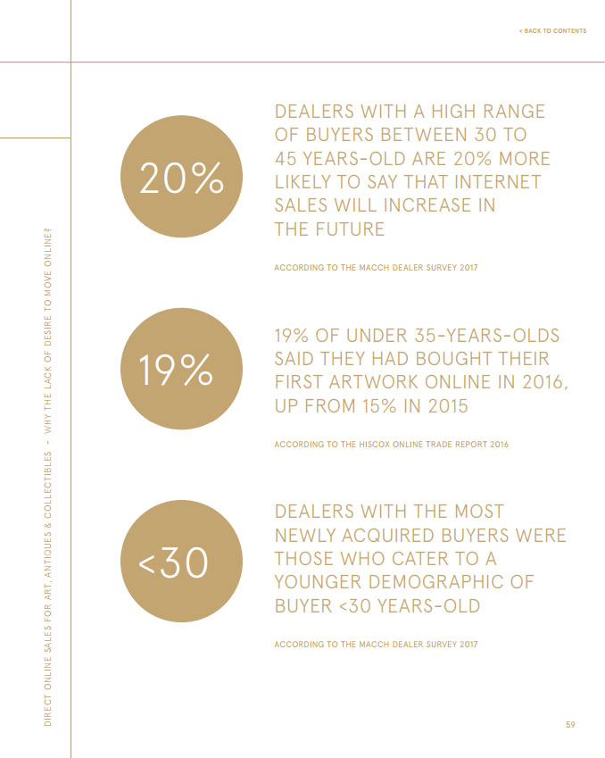
A page from TEFAF’s “Online Focus” section of its 2017 “Art Market Report.” Courtesy of TEFAF.

The Shift Online, By the Numbers

According to available data, online art-buying is still relatively modest: recent reports estimate that it could make up anywhere from 3.8 percent to nine percent of total sales worldwide. But for galleries, which have been slower than other businesses to adapt to the digital revolution, the web has already emerged as an essential tool for another purpose.
According to TEFAF’s 2017 art market report, the internet is the second most fruitful platform for meeting new clients. (Art fairs, unsurprisingly, are the first.) Half of the dealers surveyed say they meet 20–40 percent of their new buyers on the web. And more than two-thirds anticipate that the internet will become increasingly important as a way to meet clients in the future.
A brief survey of New York galleries conducted for this article reveals similar trends. Downtown dealer James Fuentes estimates that while 80–90 percent of sales happen in person, the vast majority of those buyers initially come through email or social media. Magda Sawon, co-founder of Postmasters Gallery, says that only 25–30 percent of Postmasters’s sales are done in-person, meaning the collector actually comes to see the artwork in the gallery. The rest, she says, comes from a “combination of direct outreach, digital selling platforms, promotion via social media, and press coverage.”
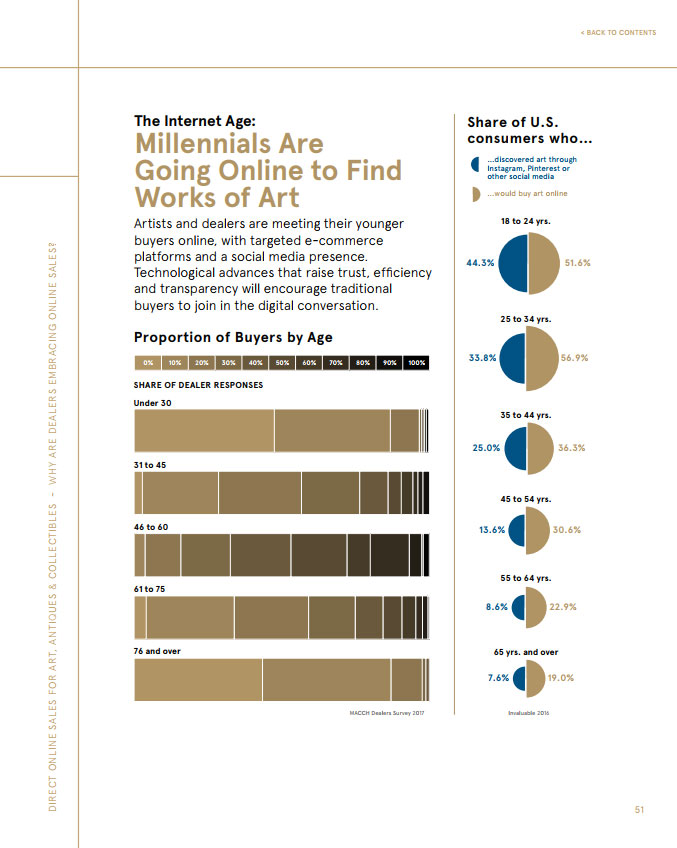
A page from TEFAF’s “Online Focus” section of its 2017 “Art Market Report.” Courtesy of TEFAF.

Kelly’s Digital Engagement 

The New York-based dealer Sean Kelly says that the “bulk” of his gallery’s sales are done in-person, but that the ways in which those sales are initiated are changing. He notes that the number of instances in which he sells art to people who are reaching out through digital channels is growing “at quite a rapid clip.”
“The numbers have not shifted profoundly, but the rate at which those inquiries are coming in is more noticeable than a year ago, or even half a year ago,” Kelly explains.
Six months ago, Kelly brought in a new communications manager, Adair Lentini, for her advertising knowledge and social media savvy. Lentini came from Frieze magazine, where she was responsible for advertising, events, and PR for North America.
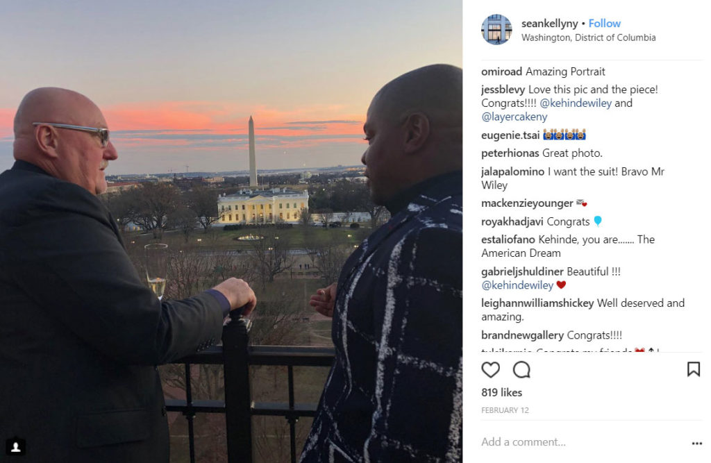
Screenshot of a recent Instagram post by Sean Kelly Gallery, featuring Kelly and artist Kehinde Wiley.
When she joined the gallery in October, she began monitoring its web analytics and implemented a number of new tactics across Kelly’s platforms. She dialed back email newsletters and increased the gallery’s Instagram presence, adding more stories, behind-the-scenes images, and even new exhibition-specific accounts.
So far, her work has paid off. Since Lentini joined Sean Kelly, the gallery has seen its online visitor numbers grow exponentially. The amount of time people spend on the website has nearly tripled, and Instagram engagement has increased by roughly 15 percent.
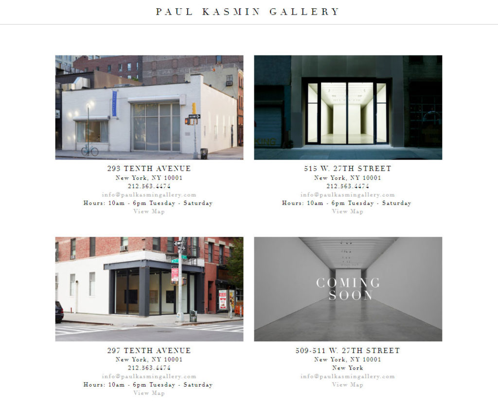
A screenshot of Paul Kasmin’s website. The gallery currently has three brick-and-mortar locations in New York, with a fourth opening soon.

Kasmin’s Audience Insights

Sean Kelly is not alone: Other galleries are employing similar strategies, devoting more resources to the digital realm and recruiting experts in the field. Paul Kasmin Gallery recently hired Molly Taylor as its new marketing and events director. Before she started in November of last year, the gallery didn’t even own a clicker to track foot traffic, let alone the resources to monitor web analytics.
Now, Kasmin is using a variety of new tools—Google Analytics, Artlogic, Plann—to, as Taylor puts it, “measure the details of engagement enacted across the gallery’s website, display advertising, social media, and e-newsletters.” The gallery uses this information to generate a monthly dashboard that tracks online engagement and assess what’s working and what isn’t.
Thanks to her new dashboard, Taylor can report that 60 percent of Paul Kasmin’s sales are done in person, 35 percent begin through email, four percent through their website, and one percent through social media.
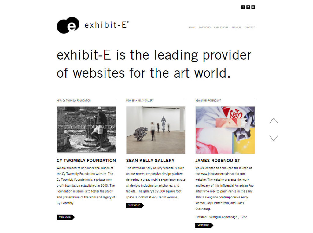
exhibit-E’s website. exhibit-E has hundred’s of art world client’s, including galleries, artists, and foundations.

Making Yourself Useful

Galleries’ push to make over their online storefronts has been a boon for consultants in the field, too. Dan Miller, the founder of exhibit-E, a website platform for galleries, foundations, and other organizations, says he’s seen a profound increase of interest in his business in recent years, particularly from galleries looking to integrate their website, mobile apps, and inventory information.
“It’s important to think of these platforms as tools for educating the public and nurturing and building relationships that lead to sales,” Miller explains.
Miller says galleries need to understand that websites can offer the kind of context that dealers themselves offered in person in a pre-digital era. “When potential buyers go to find information about an artist, it’s imperative that, when they land on the gallery’s website, they feel that they found all the information that they want, so that the gallery becomes the authority on that artist—more than the artist’s website or Wikipedia or other platforms.”
Miller encourages his clients to monitor web traffic, page rankings, click-throughs, and other analytics—still an unfamiliar strategy for many. “You can compare and contrast where the traffic is coming from, what devices they’re accessing it on, how much time they’re spending on it, then make changes accordingly,” Miller notes.
By implementing these practices, Miller says his clients can increase their online engagement by as much 250 percent.
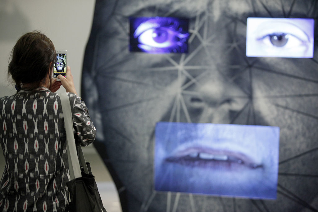
Visitors pass by the artwork of the artist Tony Oursler. Photo by Michele Tantussi/Getty Images.

Generational Shift

For Wendy Cromwell, an independent art adviser, these strategies are part of a larger conversation about how galleries adapt to a changing business environment (or don’t, at their peril). 
“You begin to recognize that the older collectors who are not so-called ‘digital natives’ are aging out the market,” Cromwell says. “It’s important to keep an open mind about how a younger generation will want to engage with art. Will it be by going to galleries, or will it be through online content and virtual experiences and art fairs? It seems to me that it’s a combination of those two already.”
Indeed, for Sean Kelly, a digital makeover is not optional. “People often ask me, ‘Why are you concerned about social media? Most collectors aren’t going to follow you on Instagram; most collectors aren’t going to be that tech-savvy,’” he says. “That might be true, but I can tell you of multiple examples in my 30-plus year history in this business where we took time with young people who may have come in with their parents or may have come in with a college or a school group, and they eventually came back to us as buyers, wanting to begin a collection.”
Slowly, dealers are recognizing that if they continue to rely on cultivating new clients only in person, the well could ultimately dry up. “I don’t think the digital is going to replace the in-person anytime soon,” Kelly concludes. “But the ways in which sales conversations are initiated—that’s where we’ll continue to see a significant difference.”

Follow artnet News on Facebook:


Want to stay ahead of the art world? Subscribe to our newsletter to get the breaking news, eye-opening interviews, and incisive critical takes that drive the conversation forward.
Share
Article topics

Big Ideas That Gripped the Art World


Here Are 6 Big Ideas That Gripped the Art World in 2018, From ‘Platform Capitalism’ to ‘Chthulucene’

As we look back on 2018, here are a few new terms, concepts, and trends that resonated with the art world this year.
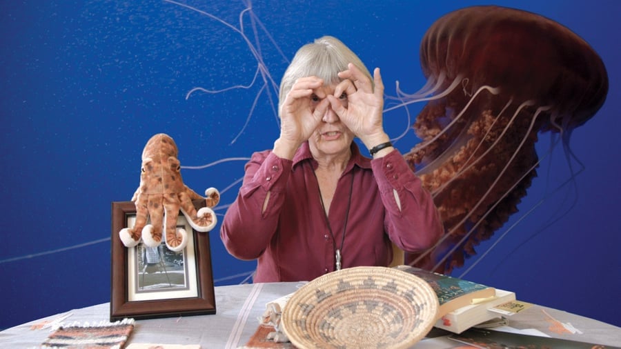
Donna Haraway: Storytelling for Earthly Survival (film still). Courtesy of Fabrizio Terranova.
What new ideas started to creep into art this year? What terms began to insinuate themselves into the critical lexicon?
These are not easy phenomena to track. Some concepts take over the conversation so suddenly that you almost forget how recent they are; some gather cult cachet over long periods before the big tastemakers notice; some have already been played out and exhaustively debated within their fields of origin by the time art starts to process them.
Nevertheless, it’s a worthy exercise to at least try to keep track. Here are six terms that capture some of the year’s themes that are either having a moment or are about to boil over.

“The Majority World”

Portrait of Shahidul Alam. Photo courtesy Gideon Mendel.
It would be foolhardy to pretend like there is any upside to the extraordinary persecution of Bangladeshi photographer Shahidul Alam by authorities in his home country this year. But his ordeal and the protests and testimony of his peers and supporters certainly did throw light on the value of his artistic and intellectual contributions—so it’s worth seizing the moment for them.
The most notable of his coinages may be “Majority World,” an eminently sensible term to replace “Third World.” The latter bears the ideological stamp of now-ended Cold War debates between the First and Second (i.e. the Capitalist and Communist) camps—but more importantly, it treats the living conditions of the overwhelming majority of people on earth as a literal afterthought.

“Chthulucene”

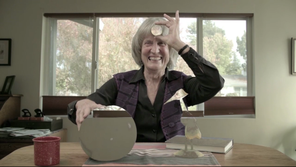
Fabrizio Terranova, Donna Haraway: Story Telling for Earthly Survival, 2016 (still) HD video, color, sound, 90 min. Photo by Kjell Ove Storvik/NNKS.
Still from Fabrizio Terranova’s video Donna Haraway: Story Telling for Earthly Survival (2016). Photo by Kjell Ove Storvik/NNKS.
I thought Donna Haraway’s term “Cthululscene,” from her recent book Staying with the Trouble: Making Kin in the Chthulucene, was too weird to catch on. I was wrong. It’s made ripples, from architecture theory to art zines to eco-art tomes like DJ Demos’s recent Against the Anthropocene, which takes Haraway’s coinage seriously. Partly on its strength, Haraway made ArtReview‘s increasingly head-scratching “Power” list (though she was down to 67 from number 3 last year.)
What, you say, is the Chthuluscene? In response to the popularity of the idea of the “Anthropocene,” the age defined by humanity’s impact on the earth, Haraway proposes imaging instead a new age: “a time when humans will try to live in balance and harmony with nature (or what’s left of it) in ‘mixed assemblages.'” Essentially, it is a call to cohabit with nature.
It is amazing how far Haraway has come from the “Cyborg Manifesto” that made her famous and endlessly quoted by artists, returning to something that sounds very much like the Gaia-focused “goddess feminism” that her original idea of “cyborg feminism” had been designed to counteract. Now she sums up her position thusly: “we are all compost, not posthuman.”
(For the record, Haraway’s “Cthululscene” may come from the same root word as H.P. Lovecraft’s ancient tentacled monster, Cthulhu, but she distances herself from Lovecraft’s “patriarchal monster”—though her description is plenty full of tentacles.)

“Platform Capitalism” / “Platform Cooperativism”

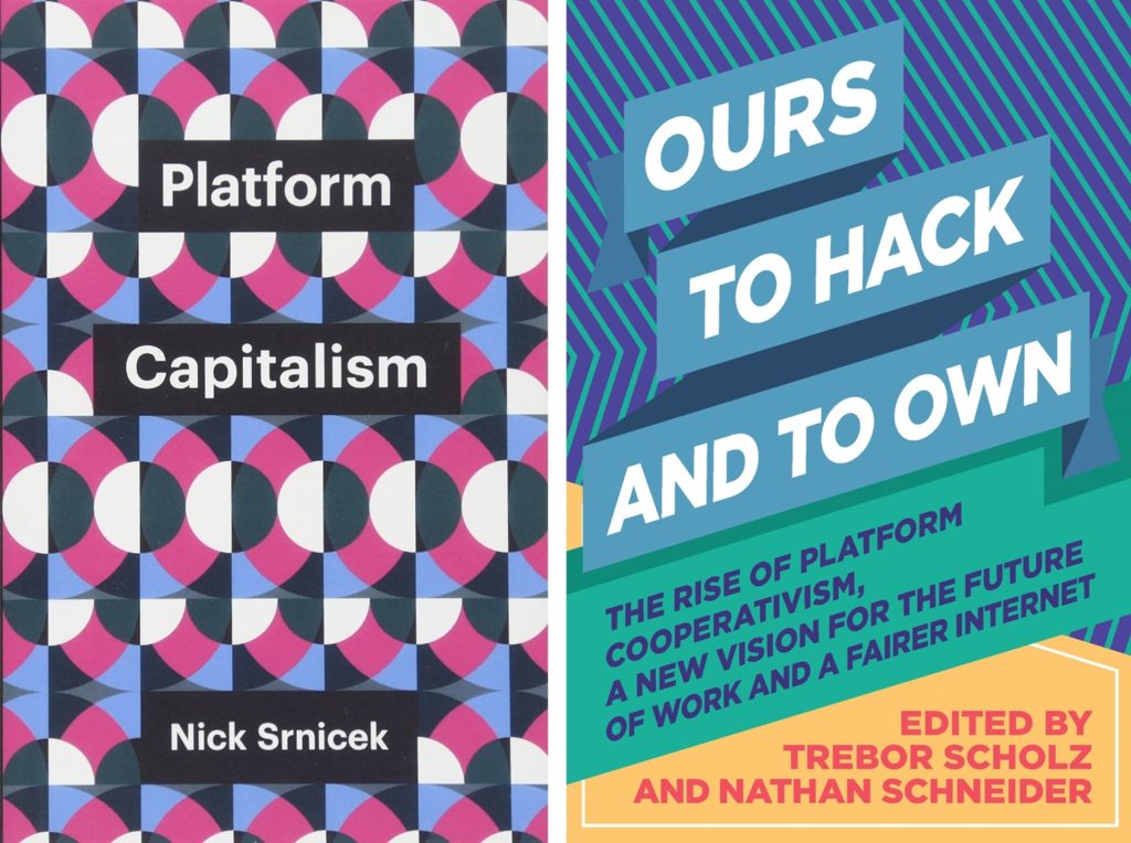
<em>Platform Capitalism</em> (Polity, 2016) and <em>Ours to Hack and to Own</em> (Or, 2016).
Platform Capitalism (Polity, 2016) and Ours to Hack and to Own (Or, 2016).
Coined by German critic Sascha Lobo, this term has been picking up steam with the publication of Nick Srineck’s recent book Platform Capitalism
For my money, the rise to buzzword status of “platform capitalism” is interesting less as a fully developed theory of some kind of new epoch of capital than of a shift in public understanding of the web. Instead of the internet leveling hierarchies, as it was seen to be not so long ago, most people now feel that it has made them dependent on what are, in effect, new-model monopolies—technological ecosystems that function by dominating some piece of your attention, your social life, your economic aspirations.
“Platform capitalism” has been met by a nascent wave of interest in “platform cooperativism,” as well, popularized by the likes of Trebor Scholz and Tiziana Terranova as a DIY people-powered answer. Whether the latter is a practical alternative or just a propaganda tool for artists and intellectual activists, I don’t know yet. (Scholz’s Platform Cooperativism Consortium at the New School received a $1 million grant from Google’s charitable arm this year).

“Practices of Attention”

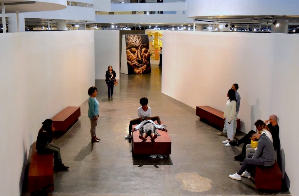
Tal Issac Hadad, Recital Para um massagista. Image courtesy Ben Davis.
Tal Issac Hadad, Recital Para um massagista being performed at the Bienal de São Paulo. Image courtesy of Ben Davis.
I have guessed that “attention” is going to become more and more central to how we talk and think about art—because art, as a specific field, must make a case for itself both within and against a lot of other, very pervasive technologies of attention capture. Reframing art’s slowness as a virtue is an obvious move. (I mean, even Childish Gambino is getting in on the “slow art” trend with an installation in New Zealand).
And indeed, curator Gabriel Pérez-Barreiro’s 33rd Sao Paulo Bienal did just this, turning its show guide over to teaching “practices of attention,” and offering a symposium of the same name, organized by curator and writer Stefanie Hessler and scholar D. Graham Burnett, exploring ideas of deliberate aesthetic perception as a way to “reaffirm the power of art as a unique place to focus attention in, to, and for the world.”

“The Undercommons”

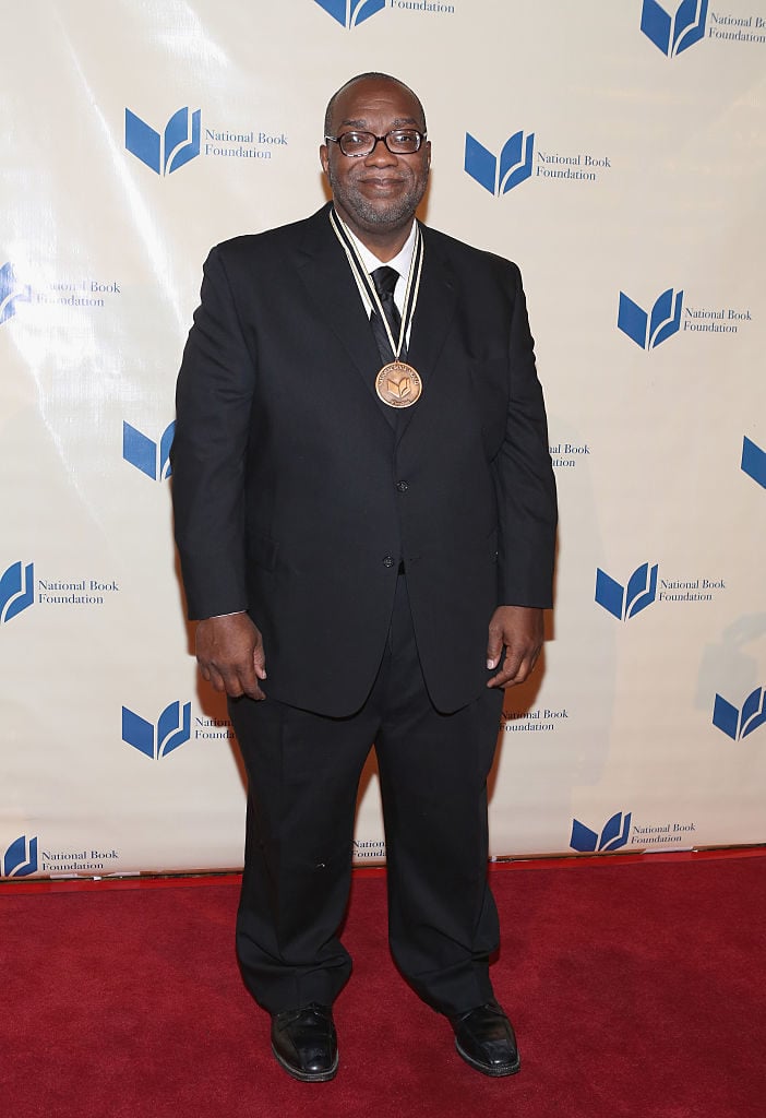
Fred Moten attends 2014 National Book Awards on November 19, 2014 in New York City. Photo by Robin Marchant/Getty Images.
Fred Moten and Stefano Harney’s The Undercommons: Fugitive Planning and Black Study was published five years ago. In 2018, Moten in particular ascended to something like master thinker status—a strange place to be, given the elusive nature of his thought. The “undercommons” was presented as the inspiration for both the New Museum Triennial and the Creative Time Summit in Florida. Moten was profiled in the New Yorker, and on stage in dialogue at Frieze New York.
As often happens when art gets a hold of an idea, in the process some of the grit was sanded off of it, and the “undercommons” now seems to be used as an affirmation of the marginal.
So it’s worth remembering the tortured, bleak, and contradictory nature of the idea: The Undercommons‘s most famous essay is a guide to how to cope within the dysfunctions of contemporary academia, advocating that the only honest path is claiming a sort of sideways, quasi-anarchistic underground space within and at odds with its failings structures.
“It cannot be denied that the university is a place of refuge, and it cannot be accepted that the university is a place of enlightenment,” Moten and Harney write in their most cited passage. “In the face of these conditions one can only sneak into the university and steal what one can.”

“Weak Cosmopolitanism”

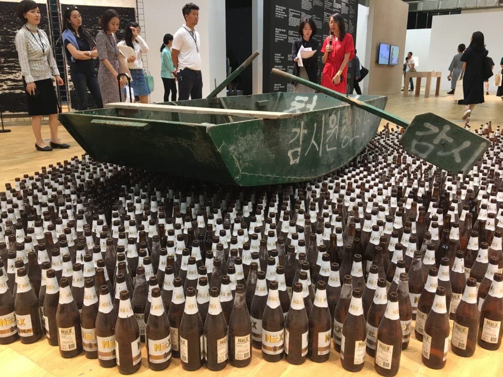
KCHO's <i>Para Olvidar</i> (1995) in the 2018 Gwangju Biennale. Photo: Hili Perlson.
KCHO’s Para Olvidar (1995) in the 2018 Gwangju Biennale. Photo: Hili Perlson.
To be fair, this is not a real term, and more just my term for a trend I have noticed. Not so long ago, so-called “object oriented ontology” was all the rage, and every biennial or high-profile exhibition was taking about “vibrant matter” and how rocks and plants were people too. This year, pretty much every international art event sang a different tune, and it was by MIA: “Borders—what’s up with that?
“Questioning borders” was the curatorial leitmotif of the year—and not just at the Gwangju Biennial, whose literal theme this year was “Imagined Borders.” You see it just as much in Manifesta’s use of the metaphor of the “Planetary Garden” as a tool “to aggregate difference and to compose life out of movement and migration.”
Given how central anti-migrant politics are to the world right now, that’s understandable. But given the alarming advances made by nativism, you also start to think that advocating some more specific policy or practice might be needed to put some meat on the bones of the high-flown cliche, and avoid the impression that we are just really congratulating our own broad-mindedness as a globe-trotting audience.

Follow artnet News on Facebook:


Want to stay ahead of the art world? Subscribe to our newsletter to get the breaking news, eye-opening interviews, and incisive critical takes that drive the conversation forward.
Share

Absolute Worst Artworks of 2018


9 of the Absolute Worst Artworks of 2018, as Chosen by the artnet News Staff

We encountered some real dippy flubs out there this year, from masterstrokes of vainglorious pretension to pervy stuff to some pure groaners.
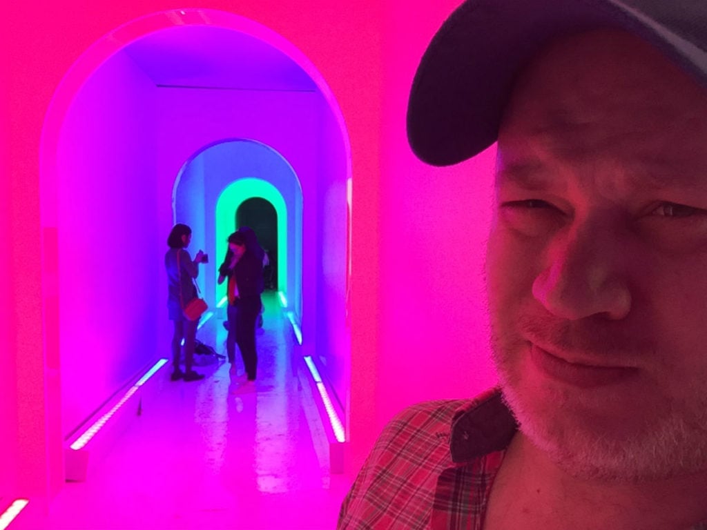
The Dream Machine.
The Dream Machine. Photo by Ben Davis.

WORST👎 ART OF 2018


Sometimes we art professionals come across an artwork so profound, so thrilling, so old-fashionedly beautiful that it lingers fondly in the memory for years to come. Other times, we look at something and think, “Whoa… that stinks.” Like, big-time. For writers, this is like a gift from heaven, because you can’t really write funny, biting, acidulous prose about good art, and that’s fun. Here, read an array of artnet News’s usually happy-go-lucky staff vent about the floppiest duds of 2018.

The Dream Machine, Brooklyn

A cutting review!
A cutting review!
I already reviewed this limp Brooklyn-based attraction at midyear, so maybe I’m beating a dead horse—or a dead Instagram Trap, to be precise. (This October it was rebranded as Nightmare Machine, an Instagrammable haunted house). But just to be clear: it’s not that I just hate the Instagram environment trend that has sprung up everywhere. I took a spin through the Color Factory in SoHo and found it to be comparatively well done, even creative; in general, I’d go so far as to argue that we should do a better job at taking this craze seriously for what it represents socially. I just don’t think the Dream Machine itself took itself very seriously. It paid only the thinnest service to its own “dream” theme in favor of recycling a bunch of ideas that have already become cliches in other Instagram Trap environments (ball pits! mirror rooms! free candy!), serving as an Instgrammable reminder of just how cynical and tiresome this trend can, and will, get before the novelty exhausts itself.
Ben Davis

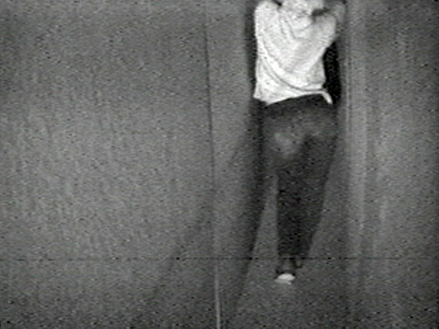
Bruce Naumann, Walk With Contrapposto (1968) at MoMA PS1


I get it. I get it. It’s a conceptual work reflecting the artist’s belief that whatever he decided to do in the studio is “art.” I even tried to focus on the significance of his attempts to maintain the “contrapposto” pose associated with classical and Renaissance sculpture while navigating a long narrow corridor. I still can’t decide whether I was more overwhelmed with indifference or irritation or a headache-inducing mixture of both. It made my brain hit snooze. #SorryNotSorry.
Eileen Kinsella

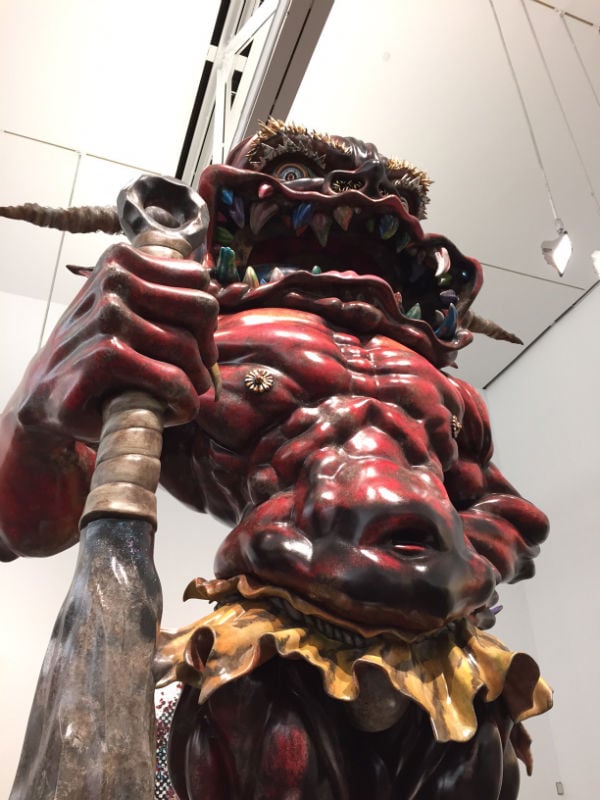
Takashi Murakami, Embodiment of A (2014) at the Vancouver Art Gallery

Takashi Murakami, Embodiment of A (2014)
Takashi Murakami, Embodiment of A (2014). Photo: Ben Davis
This is quite simple. All you have to do is scroll up and take a look at this dinky behemoth by Takashi Murakami to see why it qualifies as one of the worst works we saw all year. Sure, it was a leap for the artist to go from his twee aesthetic to something so brazenly grotesque (as our very own Ben Davis has pointed out). But this lumbering beast is ten steps too far. It didn’t help that the enormous sculpture was surrounded at the Vancouver Art Gallery by colossal and wretched paintings of lumpy old men. Truly a grisly sight.
Pac Pobric

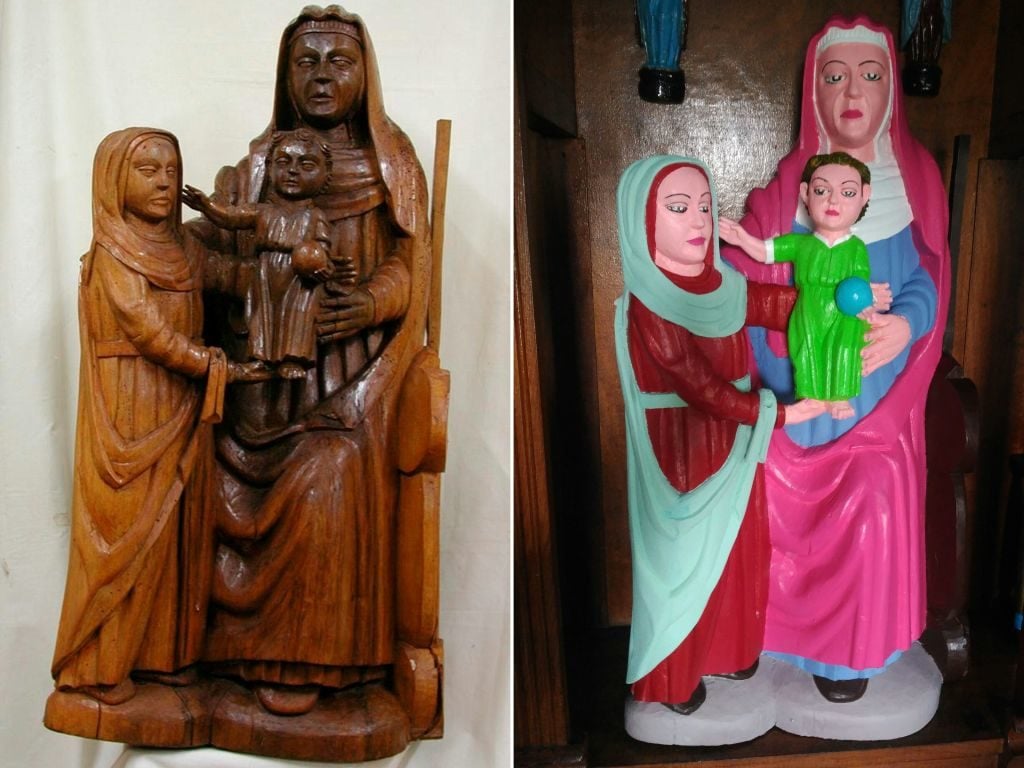
Restored 15th-Century Virgin Mary, Church of El Ranadoiro, Asturias, Spain

At left, the 15th-century statue of Virgin Mary before being “restored” (right) by a local woman in Asturias, Spain. Photo DSF/AFP/Getty Images.
This year gave us not one but two spectacularly botched restorations in the vein of the legendary “Beast Jesus.” One was a 16th-century sculpture of Saint George in Navarre, Spain, that was repainted by a local art teacher to look like a character in a Pixar film. The other was a 15th-century wood carving of Mary, Saint Anne, and baby Jesus in Asturias, Spain, that a local antique-shop owner repainted in neon, making it look more like a lawn gnome than a sacred object. (Every single one of these calamities, for some reason, seems to happen in Spain.) Between the two, it was difficult to pick the best of the worst, but the shop owner’s DayGlo paint job on a wooden sculpture that never had any paint to begin with takes the cake. My favorite part was her matter-of-fact explanation: “I’m not a professional painter but I’ve always liked painting and the statues really needed painting,” she told El Comercio. “I painted them as best I could using what I thought were the right colors.”
I will add a caveat here, though: They say you shouldn’t judge art you haven’t seen firsthand, and I’ve only seen this in pictures. Maybe it looks much subtler in person.
Julia Halperin

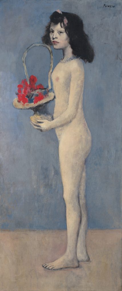
Picasso, Fillette a la corbeille fleurie (1905) at Christie’s

Pablo Picasso Fillette a la corbeille fleurie (1905). Photo: courtesy of Christie’s.
I’m cheating because I did not see this in real life, but I saw it a lot everywhere else. Picasso’s 1905 portrait of a barely pubescent and impoverished girl, standing naked to the side to showcase her small figure and apparent lack of breasts, grosses me out. Formally speaking, it isn’t bad art; Picasso is a virtuosic painter. But it leaves a bad taste in my mouth that this painting could sell for $115 million at Christie’s, which it did in May, with little or no mention of the troubling power relations that may have been at play between the so-called “Linda” (who was known to be a flower-seller and a child prostitute) and a 24-year-old Picasso. It’s 2018 (almost 2019!), and yet, in the market at least, the male gaze continues to be valorized through accumulation.
Kate Brown

Obvious, Portrait of Edmond de Belamy (2018) at Christie’s London Showroom


𝒎𝒊𝒏 𝑮 𝒎𝒂𝒙 𝑫 𝔼𝒙 [𝒍𝒐𝒈 𝑫 (𝒙))] + 𝔼𝒛 [𝒍𝒐𝒈(𝟏 − 𝑫(𝑮(𝒛)))], Portrait of Edmond de Belamy, from La Famille de Belamy. Courtesy Christie's Images Ltd.
𝒎𝒊𝒏 𝑮 𝒎𝒂𝒙 ���� 𝔼𝒙 [𝒍𝒐𝒈 𝑫 (𝒙))] + 𝔼𝒛 [𝒍𝒐𝒈(𝟏 − 𝑫(𝑮(𝒛)))], Portrait of Edmond de Belamy, from La Famille de Belamy. Courtesy Christie’s Images Ltd.
So I’m the first to admit that I was taken in by the concept at first too. I thought it was really cool that an artificial intelligence had created a portrait of a human, and my mind was exploding with the possibilities of it all. But by the time I had read more about the level of work that was being done elsewhere with AI—meanwhile the trio behind it all hawked the print for $432,500 at Christie’s—I was so done. It turns out that Obvious’s hand in making the work was pretty minimal, and while they credited the work to the algorithm as part of their savvy marketing tactics, they probably should have credited Robbie Barrat, the 19-year-old student they borrowed the code from to make the piece in the first place.
Naomi Rea

Obvious, Portrait of Edmond de Belamy (2018) at Christie’s London Showroom


𝒎𝒊𝒏 𝑮 𝒎𝒂𝒙 𝑫 𝔼𝒙 [𝒍𝒐𝒈 𝑫 (𝒙))] + 𝔼𝒛 [𝒍𝒐𝒈(𝟏 − 𝑫(𝑮(𝒛)))], Portrait of Edmond de Belamy, from La Famille de Belamy. Courtesy Christie's Images Ltd.
𝒎𝒊𝒏 𝑮 𝒎𝒂𝒙 𝑫 𝔼𝒙 [𝒍𝒐𝒈 𝑫 (𝒙))] + 𝔼𝒛 [𝒍𝒐𝒈(𝟏 − 𝑫(𝑮(𝒛)))], Portrait of Edmond de Belamy, from La Famille de Belamy. Courtesy Christie’s Images Ltd.
Like Kate with her selection, I’m bending the rules a bit because I didn’t see this in person. I also wouldn’t normally pick the same work as someone else on staff, and Naomi got her pan into this post before I did. But I’m making an exception to both because A) seeing a digitally output print in person isn’t going to change my opinion about it, and B) there’s something much bigger here that I feel like I need to address.
There are many valid reasons to conclude that Portrait of Edmond de Belamy, misleadingly billed as “the first piece of AI-generated art to come to auction,” is the aesthetic equivalent of something a plumber normally has to be paid to snake out of a clogged toilet. But perhaps nothing encapsulates my disgust with the piece as cleanly as the difference between how Naomi and I have listed the work in the header versus the way Obvious convinced Christie’s to list it when the house sold the portrait this October.
As Naomi mentioned, the three members of Obvious contend that the (open-source, minimally tweaked) algorithm used to output the image should be credited as the “artist.” But accepting this idea means further advancing the single most dangerous and most prevalent misconception about artificial intelligence technology today. By definition, an algorithm is a set of instructions for the performance of a task. Instructions are written by humans—and, more to the point, specific humans with specific goals, tendencies, blind spots, and biases. No matter who deserves ultimate credit for the final algorithm Obvious used, Obvious bears total responsibility for the dataset it fed into the algorithm. And here, the group’s choices resulted in something painfully regressive: three young white guys literally teaching software that “art” means “portraits of older, aristocratic white people.” And worst of all, the legacy art world went bananas over it.
So it would have been bad enough that Portrait of Edmond de Belamy has all the conceptual rigor of three college freshmen who just smoked their first joint. (“Dude, imagine, like, fancy old portraits, except they’re made by a fuckin’ computer!“) Obvious made matters far worse by taking technology that could and should be used to usher in a better future and instead directing it hundreds of years into a past that we as a culture have at least begun to evolve beyond. But the art world at large brought this embarrassment to a crescendo by treating the work and the group behind it as the standard-bearers of an alleged new art form. The whole episode was like watching someone gain the power to teleport to other habitable planets, then get rich by selling tickets to a world where it isn’t illegal to hunt bald eagles yet. And for that, Portrait of Edmond de Belamy deserves to live in infamy.
Tim Schneider

Theater of the World, Huang Yong Ping (1993) at the Solomon R. Guggenheim Museum, New York

Huang Yong Ping, <em>Theater of the World</em> (1993). Photo by Sarah Cascone.
Huang Yong Ping, Theater of the World (1993). Photo by Sarah Cascone.
Perhaps it is unfair to judge a work of art based on the media circus that surrounds it, but when curators at the Guggenheim bowed to threats and agreed not to include live animals in Huang Yong Ping’s Theater of the World for the exhibition “Art and China after 1989: Theater of the World,” that controversy inevitably became part and parcel of how audiences experienced the piece.
Theater of the World was supposed to include live animals—it was conceived as a caged sculpture full of live insects, amphibians, and reptiles. Throughout the show, nature was meant to run its course, some animals fighting, others serving as food. I’m certainly wholeheartedly against animal cruelty, but I remain unconvinced that the animals would have suffered any more than your average caged pet being fed live crickets and bugs.
But when PETA got wind of it, along with two other animal-related works meant to be in the show, they called for its removal from the exhibition, and a Change.org petition denouncing the artworks received over 800,000 signatures. The Guggenheim folded under the pressure, and the Theater of the World went on view without the animals.
By the time I saw the show in early January, shortly before it closed, all I could see in the work was an empty cage: a symbol of censorship, political correctness, and the reactionary nature of online outrage. It was an ugly reminder of the growing number of museum controversies, and the sense of entitlement I see in the more extreme advocates of trigger warnings. It’s not the artist’s fault, but when I think about Theater of the World, I think of the evils of censorship, and how they are threatening the art world on an increasing basis.
Sarah Cascone

Banksy, Love Is in the Bin (2018)

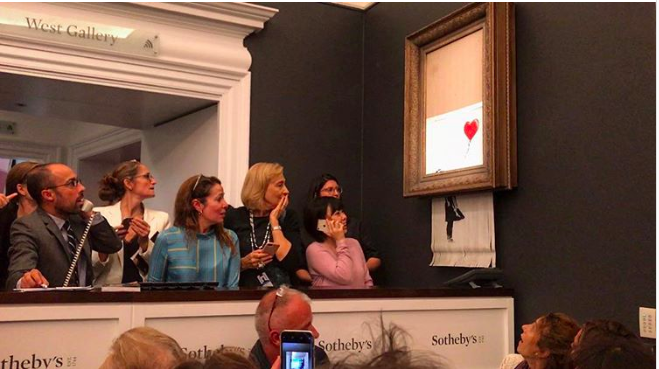
Surprised onlookers react as Banksy's Girl With a Balloon self-destructs at Sotheby's.
Surprised onlookers react as Banksy’s Girl With a Balloon self-destructs at Sotheby’s.
Let’s be clear, Banksy‘s Girl With Balloon was a terrible artwork before it was shredded at Sotheby’s Contemporary Art sale in London in October. I didn’t think it was possible to make it worse. The thematic content was far too obvious, a young girl lets go of heart-shaped balloon. What could that metaphor possible represent? Then Banksy (or somebody else) shredded it in an evening sale just after it was hammered down for £1 million ($1.4 million) in a sensationalist publicity stunt, and the world went crazy. Sotheby’s insisted they knew nothing of the plans, but anyone with knowledge of art auctions knows that no specialist would send an artwork to the auction block at that price point without inspecting every inch of it first. The shredding itself was another all-to-obvious allusion to the commercialization of art. In the aftermath of the stunt Banksy said on social media that he had intended to shred the whole work but the shredder malfunctioned. If only it had worked.
Henri Neuendorf

Marina Abramović, 5 Stages of Maya Dance (2018)

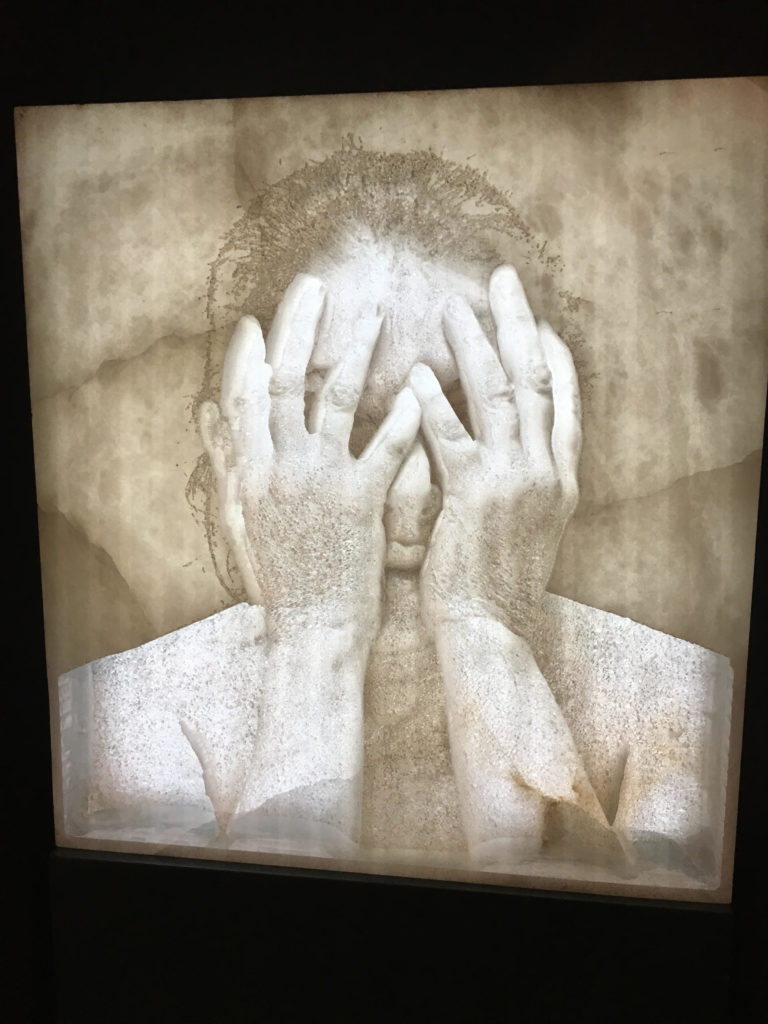
Marina Abramović, <i>5 Stages of Maya Dance</i> (2018), at Masterpiece London.
Marina Abramović, 5 Stages of Maya Dance (2018), at Masterpiece London.
Even the greatest durational artists have their off days, and it pains me to say that Marina Abramović’s over-the-top theatrical installation at the entrance of the Masterpiece London art fair this summer was the worst presentation I saw all year. Individually, the five alabaster relief self-portraits might have conveyed something of the artist’s charismatic presence. But as a spot-lit, walk-through experience in a darkened space, the Factum Arte/Lisson Gallery booth looked more Madame Tussauds than a work of art to be taken seriously. As a journey through her celebrity, 5 Stages of Maya Dance was Abramović’s Gloria Swanson moment: frozen, ready for her close-up, for eternity. It was Sunset Boulevard—and not in a good way.
Javier Pes

Follow artnet News on Facebook:


Want to stay ahead of the art world? Subscribe to our newsletter to get the breaking news, eye-opening interviews, and incisive critical takes that drive the conversation forward.
Share


         Article topics

Better Photos? Here Are 6 Tips


Want To Take Better Photos? Here Are 6 Simple Tips to Up Your Game

The photographer and RISD professor Henry Horenstein's new book 'Make Better Pictures' offers everyday tips for improving your photo skills.
Photo courtesy of Creative Commons.
The following excerpt from photographer and Rhode Island School of Design professor Henry Horenstein’s new book Make Better Pictures offers a few practical tips to improve the photo-taking skills of both everyday iPhone shutterbugs and fine artists alike.

1. Get High

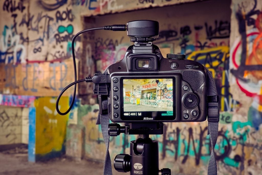
Image courtesy of Creative Commons.
The most obvious situations for getting a little high are when something is obstructing your main subject—for example, a fence blocking the cows in a pasture or the front row blocking the people in back  in a group portrait. Lift the camera high to make this shot, if you must. But be careful to hold it very steady when you do. A better solution is to get on a ladder to obtain a higher vantage point, enough to “see” over the obstruction and get a clear view of what’s behind.
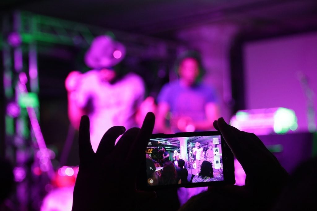
Another occasion on which you may have  your shot obstructed is in clubs, when you are trying to photograph a band. You won’t be able to set up a ladder there, obviously, but you may be able to lift your camera or find higher ground in the club or find a lower obstruction—a short person—to stand and shoot behind.
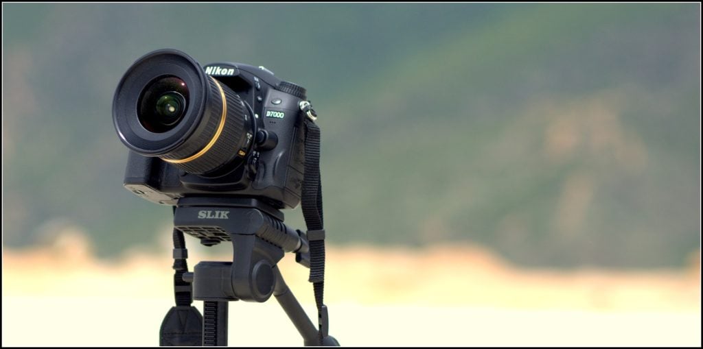
Another simple, lightweight option: a monopod. With your camera mounted on this one-legged tripod, you can raise your camera higher. How  to focus and fire? Use a remote dedicated to your camera or connect to your smartphone with an app that lets you compose, focus, and shoot from your phone.

2. Through a Glass

Good pictures can be made of subjects behind glass—for  example, store windows or aquarium tanks. But reflections on the glass can ruin your shot. The best solution is to push the front of the lens flat up against the glass. The glass doesn’t see anything that way, thus no reflection. An inexpensive rubber lens hood can make this easier.
Of course, you’ll have to accept limits on the composition. Carefully drag the camera and lens up, down, or to the side, along the glass until you get the framing you want.
Placing the lens against the glass also helps steady the camera. Press hard enough and you’ll be able to shoot at a much slower shutter speed than you’d otherwise need.
Though this technique works best if the front of the lens is flat up against the glass, it may also work if it is angled a little. But watch out for image distortion, especially with thick glass. It may also work if the camera and lens are placed a little away from the glass, if you wear non-reflecting plain, dark clothes and/or if the background is plain so it doesn’t reflect light.

3. Clubbing

Image courtesy of Creative Commons.
A lot of disappointing pictures get taken at clubs and concerts. These can be difficult shooting situations even for professionals with press credentials. For the rest of us, it can be more daunting or even impossible. Some suggestions:
1. GET AS CLOSE AS YOU CAN TO YOUR SUBJECTS. Slide up close to the stage or sidelines to make your pictures.
2. ZOOM MINIMALLY. Zooming usually means a smaller maximum lens aperture, so you’ll need to boost your ISO to compensate and this may lead to unacceptable image noise.
3. USE FLASH ONLY WHEN CLOSE. Most flash light doesn’t carry very far, at most 15-20 feet or so—another argument for getting close.
4. SET AUTOEXPOSURE COMPENSATION TO MINUS.
Often the lit part of the stage (performers) comes out too light, even “blown out.” The easiest solution is to set the auto- exposure compensation scale to -1 or -2 or so. The unlit part of the stage will go even darker than it is, but the performers should be better exposed.

4. Flash On/Off

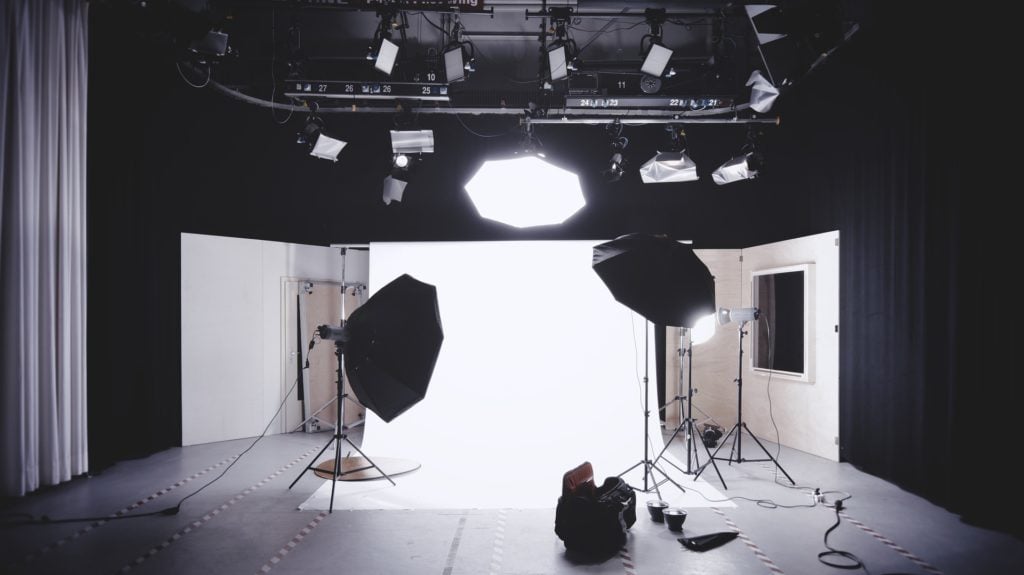
Natural light is usually more “real” than flash. More three-dimensional, interesting, and inviting. But in low  light, you may be tempted to use flash to brighten the scene because it brightens the subject for good exposure and clear detail when simply boosting ISO may not. Good use of  flash does that, but it can also be harsh, flat, and lacking subtlety. It can make subjects feel like cut-out characters.
The flash effect sometimes works, if you’re looking for a certain kind of impact—for example, hyperactive/goth/vampire/punk. Or it can add detail to shadow areas  that might otherwise block up—go too dark. But most pictures look better in natural light. If you can get away with it, turn off the flash. Use a prime lens with a wide aperture, if need be, and push up the ISO. Use a tripod with a slow shutter speed for still subjects. Don’t worry about capturing detail in every area of the image. And hope for the best.
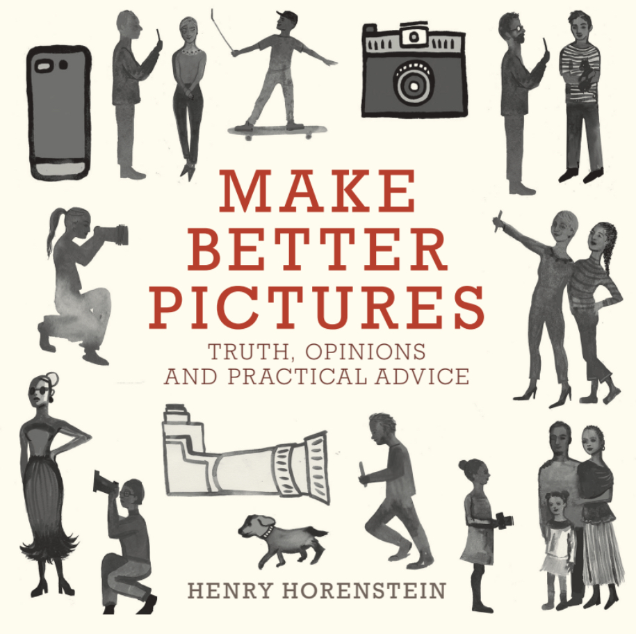
The cover of Henry Horenstein’s new book, Make Better Pictures.

5. Light Dims With Distance

The farther you are from your subject, the more flash power you need. This is because light falls off dramatically with distance. The rule, called the inverse square law, says that moving your flash or other light source twice as far away, say to ten feet instead of five, reduces the light to one-quarter of its original strength.
This is important to remember if you want to shoot from a distance with a flash. Unless your flash is very strong, the light will probably not carry. Many small flashes, for example those with your cell phone, tablet, or compact camera, may not carry far enough to be effective at more than five to ten feet.
Also, keep this rule in mind if you want to bounce light off a reflector, ceiling, or wall to diffuse its effect. Bounced light must travel from the source—the flash or other supplementary light—to the reflecting surface and back to the  subject. That can be a long way to go for a flash or other light unless it is especially strong. And the reflecting surface can even absorb some of the light—a full stop worth or more.

6. Background Matters

Image courtesy of Creative Commons.
Background distraction is often a matter of subject content—a scene that is just too busy. Perhaps a house in the background distracts when you are photographing a car, or a crowd in the background distracts from a float in a parade. But the distraction could also be from color or tonal similarities or differences. If your subject is wearing a red sweater, she will blend into a reddish wall; if she wears a blue sweater instead, she will stand out from the wall.
In black and white, color doesn’t matter; tonal differences rule. So, a blue sweater and red background may render as the same gray. Place your subject in a dark sweater, whatever the color, against a light wall—or light against dark—though sometimes color and tonal closeness can be nice. So, if possible, ask your portrait subject to bring different clothes and ask her to change if need be.
Excerpted from Make Better Pictures. Copyright © 2018 by Henry Horenstein. Used with permission of Little, Brown and Company, New York. All rights reserved.


Follow artnet News on Facebook:

Want to stay ahead of the art world? Subscribe to our newsletter to get the breaking news, eye-opening interviews, and incisive critical takes that drive the conversation forward.
Share