Art World
9 of the Absolute Worst Artworks of 2018, as Chosen by the artnet News Staff
We encountered some real dippy flubs out there this year, from masterstrokes of vainglorious pretension to pervy stuff to some pure groaners.

WORST ART OF 2018
Sometimes we art professionals come across an artwork so profound, so thrilling, so old-fashionedly beautiful that it lingers fondly in the memory for years to come. Other times, we look at something and think, “Whoa… that stinks.” Like, big-time. For writers, this is like a gift from heaven, because you can’t really write funny, biting, acidulous prose about good art, and that’s fun. Here, read an array of artnet News’s usually happy-go-lucky staff vent about the floppiest duds of 2018.
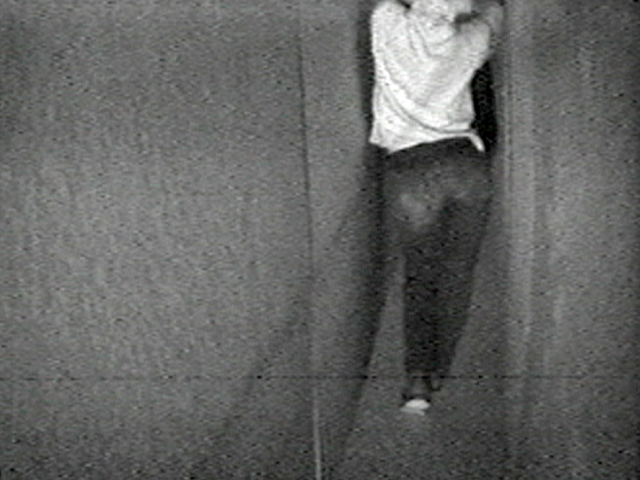
The Dream Machine, Brooklyn

A cutting review!
—Ben Davis
Bruce Naumann, Walk With Contrapposto (1968) at MoMA PS1
I get it. I get it. It’s a conceptual work reflecting the artist’s belief that whatever he decided to do in the studio is “art.” I even tried to focus on the significance of his attempts to maintain the “contrapposto” pose associated with classical and Renaissance sculpture while navigating a long narrow corridor. I still can’t decide whether I was more overwhelmed with indifference or irritation or a headache-inducing mixture of both. It made my brain hit snooze. #SorryNotSorry.
—Eileen Kinsella
Takashi Murakami, Embodiment of A (2014) at the Vancouver Art Gallery
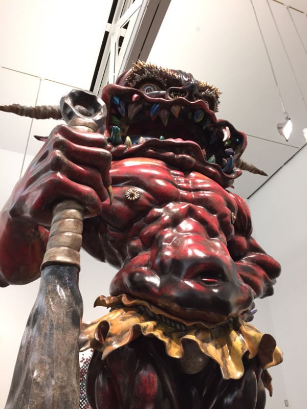
Takashi Murakami, Embodiment of A (2014). Photo: Ben Davis
—Pac Pobric
Restored 15th-Century Virgin Mary, Church of El Ranadoiro, Asturias, Spain

At left, the 15th-century statue of Virgin Mary before being “restored” (right) by a local woman in Asturias, Spain. Photo DSF/AFP/Getty Images.
I will add a caveat here, though: They say you shouldn’t judge art you haven’t seen firsthand, and I’ve only seen this in pictures. Maybe it looks much subtler in person.
—Julia Halperin
Picasso, Fillette a la corbeille fleurie (1905) at Christie’s
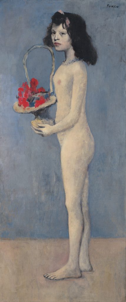
Pablo Picasso Fillette a la corbeille fleurie (1905). Photo: courtesy of Christie’s.
—Kate Brown
Obvious, Portrait of Edmond de Belamy (2018) at Christie’s London Showroom
![𝒎𝒊𝒏 𝑮 𝒎𝒂𝒙 𝑫 𝔼𝒙 [𝒍𝒐𝒈 𝑫 (𝒙))] + 𝔼𝒛 [𝒍𝒐𝒈(𝟏 − 𝑫(𝑮(𝒛)))], Portrait of Edmond de Belamy, from La Famille de Belamy. Courtesy Christie's Images Ltd.](https://news.artnet.com/app/news-upload/2018/08/Edmond-De-Belamy_frame-and-picture-1024x768.jpg)
𝒎𝒊𝒏 𝑮 𝒎𝒂𝒙 ���� 𝔼𝒙 [𝒍𝒐𝒈 𝑫 (𝒙))] + 𝔼𝒛 [𝒍𝒐𝒈(𝟏 − 𝑫(𝑮(𝒛)))], Portrait of Edmond de Belamy, from La Famille de Belamy. Courtesy Christie’s Images Ltd.
—Naomi Rea
Obvious, Portrait of Edmond de Belamy (2018) at Christie’s London Showroom
𝒎𝒊𝒏 𝑮 𝒎𝒂𝒙 𝑫 𝔼𝒙 [𝒍𝒐𝒈 𝑫 (𝒙))] + 𝔼𝒛 [𝒍𝒐𝒈(𝟏 − 𝑫(𝑮(𝒛)))], Portrait of Edmond de Belamy, from La Famille de Belamy. Courtesy Christie’s Images Ltd.
There are many valid reasons to conclude that Portrait of Edmond de Belamy, misleadingly billed as “the first piece of AI-generated art to come to auction,” is the aesthetic equivalent of something a plumber normally has to be paid to snake out of a clogged toilet. But perhaps nothing encapsulates my disgust with the piece as cleanly as the difference between how Naomi and I have listed the work in the header versus the way Obvious convinced Christie’s to list it when the house sold the portrait this October.
As Naomi mentioned, the three members of Obvious contend that the (open-source, minimally tweaked) algorithm used to output the image should be credited as the “artist.” But accepting this idea means further advancing the single most dangerous and most prevalent misconception about artificial intelligence technology today. By definition, an algorithm is a set of instructions for the performance of a task. Instructions are written by humans—and, more to the point, specific humans with specific goals, tendencies, blind spots, and biases. No matter who deserves ultimate credit for the final algorithm Obvious used, Obvious bears total responsibility for the dataset it fed into the algorithm. And here, the group’s choices resulted in something painfully regressive: three young white guys literally teaching software that “art” means “portraits of older, aristocratic white people.” And worst of all, the legacy art world went bananas over it.
So it would have been bad enough that Portrait of Edmond de Belamy has all the conceptual rigor of three college freshmen who just smoked their first joint. (“Dude, imagine, like, fancy old portraits, except they’re made by a fuckin’ computer!“) Obvious made matters far worse by taking technology that could and should be used to usher in a better future and instead directing it hundreds of years into a past that we as a culture have at least begun to evolve beyond. But the art world at large brought this embarrassment to a crescendo by treating the work and the group behind it as the standard-bearers of an alleged new art form. The whole episode was like watching someone gain the power to teleport to other habitable planets, then get rich by selling tickets to a world where it isn’t illegal to hunt bald eagles yet. And for that, Portrait of Edmond de Belamy deserves to live in infamy.
—Tim Schneider
Theater of the World, Huang Yong Ping (1993) at the Solomon R. Guggenheim Museum, New York
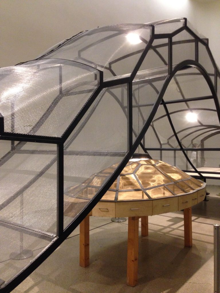
Huang Yong Ping, Theater of the World (1993). Photo by Sarah Cascone.
Theater of the World was supposed to include live animals—it was conceived as a caged sculpture full of live insects, amphibians, and reptiles. Throughout the show, nature was meant to run its course, some animals fighting, others serving as food. I’m certainly wholeheartedly against animal cruelty, but I remain unconvinced that the animals would have suffered any more than your average caged pet being fed live crickets and bugs.
But when PETA got wind of it, along with two other animal-related works meant to be in the show, they called for its removal from the exhibition, and a Change.org petition denouncing the artworks received over 800,000 signatures. The Guggenheim folded under the pressure, and the Theater of the World went on view without the animals.
By the time I saw the show in early January, shortly before it closed, all I could see in the work was an empty cage: a symbol of censorship, political correctness, and the reactionary nature of online outrage. It was an ugly reminder of the growing number of museum controversies, and the sense of entitlement I see in the more extreme advocates of trigger warnings. It’s not the artist’s fault, but when I think about Theater of the World, I think of the evils of censorship, and how they are threatening the art world on an increasing basis.
—Sarah Cascone
Banksy, Love Is in the Bin (2018)
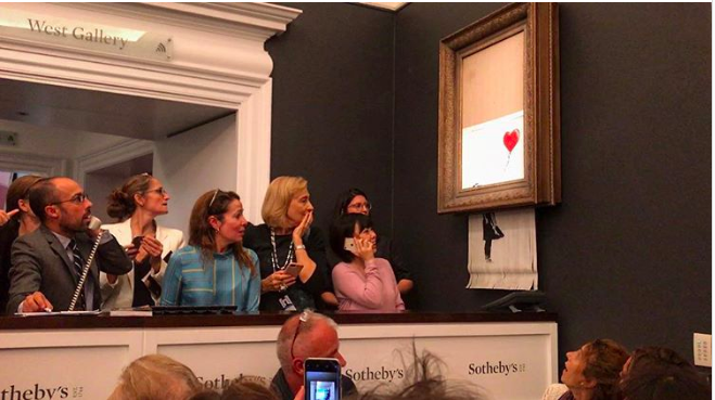
Surprised onlookers react as Banksy’s Girl With a Balloon self-destructs at Sotheby’s.
—Henri Neuendorf
Marina Abramović, 5 Stages of Maya Dance (2018)
Marina Abramović, 5 Stages of Maya Dance (2018), at Masterpiece London.
—Javier Pes
Follow artnet News on Facebook:
Want to stay ahead of the art world? Subscribe to our newsletter to get the breaking news, eye-opening interviews, and incisive critical takes that drive the conversation forward.
Share
Article topics
No comments:
Post a Comment