ESSAYS
Filling in the Blanks: A Prehistory of the Adult Coloring Craze
Its dizzy heights may have passed, but the fad for adult coloring books is far from over. Many trace the origins of such publications to a wave of satirical colouring books published in the 1960s, but as Melissa N. Morris and Zach Carmichael explore, the existence of such books, and the urge to colour the printed image, goes back centuries.
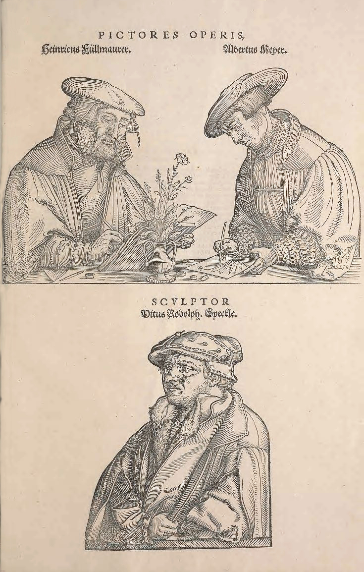
For many publishers around the world 2015 was, fiscally speaking, an excellent year — a welcome boost in an otherwise uncertain decade. But this upturn had a perhaps surprising source: coloring books for grown-ups. What strange winds conspired to suddenly urge adults in their droves to take up colored pencils again? Whatever the reasons, sales rocketed: Nielsen logged sales of 12 million for the category in 2015, up from a measly 1 million the year before. In February 2016, with the craze still going strong, New York Academy of Medicine Library gave birth to a new initiative called Color Our Collections Week, a scholarly take on the coloring trend. Now in its third year, the campaign sees, on the first week of February, archives, special collections, and libraries take to social media with individual images and even entire books compiled from their holdings for the public to color. While these chosen works are all in the public domain, and so can technically include (in the US at least) works published up until 1924, the images in these coloring books more typically hail from the fifteenth through eighteenth centuries. And it is in these images — published in the centuries prior to the advent of color printing — that we can see a precedent for this seemingly modern fad. While it may seem like simply jumping on the adult coloring bandwagon, Color Our Collections Week, with its naturally historical focus, is actually tapping into (and shedding light on) a tradition much older.
Last year, the New York Academy of Medicine Library chose an image from Leonhart Fuchs’ monumental 1542 botanical work, De historia stirpium commentarii insignes (“Notable Commentaries on the History of Plants”), to promote the event. An archivist from the History of Science Collections at the University of Oklahoma chimed in on Twitter to say their own copy of this book had already been colored in.
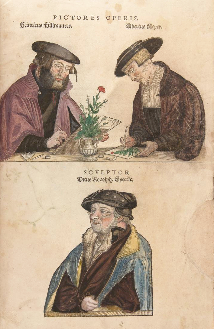
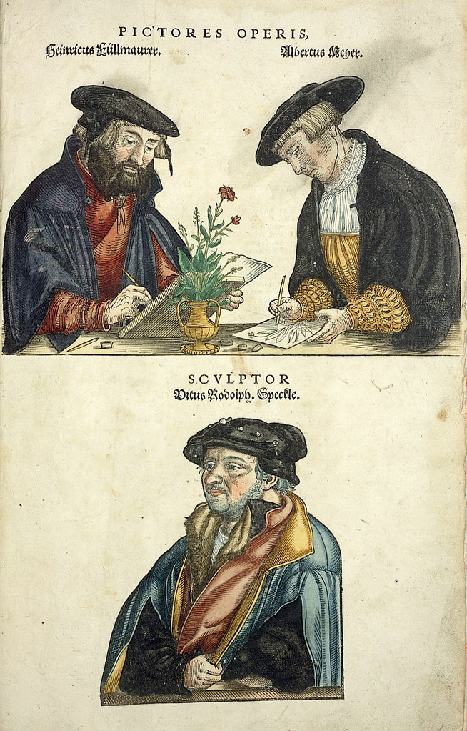
Should we be surprised by this? Color Our Collections Week might give the impression that these images, from the era before colored printing, are at last being colored — rescued from their hitherto drab monochrome existence. Yet printed images from the early modern period were regularly colored by hand.
The practice goes back to the earliest days of print in the fifteenth century. Artists, printers, booksellers, consumers, and readers all applied color to originally black-and-white images. Before Gutenberg’s innovation of the moveable-type press, both woodblock and engraved prints, single sheets with printed images, were popular in Germany and parts of Central Europe. They were used in various ways, and many people did what we might do with them — hung them on the walls of their home.
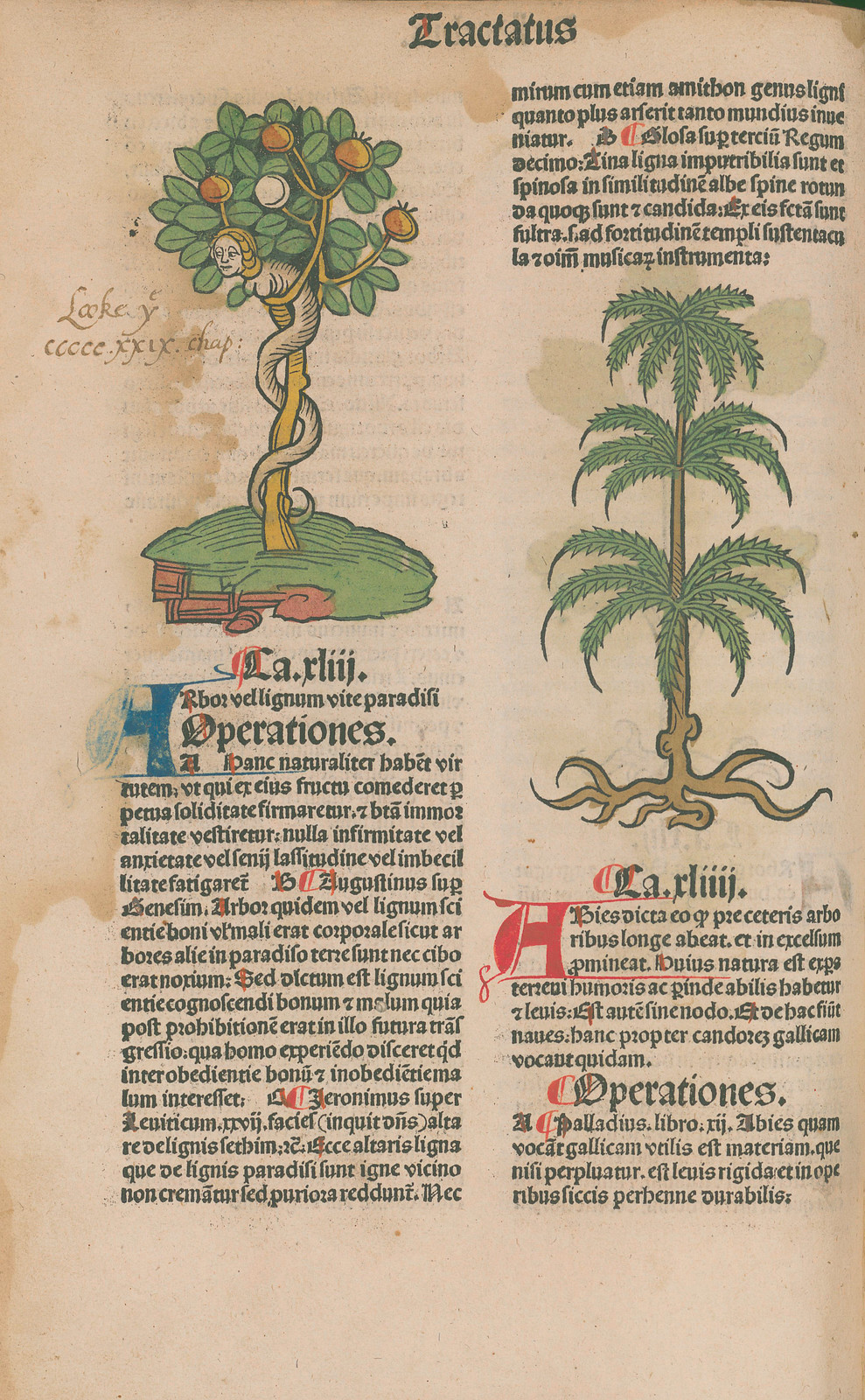
With the emergence of the printed book the coloring trend continued. Colored illustrations were common in medieval manuscript books, most notably in the intricately illuminated manuscripts produced by monastic institutions. The early printed books from the fifteenth century and after often imitated the textual design and illustrations of these medieval manuscript books. Indeed, illuminated manuscripts and printed books were not mutually exclusive: some printed books contain illumination, while some manuscripts have painted prints pasted into them. It would seem that at least some early printers and readers attempted to create color illustrations for these works the only way they knew how: by coloring the pictures themselves.
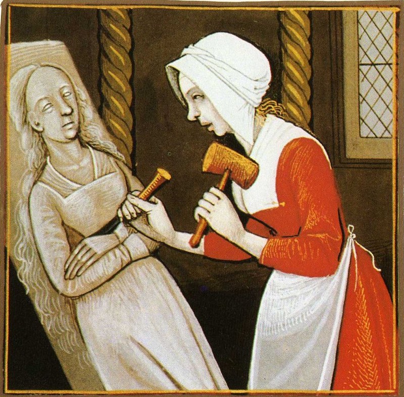
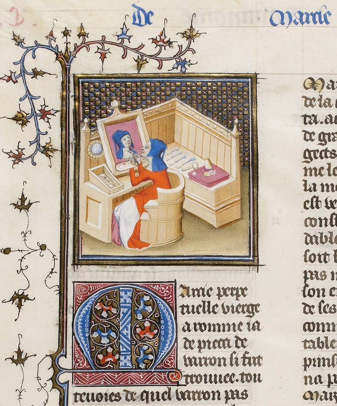
The images below further demonstrate this transition from medieval to early modern book production, and the role colored illustrations played. Both are from De Claris Mulieribus, a fourteenth-century book by Giovanni Boccaccio (author of the Decameron). This work was a compilation of biographies of women, real and mythical, famous and infamous. It was first circulated as a manuscript, and surviving examples are richly illustrated with images of the women they discuss. The book was among the first to make the leap from manuscript to print, and the illustrations came with it. In order to recreate the feel of previous versions of the work, it needed colored illustrations. The images below are, fittingly enough, of the painter and sculptor (and apparently prolific creator of self-portraits) Iaia of Cyzicus (also known as Marcia). The first two are from manuscript versions of the work, showing Marcia sculpting and painting.
These next two are from printed editions of the work. The Latin edition has some illumination of the letters, while the German book’s image is fully colored.
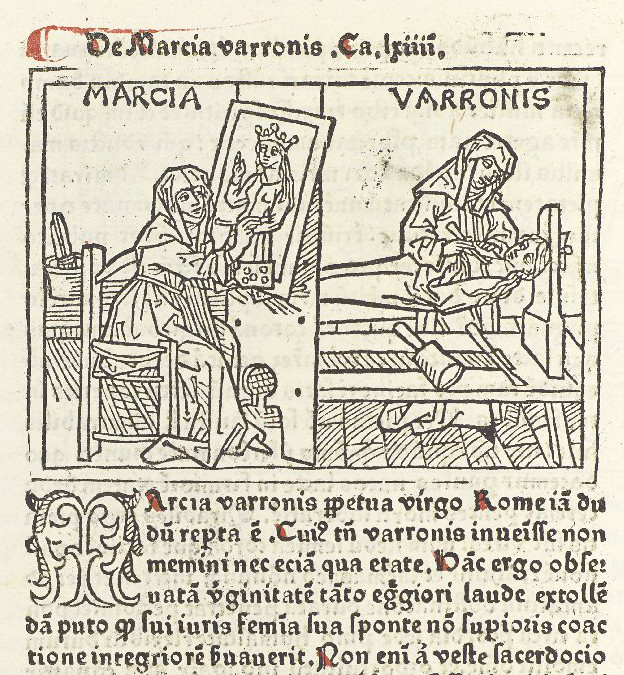
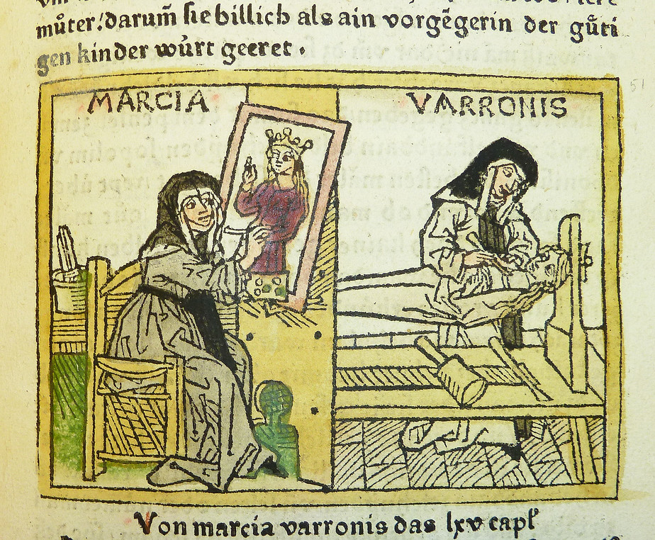
Most illustrations found in books from the early days of print are in the form of woodcuts and etchings. Woodcuts were most compatible with moveable type because both used relief printing, and early printers could easily print a page with both text and illustrations.
Because of the carving and printing process, woodcuts have simpler designs with less shading. They therefore make for excellent coloring pages, and Color Our Collections participants frequently choose woodcuts for their images. Moreover, art historian Susan Dackerman argues that they were meant to be colored. Many of these color prints were created in a workshop setting, with an engraver, printer, and colorist working together. The “vast majority” of surviving fifteenth-century woodcuts are hand colored, and they were produced in the tens of thousands in the fifteenth century.1
Some images, like this fifteenth-century German woodcut of Christ on the cross, are only complete once colored. In this case, angels hold cups to catch blood that needs to be added with paint. The National Gallery of Art owns a number of examples of this woodcut, each differently colored. Some have been left uncolored, and a couple have only the requisite blood added to complete the image. Among those more fully colored, we can see that quite a bit of artistic license was taken.

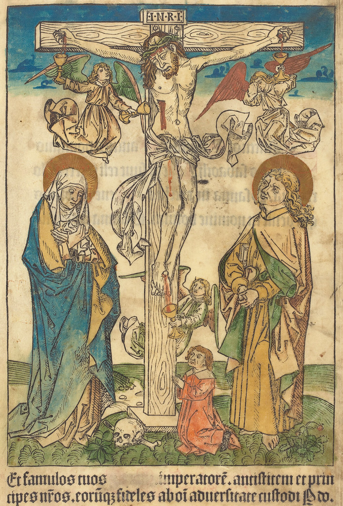

According to Dackerman, twentieth-century art historians and collectors denigrated color, seeing it as nothing more than a way to hide the flaws of poorly-executed engravings and woodcuts. Well-executed prints, they argued, needed no color at all. This disdain for colored prints helped to obscure their place in art history. This line of argument harkened back to the debates that emerged during the Italian Renaissance over whether design or color were most important (disegno/colore).
In many of these images, the paint seems hastily applied. This haphazard coloring was often a result of the artist having many prints to paint rather than a lack of skill. Artists applied paint freehand, using a brush, but they sometimes employed stencils made from extra impressions of the images in order to paint more quickly.
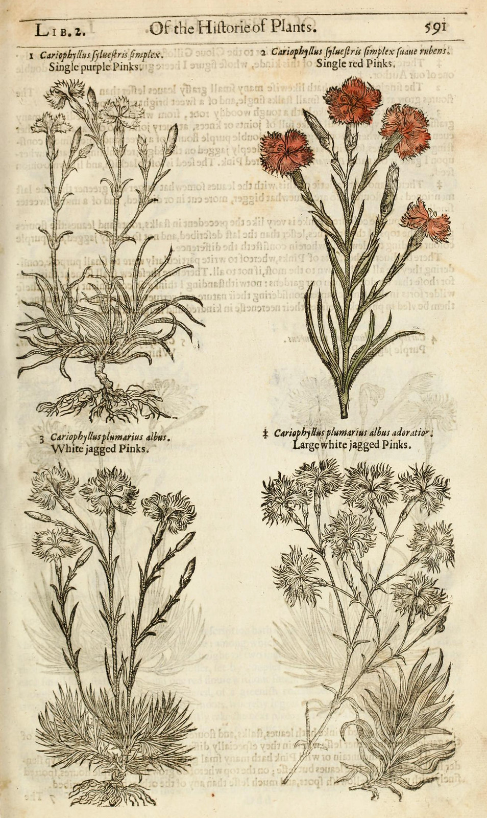
Many works were colored not by professionals, but by readers. A lot of the examples we have found of hand-colored illustrations come from botanical works and herbals. For example, a copy of John Gerard’s Herball (1636), with selective images colored in, suggests it was the reader who painted it, perhaps as a way to record plants he or she had seen in person. Botany and painting were favored pursuits of genteel men and women in this period, so it’s not surprising that the same people would share both hobbies.
While publishers may have informally expected these monochrome images to be colored by some readers, it wasn’t until the eighteenth century that the practice was formalised in the first purpose-made coloring books. And in these the link between botany and painting persisted. Robert Sayer’s The Florist, published in London in 1760, was one of the first books where the author explicitly intended readers to color in the images. Comprised of pictures of various flowers, the author gives his (presumably) adult readers detailed instructions for paint mixing and color choice (including the delightful sounding “gall-stone brown”).
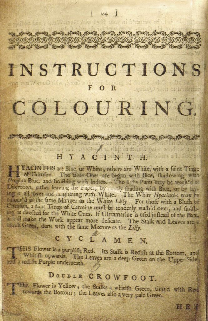
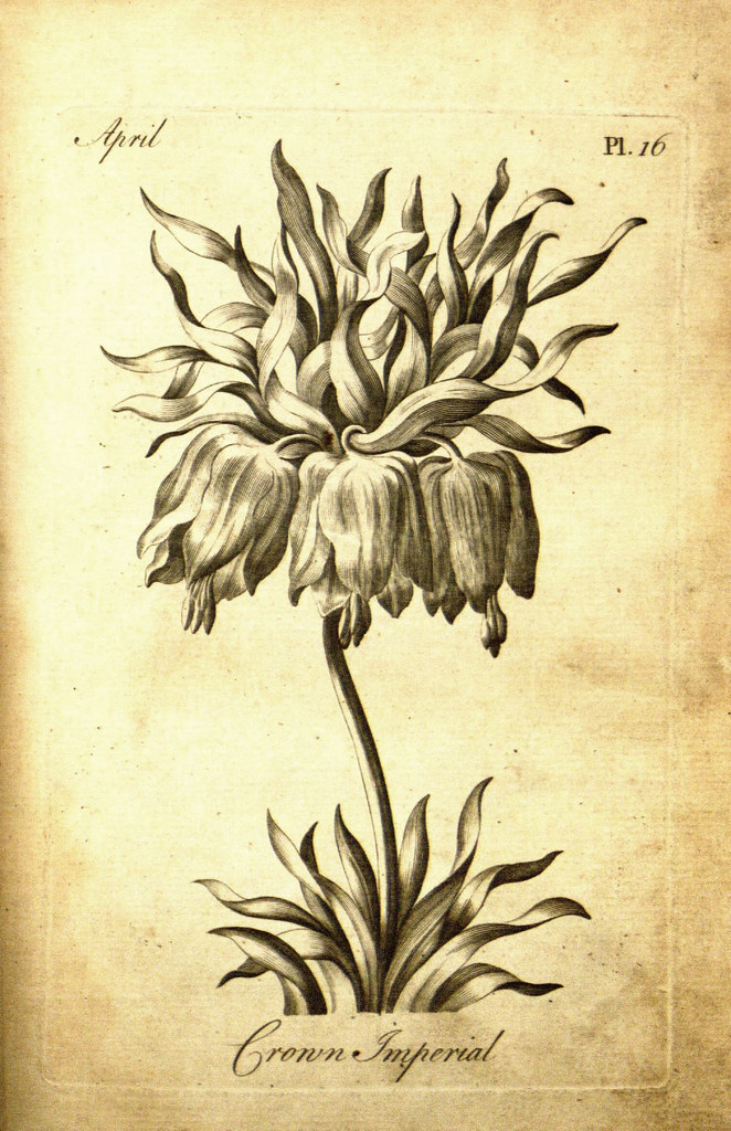
Botanical works were particularly suitable for readers who wanted to engage directly with a physical book, because they offered images of things that could be observed in the natural world. Although the images in this particular copy of The Florist were left uncolored, the owner used the book to press actual plants. Many botanical works were heavily annotated, sometimes by several different owners, and pressed plants are often found in their pages.
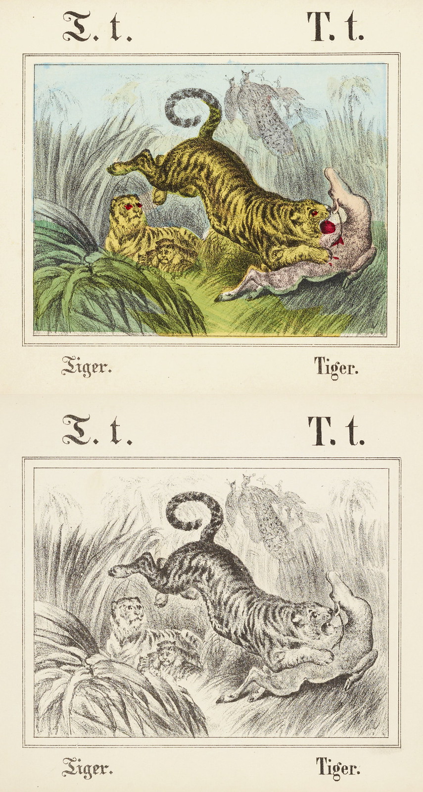
The Florist was produced “for the use & amusement of Gentlemen and Ladies”, but most subsequent coloring books were created with children in mind. By the nineteenth century, these books became increasingly popular. Although they helped children develop artistic skills, creativity was not particularly prized. In The Young Artist’s Coloring Guide, a series published in the 1850s, a fully-colored version accompanied the uncolored image, ostensibly to imitate.
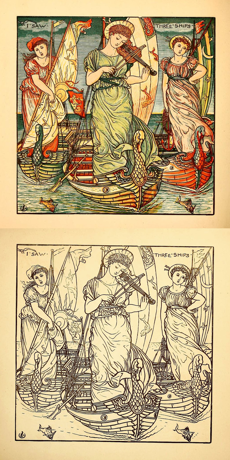
In Walter Crane’s Painting Book, originally published in 1880, there’s also color companions to copy, though one could argue in this case, they being from the hand of one of the nineteenth century’s greatest illustrators, such an approach made for a significantly more beautiful object and one likely enjoyed by adults as well as children.
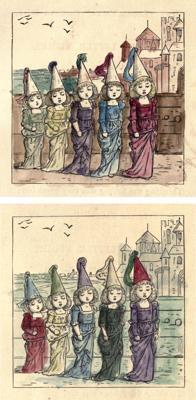
Crane wasn’t the only noted illustrator of the time to lend his name to such a book. A year earlier came The “Little Folks” Painting Book, published by the McLoughlin Brothers, with illustrations by noted artist Kate Greenaway. With no accompanying colored example to copy it was a bit less didactic than Crane’s but it still cautioned children to use a “fitting choice of colours”, and there was a pre-colored frontispiece which would have acted as a guide of sorts to the color scheme.
Of course, in the case of these Victorian examples, and earlier offerings such as The Florist, the coloring-in is the very raison d’etre of the book. The early modern examples less so. Though that’s not to say a similar enjoyment was not taken by early modern readers wanting to colorize their wooducts or etchings, that same thrill of bringing color to what was once blank. It seems the therapeutic effects were not unnoticed at the time either. In his 1622 work The Compleat GentlemanHenry Peacham, in a chapter encouraging the practice of coloring-in printed maps, talks of how “the practise of the hand, doth speedily instruct the mind, and strongly confirme the memorie beyond any thing else.”2
As for the modern trend in adult coloring books, critics have charged marker-wielding grown-ups with being childish, and have alleged that the success of these books is a product of a dumbed-down culture. It may indeed be a fad, but it also has a longer history. So, the next time you buy an adult coloring book or get excited about Color Our Collections Week, know that you are not being childish. Rather, you are taking part in a long tradition of printed images that were meant to be colored.
Melissa N. Morris is an Assistant Professor of History at the University of Wyoming. She has a PhD in History from Columbia University, where she wrote a dissertation on how plants mediated relationships between Europeans and Indigenous peoples in the seventeenth century Americas. On Twitter here.
Zach Carmichael is Local History and Genealogy Specialist II at the Carnegie Library, Muncie, IN. He has an MA in history from Miami University (OH), where he studied colonial New England taverns, and an MLIS from the University of Pittsburgh, where he specialized in archives. On Twitter here.
1. Susan Dackerman, Painted Prints: The Revelation of Color in Northern Renaissance and Baroque Engraving, Etchings, and Woodcuts (University Park, PA: The Pennsylvania State University Press, 2002), 10.
↩
2. Henry Peacham, Peacham’s Compleat gentleman, 1634., with an introduction by G.S. Gordon (Oxford: Clarendon Press, 1906), 65.↩
↩
2. Henry Peacham, Peacham’s Compleat gentleman, 1634., with an introduction by G.S. Gordon (Oxford: Clarendon Press, 1906), 65.↩
Public Domain Works
- The Florist (1760), by Robert Sayer.
- The Young Artist’s Coloring Guide. No. 12. (ca. 1850).
- The “Little Folks” Painting Book, (1811), with illustrations by Kate Greenaway.
- Walter Crane’s Painting Book (1889) by Walter Crane and Edmund Evans.