Friday, February 2, 2018

Feminist Artists Reclaimed Futura


Visual Culture
How Feminist Artists Reclaimed Futura from New York’s Mad Men
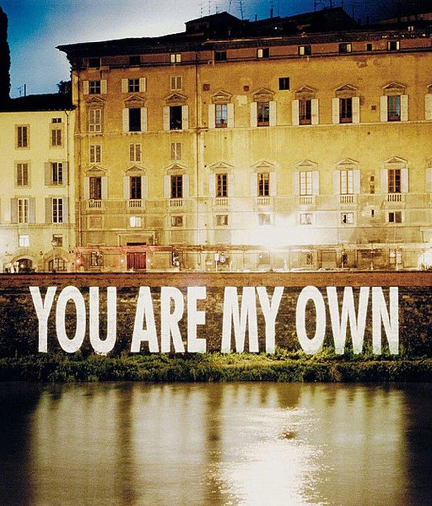
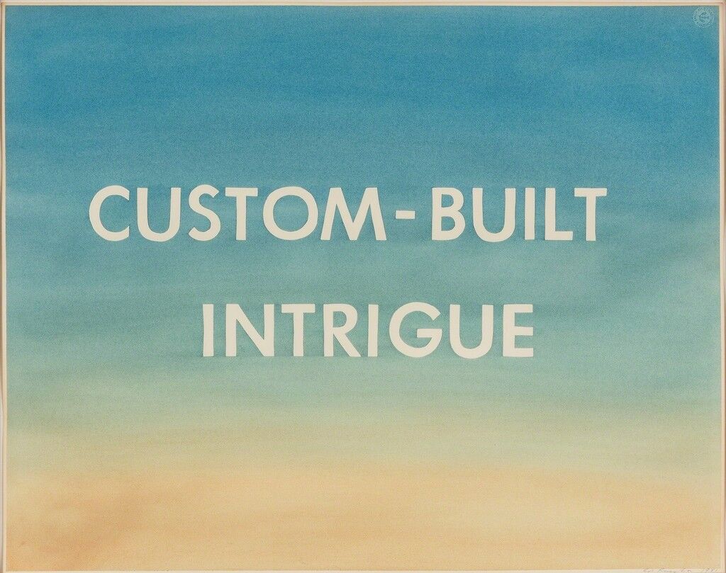
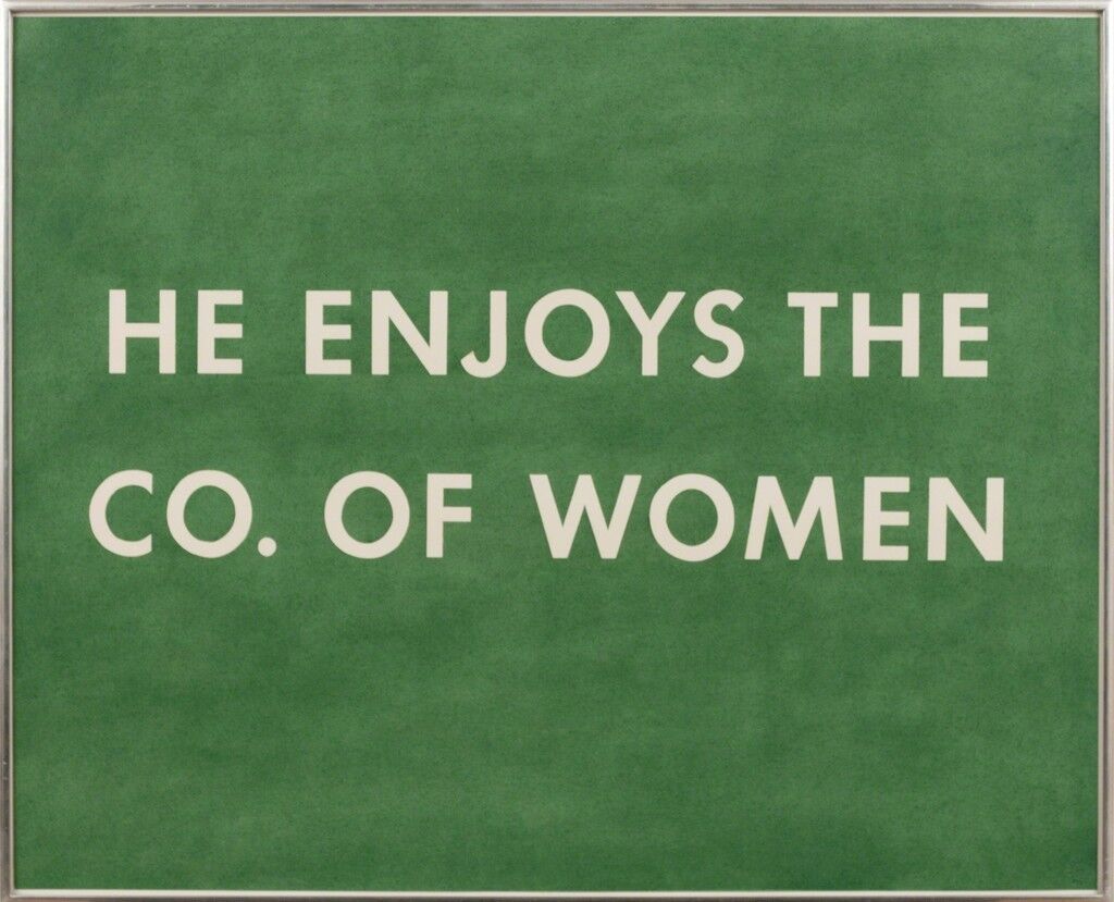
What do the Nazi Party, NASA, Wes Anderson, Forever 21, Louis Vuitton, Ed Ruscha, and Barbara Kruger have in common? All of them have favored the same font—Futura, the geometric sans-serif typeface designed in 1924 by German designer Paul Renner.
It was the first commercial font to combine the classical proportions of the letters on Roman monuments with the simple geometry of the circle, triangle, and square. “Renner wanted to design a typeface specifically for the industrial age, stripping away all ornament,” says Douglas Thomas, a designer, historian, and assistant professor of graphic design at Brigham Young University. “He was trying to answer many of the same questions as his contemporaries in the Bauhaus such as Josef Albers and Herbet Bayer, who also made experimental typefaces based on geometry.”
Several years ago, Thomas began to wonder: Why had Helvetica—another trusty sans-serif—landed in the spotlight, while the cultural impact of Futura remained largely unexamined? Futura, he notes, was more historically popular, more closely linked with modernism, and, in the eyes of many, a more beautiful alphabet.
So Thomas decided it was time to give the font its due. His forthcoming book, Never Use Futura, is titled after a frequent graphic design school admonition. Students are instructed to avoid the typeface, in order to keep their work from seeming derivative or cliché. But, charmed by its perfectly circular O and dagger-sharp M, many of them go on to use it anyway.
On the surface, it seems strange that a typeface as heavy with historical baggage and as widely used as Futura is still irresistible to designers. More than 90 years after its creation, it is a fixture of Western visual culture—appearing everywhere from book covers to butter wrappers to BEWARE OF DOG signs.
Courtesy of Never Use Futura.
Courtesy of Nike.
Courtesy of Nike.
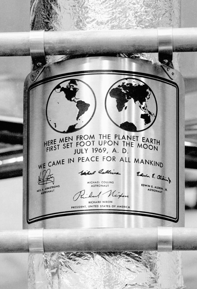
Futura is the Forrest Gump of typefaces, a silent witness to an improbable number of the 20th century’s greatest triumphs and most terrible foibles. It appears on a military order announcing the internment of Japanese-American citizens during World War II and a Nazi labor permit dated 1943; decades later, the first men on the moon deposited a plaque that proclaimed, in all-caps Futura, “WE CAME IN PEACE FOR ALL MANKIND.”
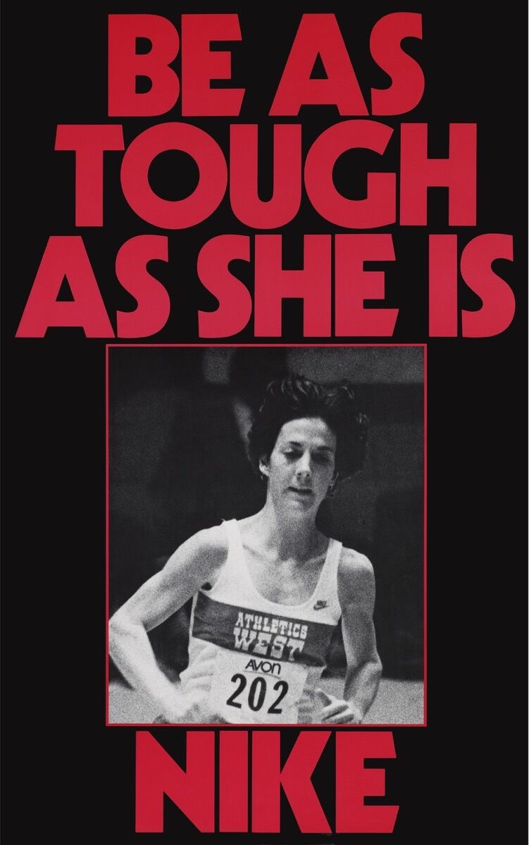
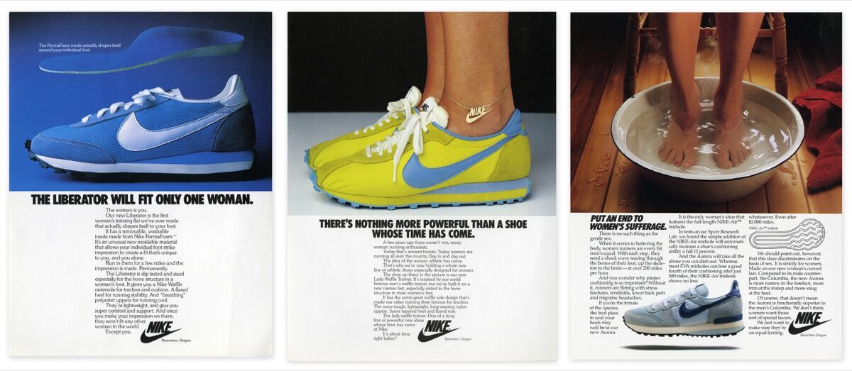
By the late 1980s and early ‘90s, Futura had become so ubiquitous—particularly in advertising and corporate identity—that a group of fed-up art directors took out a full-page ad calling for the industry to boycott Futura Extra Bold Condensed. They labeled it “the most overused typeface in advertising history.” (Nike and Absolut Vodka were a few of the biggest offenders.)
Courtesy of Nike.
Courtesy of Nike.
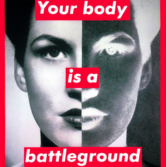
This oversaturation in the commercial sphere, says Thomas, made it a perfect tool for artists criticizing runaway capitalism. “Futura is the lingua franca of 20th-century advertising,” he explains. “So if you’re trying to critique commercialism, what better than to use the same visual language as the advertisers themselves?” Women artists were particularly adept at using the tools of advertising (including their typefaces) to critique its structures. “I think it’s a helpful corrective,” Thomas continues. “If you think of 1950s ‘Mad men’ using Futura to target women in a stereotypical housewife mold, I think it’s very significant that in the 1980s and ’90s, Barbara Kruger, Jenny Holzer, and the Guerrilla Girls were turning these typographic messages back on advertisers.”
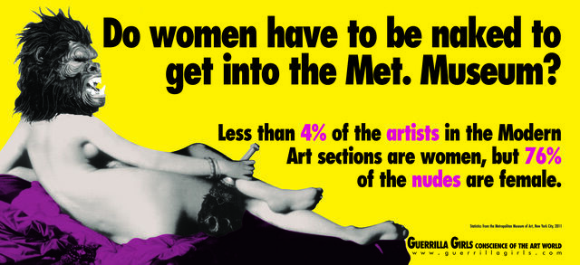
The Guerrilla Girls did this explicitly by creating posters with headlines like “When Racism & Sexism Are No Longer Fashionable, What Will Your Art Collection Be Worth?” and “Do women have to be naked to get Into the Met Museum?” (both from 1989). Using a potent mix of humor, statistics, and Futura Bold Extra Condensed, the Guerrilla Girls aimed for a wide audience. Like advertising, their work was mass-market, provocative, and ultimately disposable.
Kruger is less thorough in her embrace of advertising techniques than the Guerrilla Girls, but no less forceful in her feminist and anti-capitalist critiques. Once a graphic designer at Condé Nast, she is well-versed in the visual language of print advertising. Her short messages (“I shop therefore I am”; “We don’t need another hero”) suit the slickness of Futura Bold Oblique, and can initially be mistaken for cheeky ad copy. Her signature visual style, adopted in the early 1980s, situates white text inside a red box overlaying close-cropped, black-and-white photographs of women. By borrowing the visual tropes of advertising, then subverting them, Kruger draws our attention to both the tools and the underlying messages of consumerism.
“Kruger’s use of language is sharp and astute, but what if she’d used Times New Roman or Comic Sans instead?” says Thomas. “Her work would still be witty, but it wouldn’t have that same punch. It wouldn’t immediately tie back to the original advertisements by using the typeface of so many mass consumer brands. By using Futura, she makes that connection clearer and the criticism all the more pointed.”
In the end, it seems that Kruger was right to ignore that design-school maxim: “Never use Futura.”

Ariela Gittlen

Thursday, February 1, 2018

Hipster Culture and Instagram Are Responsible for a Good Thing


Hipster Culture and Instagram Are Responsible for a Good Thing

Image
Colossal Media painters working on a Spotify mural in SoHo.CreditGeorge Etheredge for The New York Times
Some punk kids have no dreams at all. Paul Lindahl was a skater and a drummer in a band when he found himself dreaming of painting advertisements. “There was a paint production company in Portland, Oregon,” he said. “I was like, oh my God, that’s amazing. Big-format murals, I want to do that.”
Before the advent of low-cost vinyl plotters, large-format hand-painted murals were the norm for advertisements in cities across America. Mural painting was a trade passed on through a system of informal apprenticeship, much like plumbing or tattooing. By the mid-1990s, when Mr. Lindahl started dreaming, opportunities for new painters were few and far between. Hand-painted ads had become a niche product, an expensive last resort in landmark districts with strict signage laws.
Image
Paul Lindahl, a founder of Colossal Media, at the new Colossal warehouse.CreditGeorge Etheredge for The New York Times
Mr. Lindahl got a job and worked his way up at a local paint production company, sometimes making stencils in 30-hour-long shifts. “I eventually got canned from there because I was out doing graffiti, got arrested, couldn’t come to work or whatever,” he said. He moved around, repeating this pattern at the last remaining hand-paint companies in San Francisco and Los Angeles. “I thought, let me just try out all these different cities, chase the tail of the dragon of this thing that’s dying,” he said.
ADVERTISEMENT
Like many others who are chronically unemployable, Mr. Lindahl eventually went into business for himself. He founded Colossal in 2004, from a one-car garage in the Park Slope section of Brooklyn, with his friends Adrian Moeller and Patrick Elasik, the founders of the graffiti magazine Mass Appeal. (Mr. Elasik died in 2005.) The slogan was “Always Handpaint.” By then, even vinyl plotters had been replaced by affordable digital printing.
Image
The paint mixing room at the new Colossal warehouse.CreditGeorge Etheredge for The New York Times
“As we got into it, we realized nobody wanted it. It was archaic. It was untrustworthy,” Mr. Lindahl said. “Up until that point, the quality had just nose-dived because people were trying to get to the dollar.”
Some of Colossal’s earliest murals were for video games and alcoholic drinks — products that profit from a grittier aesthetic. It took a few years for Colossal’s hand-painting to re-earn the trust of more conservative brands. Mr. Lindahl attributes his eventual success to meticulous quality but also coincidence. The nascent hipster culture of the mid-2000s favored D.I.Y. and “homegrown stuff.” Its consumers associated obsolescence with authenticity, reviving bygone trades like butchering, woodworking and, yes, hand-painting.
You have 4 free articles remaining.
Subscribe to The Times
On newly influential social media platforms, corporate brands increasingly sought to associate their products with meaningful experiences. Colossal’s murals fostered on-the-street engagement, which often spilled over to the Instagram page. Today, the brand is no longer tied to that Bushwick warehouse aesthetic. Recent clients include Adidas, Coca-Cola and the Gagosian Gallery.
Image
Paint blotches dot a print in the paint mixing room.CreditGeorge Etheredge for The New York Times
Image
An employee at the Colossal warehouse works on mimicking the color of a print that will be turned into a mural in SoHo.CreditGeorge Etheredge for The New York Times
“We’re doing work with Gucci, Yves Saint Laurent — fashion brands that I can’t even say, because they’re French companies, or whatever,” Mr. Lindahl said. “They get the value. It’s more than just this flashing ad, forcing information down your face. People that like what we do stop and choose to enjoy it.”
Colossal Media may be the world’s largest hand-paint-only advertisement company, leasing 120 walls across America. Twenty of those are in Manhattan, and 68 are in Brooklyn. Many of these walls are at sidewalk level. Others, like the wall at 305 Canal Street, are several stories above the street.
On a recent Tuesday, around dawn, Colossal’s team of “wall dogs” rode out to SoHo to prep the Canal Street space for a Spotify mural that would feature an image of Kendrick Lamar. Six stories up, on a 28-inch-wide plank, they transferred the outline of his 12-foot face, using handmade stencils and bags of charcoal dust. The mural would take five days to complete, and require 13 different shades of paint. It cost Spotify twice as much as a vinyl billboard.
ADVERTISEMENT
“Hanging off the side of a building and painting somebody’s advertisements just doesn’t add up,” said Jason Coatney, one of Colossal’s 27 wall dogs. “It’s more expensive. It’s more dangerous. It’s time-consuming.”
Image
The Colossal crew sets up the rig for a Spotify mural in SoHo.CreditGeorge Etheredge for The New York Times
Like other novelties of the post-hipster age, the source of the value is not just the finished work, but also the tedious and rarefied conditions of its production. The spectacle of painters hanging from a wall is as much Colossal’s product as the murals themselves. Colossal offers time-lapse footage and photos for clients to share on social channels.
In a way this makes wall dogs part of a live show. While studio painters can step back and check their work, wall dogs paint close up at a large scale. A few wrong strokes can quickly send a mural off into the realm of the uncanny valley. “Kendrick Lamar’s face isn’t like anybody else’s face, but it’s similar,” said Mr. Coatney, painting high above Canal Street. “You start with the big similarities, and then you make it him.”
Mr. Coatney helps run Colossal’s training program, a formalized version of the apprenticeships that preserved hand-paint knowledge for the last hundred years. His apprentice on the Spotify mural was Will Krieg, 24, whose father also works as a sign painter, in Colorado.
“Half our crew has an art history background,” Mr. Coatney said. “You know, they went to art school and have a degree. And then the other half has no traditional art experience, and they came in really raw with a lot of drive.”
Mr. Lindahl describes his staff as mostly “punk kids” and “misfits.” They range in age from 21 to 67 and are almost exclusively male. This gender imbalance reflects a broader imbalance in physical, hands-on trades in general.
ADVERTISEMENT
"If you’ve got the heart, if you’ve got the persistence, if you’ve got the desire — and you’ve got some life experience that supports that — we can make a wall dog out of you,” Mr. Lindahl said.
Image
The outline for the Spotify mural.CreditGeorge Etheredge for The New York Times
Image
Jason Coatney works on the Spotify mural.CreditGeorge Etheredge for The New York Times
Image
CreditGeorge Etheredge for The New York Times
Mr. Lindahl recognizes the sellout-ish nature of a bunch of punks painting advertisements, but he’s proud to offer a conventional path for artists who may otherwise contend with instability. He says the average wall dog makes $80,000 per year, with health insurance and a 401(k).
To him, these are better terms than working in the studio of a contemporary artist like Jeff Koons. “They’ll get 60 artists because there’s a show coming up. Then the show passes, and everybody’s fired,” he said. “Here, if you come in the door, we’re not a steppingstone. The hope is that you spend your entire career with us.”
Five days later, from down on the street, the face of Kendrick Lamar looked so precise that nobody would have guessed it was painted by hand. Then one person stopped to take a photo, and others began to look skyward and do the same. The mural was scheduled to stay up for a month. By the end of January, it was all painted over with white.
“Some of the really old walls, if you took a big chip off, there would be, like, a quarter-inch of years and years of corporations trying to sell you stuff,” Mr. Coatney said.
This cycle may seem bleak, but for Mr. Coatney ephemerality is another day at work. “I don’t feel sad, because when I see that happening I know that it’s putting food on a bunch of people’s tables,” he said. “If they’re just sitting there dormant, it means we’re not doing something right. They’re not meant to last forever. It’s just paint.”


Image
The finished Spotify mural.CreditGeorge Etheredge for The New York Times