EXHIBITIONS
"Your Silence Will Not Protect You": 8 Reasons to See Barbara Kruger at Mary Boone Gallery

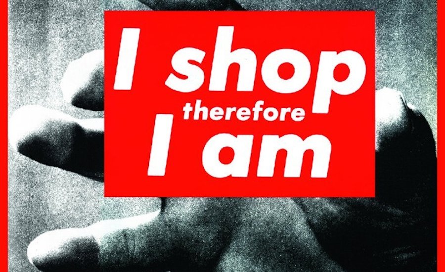
Though Thanksgiving weekend is about spending time with family, it's also about shopping. If you're looking to avoid anxiety-induced over-spending, spend Black Friday and Cyber Monday seeing art instead. "1978," the Barbara Krugerexhibition at Mary Boone Gallery in New York, is a great place to start—considering that her decades-long career has been devoted to subverting consumerism and advertising.
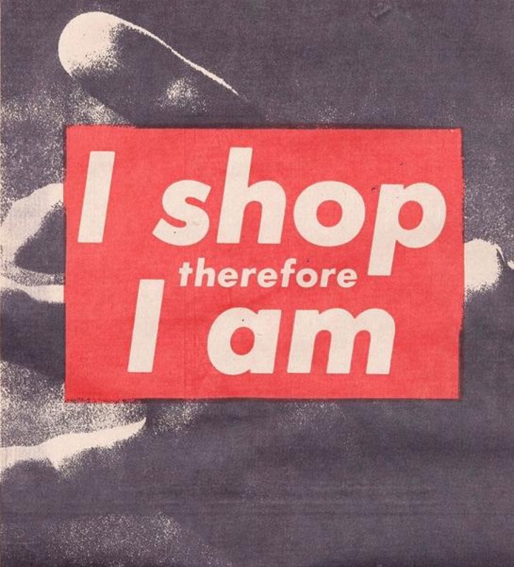
Most people know Kruger for her eponymous black-and-white photographs with white-on-red text boxes over them, a look very famously ripped off by hype-beast brand Supreme. These collage works were made in the early eighties, but Kruger had been working for roughly two decades prior to that, first as a graphic designer, then as an artist. The works in Mary Boone are all pulled from the year 1978, foregrounding Kruger's early experiments with found images and text. The show is a good way of contextualizing Kruger's oeuvre, and, because it's Kruger, the works are also just good. Below are eight reasons to check out the show, starting with some facts about the artist in general, and ending with some highlights of the exhibition itself.
1. Like Andy Warhol, Kruger was very much influenced by her years working as a graphic designer.
Kruger left Parsons in 1966 to work at Mademoiselle magazine as an entry-level designer; she was promoted to head designer a year later. For the next decade, Kruger and would do graphic design for prominent publications including Aperture.
Kruger left Parsons in 1966 to work at Mademoiselle magazine as an entry-level designer; she was promoted to head designer a year later. For the next decade, Kruger and would do graphic design for prominent publications including Aperture.
 Untitled (You've got money to burn) by Barbara Kruger, 1987. Image via Pinterest
2. In the early eighties, Kruger began making art with images pulled from advertising and print-media to comment on consumer culture.
In the late sixties, Kruger was part of the feminist recuperation of craft. Her earliest works, dated back to 1969, involved large wall hangings made of yarn, beads, sequins, and crochet. After becoming bored of this style, she took a break from art before returning with a newfound interest in photography, photographing “family homes that [her family] could never afford.” In the early '80s, she switched from photography to found photography, collaging images from advertising and magazines with accompanying text. As writer Jamie Keiles pointed out in the New Yorker, “This work paired scenes from banal consumer life with text that reframed the implied motives of her subjects. In one black-and-white work, from 1979, a woman reading Marie Claire appears beside the headline ‘deluded.’”
In the late sixties, Kruger was part of the feminist recuperation of craft. Her earliest works, dated back to 1969, involved large wall hangings made of yarn, beads, sequins, and crochet. After becoming bored of this style, she took a break from art before returning with a newfound interest in photography, photographing “family homes that [her family] could never afford.” In the early '80s, she switched from photography to found photography, collaging images from advertising and magazines with accompanying text. As writer Jamie Keiles pointed out in the New Yorker, “This work paired scenes from banal consumer life with text that reframed the implied motives of her subjects. In one black-and-white work, from 1979, a woman reading Marie Claire appears beside the headline ‘deluded.’”
3. Kruger’s work made the Futura font famous!
In 1981, her art was featured alongside work by Jean-Michel Basquiat and Jenny Holzer in a group show called “Public Address.” There, she debuted what would become her signature style: white Futura Texta font in red boxes over black-and-white photography. If aesthetic reminds you of the Supreme logo… it should. As Keiles points out, “In 1994, the downtown streetwear brand Supreme cribbed Kruger’s red-and-white Futura for its logo—teasing the boundary between homage, parody, and theft.”
4. Kruger changed the way we think of “text art."
While text artists like Ed Ruscha became famous for adding words to paintings, Kruger sought to create what Mary Boone Gallery calls a “total environment of words and images.” For her 1991 show at the gallery, Kruger covered the floors, ceilings, and walls with imagery. By taking text off the page and turning it into a three-dimensional space, Kruger reflects our total saturation in media and “the discourse,” an effect that has only been amplified in the Information Age.
 Untitled (Your body is a battleground) by Barbara Kruger, 1989. Image via The Broad.
5. Kruger’s art was informed by her feminist praxis
Most Kruger’s works––especially the ones featuring women’s bodies––had an explicitly feminist message. By adding text, she foregrounded the male gaze––reflecting it back to its viewer––and what women thought, felt, and said in response. Kruger often used the second person to implicate the viewer. For instance, a close-up of a woman pricking her finger with a safety-pin reads: “Thinking of You.” Some of Kruger’s works were even created to function within specific feminist movements: Untitled (Your Body Is a Battleground), for instance, was originally a pro-life poster for the 1989 Women’s March on Washington.
 Untitled (Thinking of You) by Barbara Kruger, 1990-2000. Image via the Whitney Museum of American Art.
6. The Mary Boone show is a rare look at Kruger’s early text works.
The exhibit is comprised of works from 1978. Suitably, the show is called "1978." These pieces show Kruger’s early experiments with text and image, which, unlike her later works, aren’t put within the same frame. Instead, they’re paired separately, in a style closer to comic book paneling. But despite this visual difference, Kruger’s deft shifts between psychological depth and obfuscation are still very much there.
 Untitled (Body) by Barbara Kruger, 1978. Image via Mary Boone Gallery
7. In the Untitled (Body) series, Kruger Plays with font size to tell multiple stories at once.
Each work in the Untitled (Body) series contains two groups of text: on the left, in smaller font, are short phrases stacked on top of each other, perhaps mimicking an internal narrative. On the right, italicized text in a larger font size implores some "you"––who is both not present but also is, because it is the viewer, "you"––against unwanted sexual advances.
Each work in the Untitled (Body) series contains two groups of text: on the left, in smaller font, are short phrases stacked on top of each other, perhaps mimicking an internal narrative. On the right, italicized text in a larger font size implores some "you"––who is both not present but also is, because it is the viewer, "you"––against unwanted sexual advances.
 Untitled (Cars), 1978 by Barbara Kruger. Image via Mary Boone.
8. Kruger's Untitled (Cars) series shows the kind of extended narrative arcs that, in her later works, the artist would condense into just a few words .
Untitled (Cars) is based on what Kruger (though also you) might imagine about people based on their cars: a pink rose on the dashboard, a half-eaten banana thrown on red leather interiors, everyone else's American Dreams blossoming and blowing up. The accompanying text, banged out on a typewriter, is about a paragraph of elliptical narrative: "He laughed when his mother bought the bushel of plastic flowers," begins one. "She picked out roses and tulips in four different colors and scattered them all through the house." Kruger is famous for using jingles and aphorisms. If these catchphrases reflect American consumerism, we can, as these early works show, also see them as hyper-condensed narratives, the mini-arcs of Untitled (Cars) compressed into a word or two.
Untitled (Cars) is based on what Kruger (though also you) might imagine about people based on their cars: a pink rose on the dashboard, a half-eaten banana thrown on red leather interiors, everyone else's American Dreams blossoming and blowing up. The accompanying text, banged out on a typewriter, is about a paragraph of elliptical narrative: "He laughed when his mother bought the bushel of plastic flowers," begins one. "She picked out roses and tulips in four different colors and scattered them all through the house." Kruger is famous for using jingles and aphorisms. If these catchphrases reflect American consumerism, we can, as these early works show, also see them as hyper-condensed narratives, the mini-arcs of Untitled (Cars) compressed into a word or two.
EXHIBITIONS
The Most Anticipated Solo Museum Exhibitions of 2019

As 2018 comes to an end, we're looking forward to a whole new round of museum exhibitions next year. Here are some of the solo exhibitions we're most exited to see, in chronological order beginning with the soonest to open.
"Laurie Simmons: Big Camera/Little Camera"
MCA Chicago, Illinois
February 23 – May 5
MCA Chicago, Illinois
February 23 – May 5
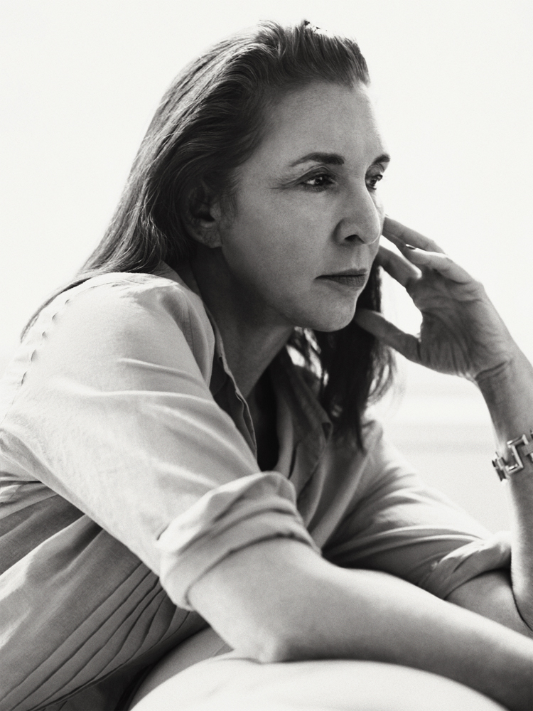
 Laurie Simmons. Image via Interview Magazine
"Laurie Simmons: Big Camera/Little Camera" is a major retrospective of the artists work, spanning more than four decades of photographs, in addition to three videos, two of which star the artist playing the character of an artist frustrated with her lack of recognition—ironic considering Laurie Simmons is recognized as one of the most important pioneers in feminist photography. Using dolls and props of varying scales, Simmons has been making fictional scenes from the ‘70s that comment on “the American dream of prosperity and feminine domesticity." The exhibition was originally organized by the Modern Art Museum of Fort Worth.
| Exhibition presents a photographic journey inspired by Simone de Beauvoir's diary 'America Day by Day' | ||
Coast to Coast, SONJ, 1947 @ Estate of Esther Bubley.
| ||
NEW YORK, NY.- Sous Les Etoiles Gallery is presenting «1947, Simone de Beauvoir in America» a photographic journey inspired by her diary «America Day by Day».
This exhibition curated by Corinne Tapia, director of Sous Les Etoiles Gallery, aims to illustrate the depiction of De Beauvoir’s encounter with America at the time. It is the first time that this book becomes the subject of an exhibition. In January of 1947, the French writer and intellectual, Simone de Beauvoir (1908–1986) landed in New York’s La Guardia Airport, beginning a four-month journey across America. She traveled from East to the West coast by trains, cars and even Greyhound buses. She has recounted her travels in her personal diary and recorded every experience with minute detail. De Beauvoir decorticates everything she sees, immersing herself in the New World. It is also most certainly a very photographic book. As you read it, you can easily imagine the footsteps of Simone de Beauvoir in places she discovers for the first time impressed by the American way of life that begins to take effect.” I wanted the viewer to be as close to her reality at that time, so most of the photographs exhibited are in the year of 1947”, said Corinne Tapia. This exhibition includes the photographs from Ansel Adams, Ferenc Berko, Henri Cartier-Bresson, Esther Bubley, Morris Engel, Louis Faurer, William Gottlieb, Sid Grossman, Martha Holmes, Sy Kattelson, Saul Leiter, Rebecca Lepkoff, Fred Lyon, Wayne Miller, Gjon Mili, Wayne Miller, Ruth Orkin, Arnold Roth, Art Shay, Fred Stein, Tony Vaccaro, Brett Weston, Ida Wyman, Max Yavno and Tobb Webb. | ||
| The First Art Newspaper on the Net | Established in 1996 | Portugal | Monday, December 24, 2018 |
| |||||||||||||||||||
 Founder: Ignacio Villarreal |
| Editor & Publisher: Jose Villarreal - Consultant: Ignacio Villarreal Jr. Art Director: Juan José Sepúlveda Rmz. |


No comments:
Post a Comment