
Opinion
How Art Helps Makes Sense of Donald Glover’s ‘This Is America’ Video & More Critical Thoughts on Culture
Plus, Tony Cokes turns tweets into art, and one very eerie paparazzi pic.
This week, I’m trying something different, taking a kind of cross-section of culture, looking at art in the galleries and as it pops up in wider media world.
The Evolution of “America”
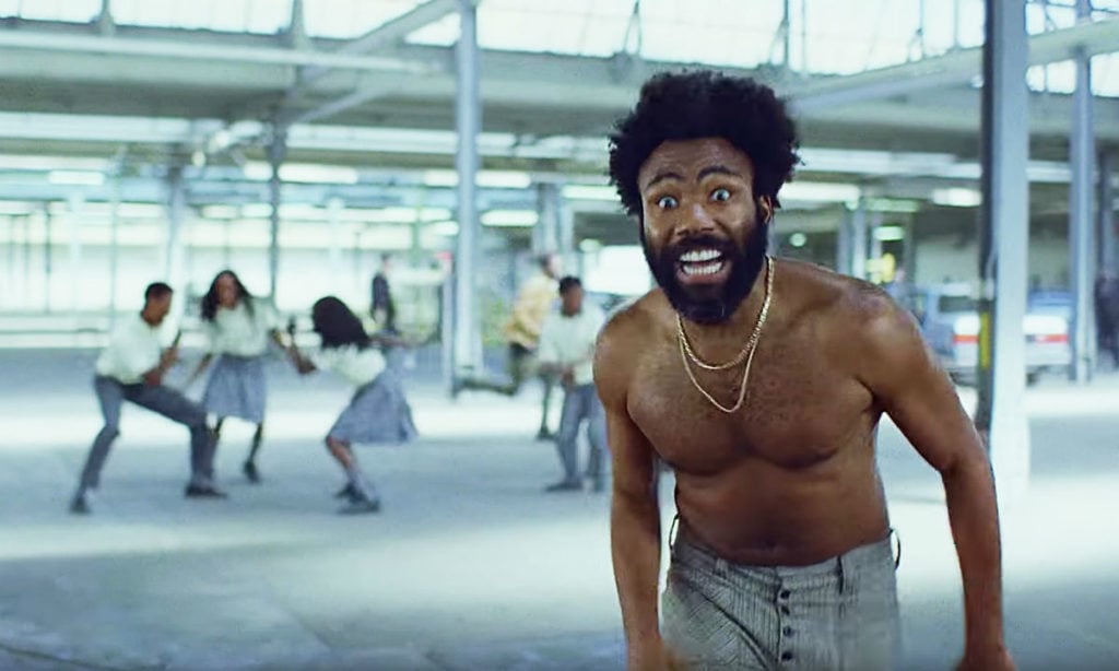
Childish Gambino/Donald Glover’s disconcerting and virtuosic “This Is America” video has sent the internet into a delirium of interpretation. Its YouTube view count stands, a week and change after release, north of 135 million. Thinking about the clip and reading the reactions, what strikes me about it is how much its densely packed enigmas both assume a climate of interpretation and withdraw from it.
Part of what is brilliant about Hiro Murai’s direction, with its whiplash tonal shifts and spellbinding long takes, is how much it manages to produce tableaux that feel urgently symbolic but deliberately can’t be reduced to a snap reading. It’s not a coincidence that Glover has simply demurred from explaining himself, saying, “I’ll just let it be.”
Thus, the cartoonishly extreme violence references murderous police and vigilante killings inflicted on black people—that’s clear enough—but it is Glover himself who is perpetrating it as an active agent. The dancing (choreographed by Sherrie Silver) invokes minstrelsy, but switches from its caricatured exaggerations to faithful riffs on a huge variety of contemporary black dance styles, including South Africa’s Gwara Gwara.
Does the horse and hooded rider shooting through the background evoke the Klan, or an escaped slave fleeing, or something more apocalyptic, “Death on a Pale Horse?”
Are the kids in the balcony with their phones documenting the violence below as activists, or consuming it as passive spectators locked into their screens?
The video ends with Glover fleeing a shadowy stampede of figures—but they are ambiguous and could represent the nightmare hordes of US racism or the frenzy of mindless fans out to consume him, a hybrid of A Hard Days Night and Get Out.
The clip’s conscious channelling of Jim Crow imagery combined with the “Looney Tunes logic” (as Murai puts it) of its violence make me think of Kara Walker‘s controversial cartoon cut-out fantasias of terrorizing racist imagery. These have historically provoked the same kind criticism that “This Is America” has caught, here and there, for not being clear enough about where it stands and for trivializing real atrocities.
But the artworks that most say something to me about the video are Glenn Ligon’s black-painted neons of the word AMERICA, one of which hangs currently in the lobby of the Whitney Museum. Indeed, “Glenn Ligon: America” was the name of his Whitney career retrospective a few years ago—though it’s more than just the word on its own that connects the dots between his work and “This Is America.”
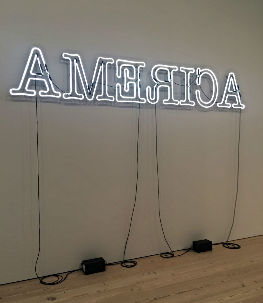
Glenn Ligon, Rückenfigur (2009). Image courtesy vl04 on Flickr.
Ligon thought of these works, which subtly scramble the letters or mute the light by turning the illuminated part into the wall, as conveying the sense of being stuck with contradictory, maybe incompatible senses of America. “The dichotomies between rich and poor, progress and going backwards seemed to be where we were at in America,” he explained of his work. “Those things going on at the same time seemed, to me, embodied in the word ‘America.’”
The flickering ambiguity in those neon works was very much a product of the Obama years. Ligon spoke very concretely about these neons as working through the simultaneity of promise alongside pain: “There is this sense that America, for all its dark deeds, is still this shining light. That’s how the piece came about, because I was thinking about Dickens’s ‘the best of times, the worst of times.’ Yes, that’s where America is.”
That was 2008. A decade later, in Glover/Gambino’s “This Is America,” America’s “dark deeds” are more present than ever, while the US as “shining light” is less certain in the age of Trump. America offers success—it’s hard to think of anyone who is amassing a more dizzying breadth of cultural credibility than Donald Glover right now—but that’s not exactly the same as promise that it might be redeemed, and the awareness that the same society that allows power and visibility also creates violence and exploitation seems all the more intense, inescapable, irreconcilable.
The Pleasures of “On Non-Visibility”
As one Twitter wag quipped, “Donald Glover’s ‘This is America’ song and video is our reward for surviving Kanye West’s week of white supremacy.” The Childish Gambino video dropped amid the fuss around Kanye’s seeming flirtation with the alt-right.
In a more recent media ruckus, Danish film auteur Lars von Trier has returned to his customary amoral provocateur role, launching the ultra-graphic The House That Jack Built at Cannes, a purported critique of Trump’s America that wallows in torture, and provoked a mass walkout.
It so happens that both West’s and von Trier’s public provocations feature as raw material for an art show by Tony Cokes (b. 1956) currently at Greene Naftali, titled “On Non-Visibility” (through June 9).
Cokes is a brainy and serious artist who teaches at Brown University. Working in a vein not totally removed from someone like Ligon, he characteristically examines public statements and images, extracting them from their usual context and often juxtaposing them with pop music in slideshows or videos to tease out new associations.
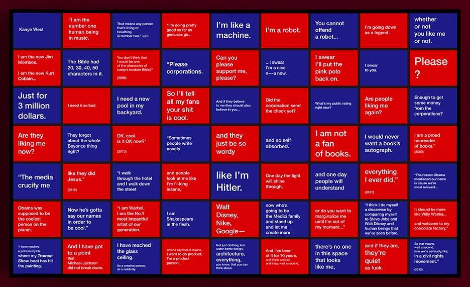
Tony Cokes, Face Value (Kanye West) (2018). Courtesy of the artist and Greene Naftali.
Two works in the show dwell on snippets from an interview with von Trier and a stream of tweets by West, respectively, organized into grids on a lightbox. Von Trier’s quote comes from a weird discourse where he flirts with Nazism (on Hitler: “he’s not what you call a good guy, but I sympathize with him a little bit”); West’s statements are culled from various Twitter rants and display his well-known and increasingly alarming megalomania (“The media crucify me / like they did Jesus”).
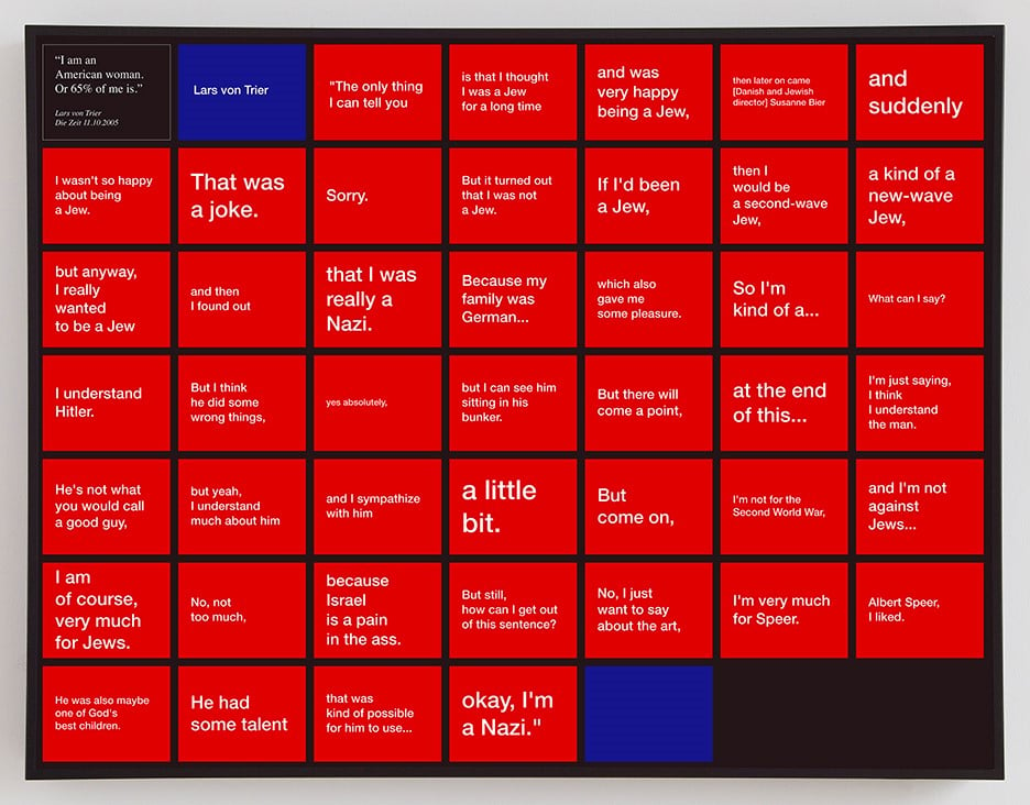
Tony Cokes, Face Value (Lars von Trier) (2018). Courtesy of the artist and Greene Naftali.
Cokes is always concerned with how representation works. As his show title suggests, he deals with media images by focusing on texts extracted from their associated imagery. What you get is a kind of pop art extracted from the pop part, Tweets super-cooled into text art and extracted from the endlessly distractible flow of hype and hot takes. (Commentators have noted that this ability to diffuse each new outrage by creating another seems to be a secret of President Trump’s power; a Trump monologue about his love of women is the subject of another Cokes video at Greene Naftali.)
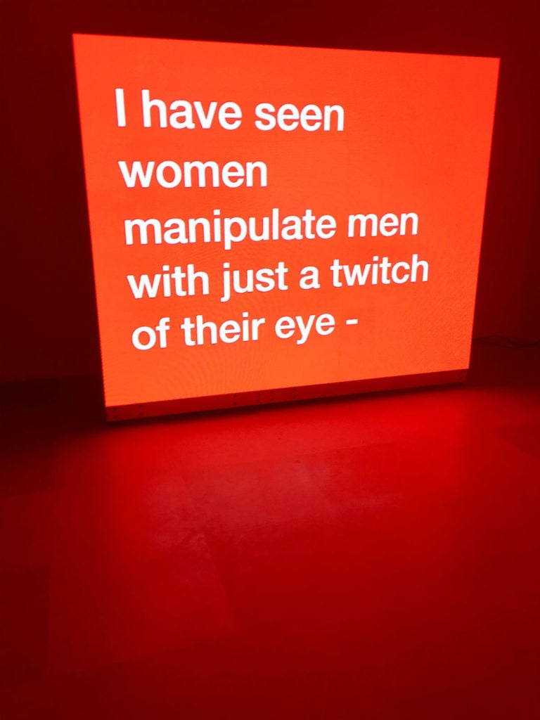
Tony Cokes Evil.66.1 (DT.sketch.1.8) (2016). Image courtesy Ben Davis.
There are claims made for this kind of art-as-media-critique that I don’t really buy. The fact that von Trier and West happen to be in the headlines as Cokes’s show is up in New York surely makes it topical—but also shows how these figures definitely do not want for scrutiny. Infinite criticism generated by trolling has only expanded their buzz, giving them a kind of air current to float on. In fact (and like “This Is America,” in a way), what is distinctive about Cokes’s intervention is how withdrawn it is from easy framing criticism or moral positioning.
It may be more interesting to ask what Cokes’s works propose, not as a form of criticism, but as a style of aesthetic pleasure. To me, their interest amounts to this: Given the endless noise thrown off by such figures, there is a jolt of pleasure in the works’ contrasting sense of clarity, their stripped-down post-conceptual matter-of-factness, their submission of public personae grown out of control to a simple checkerboard in flat colors, decorative but restricted.
![Tony Cokes, Face Value (Kanye West) [detail] (2018). Courtesy of the artist and Greene Naftali.](https://news.artnet.com/app/news-upload/2018/05/cokes-kanye-detail.png)
Tony Cokes, Face Value (Kanye West) [detail] (2018). Courtesy of the artist and Greene Naftali.
Paparazzi Art History
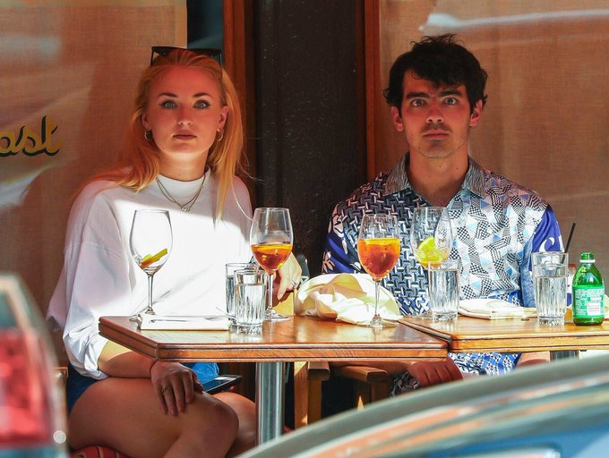
Finally, as a palette cleanser: Last week’s viral sensation was this photo of Cake by the Ocean singer Joe Jonas and Game of Thrones actress Sophie Turner, the duo frozen stone faced like the American Gothic couple out for a sunny brunch. Some comedian called it “a surrealist painting criticizing celebrity culture.”
No one asked me, but myself I would have said that it most reminds me of Diane Arbus’s Identical Twins, Roselle, New Jersey (1967) (the inspiration for Stanley Kubrick’s creepy twins in The Shining). Still the quip made me ask myself: Can I think of any such Surrealist painting?
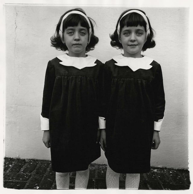
Diane Arbus, Identical Twins, Roselle, New Jersey (1967).
Actually, I think figures gazing out are sort of rare in Surrealist art, which is all about evoking looking in on a dream-like space. In an exception like Magritte’s similarly lunchtime self-portrait The Magician (Self-Portrait With Four Arms), the flat gaze is an anchor, a nod to the neutral gaze of classic portraiture. It provides the deadpan contrast that makes whatever is strange in the surrounding environment seem that much stranger.

Rene Magritte, The magician (Self-portrait with four arms)(1952). Image courtesy Wikiart.
The same is true of Leonora Carrington’s 1937-38 self-portrait in the Met collection; or Dorothea Tanning’s 1942 self-portrait Birthday in the Philadelphia Museum of Art’s collection; or, most relevant to Joe and Sophie, Frida Kahlo’s twinned self in something like Two Fridas (1939)
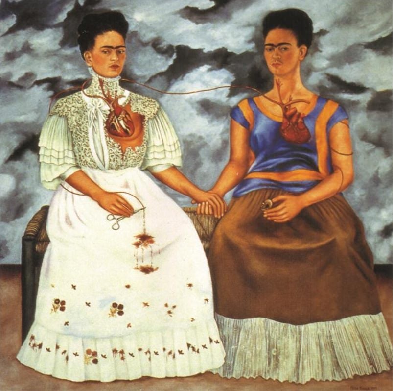
Frida Kahlo, The Two Fridas (1939).
By contrast, our celebrity couple’s dead gaze is not what is normal but what is weird about the photo in question, against the background of colorful cocktails. So maybe we could call the image something like “reverse Surrealism.”
Follow artnet News on Facebook:
Want to stay ahead of the art world? Subscribe to our newsletter to get the breaking news, eye-opening interviews, and incisive critical takes that drive the conversation forward.
SHARE


No comments:
Post a Comment