Thursday, November 23, 2017

skinny backyard dwelling


Space Pod by Studio B

Studio B creates skinny backyard dwelling for landscape architect in Colorado

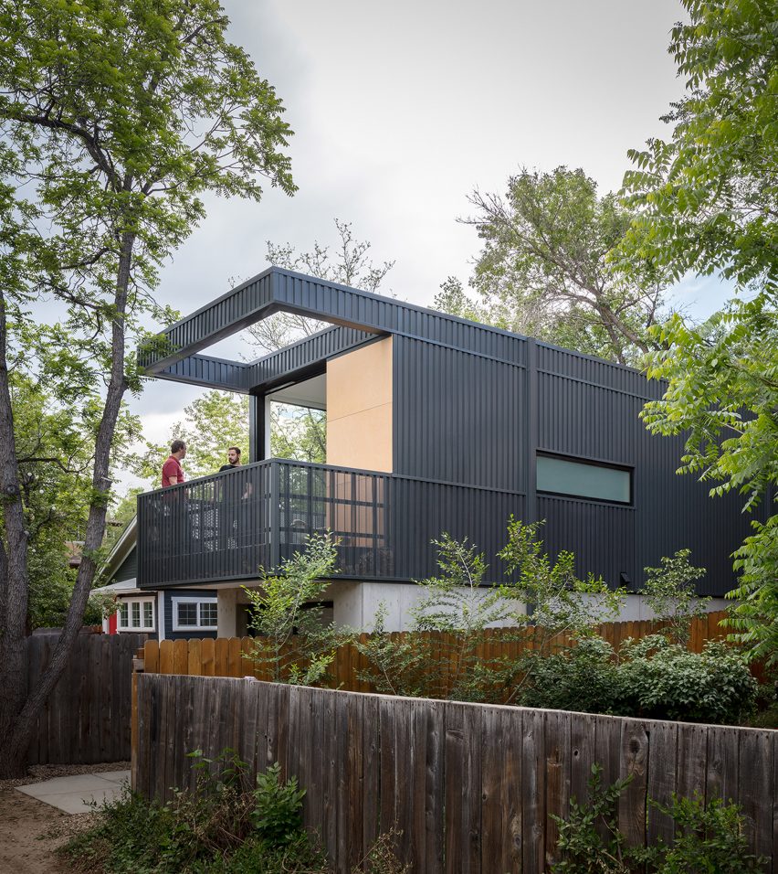
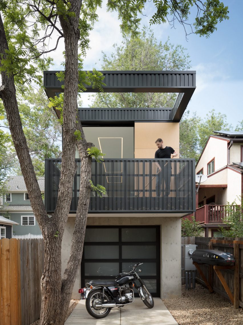
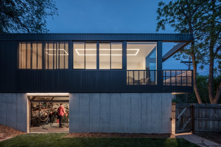
Long, narrow shotgun homes influenced the design of this backyard structure in Boulder by Studio B, which features a concrete base and an upper level wrapped in grey metal and glass.
Called Space Pod – a nickname conceived by the neighbours – the building is located in a walkable, transitional district near Downtown Boulder, a town in the foothills of Colorado's Rocky Mountains.
Space Pod by Studio B
The building serves as a multipurpose space for a young landscape architect. It is the first stage of a larger project, with the second phase entailing the construction of a single-family home on the property.
"The location of each volume on the site was driven by the desire to create a private, sun-filled backyard space, free from large imposing structures," said Studio B Architecture + Interiors, which has offices in Boulder and Aspen.
Space Pod by Studio B
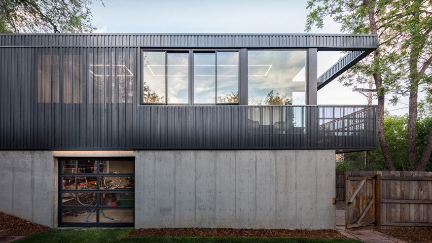
The minimalist material palette for the backyard dwelling was inspired by the monochromatic black paintings of Ad Reinhardt and Frank Stella. Concrete, metal and glass define the facades.
"This composition features subtle textures, perforations and transparencies, more or less visible in different light," the team said.
Space Pod by Studio B
The shape of the building takes cues from so-called shotgun homes, which are long, narrow, rectangular boxes in which rooms are arranged one behind the other.
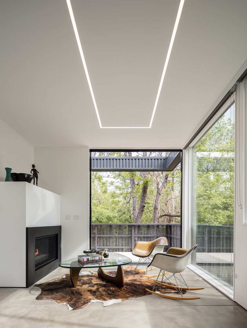
Encompassing 800 square feet (74 square metres), the building contains a garage and bike workshop on the lower level, and a flexible space upstairs for work, play and relaxation.
Space Pod by Studio B
Large expanses of glass, along with a balcony, offer views of the Flatirons – large rock formations on the edge of Boulder.
Founded in 1991, Studio B has designed a range of modernist buildings in Coloradoand beyond. They include an extension to a remote school clad in weathering steel and red cedar, an Aspen home wrapped in zinc and glass, and a Denver residence made of handmade bricks from Italy.
Photography is by David Lauer.

home in stone and oxidised steel

RCR Compound by Carney Logan Burke Architects

Carney Logan Burke clads remote Montana home in stone and oxidised steel

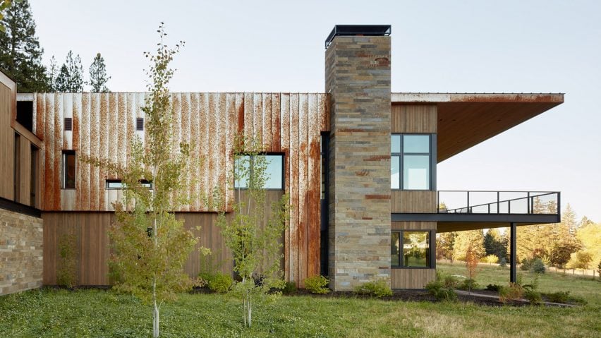
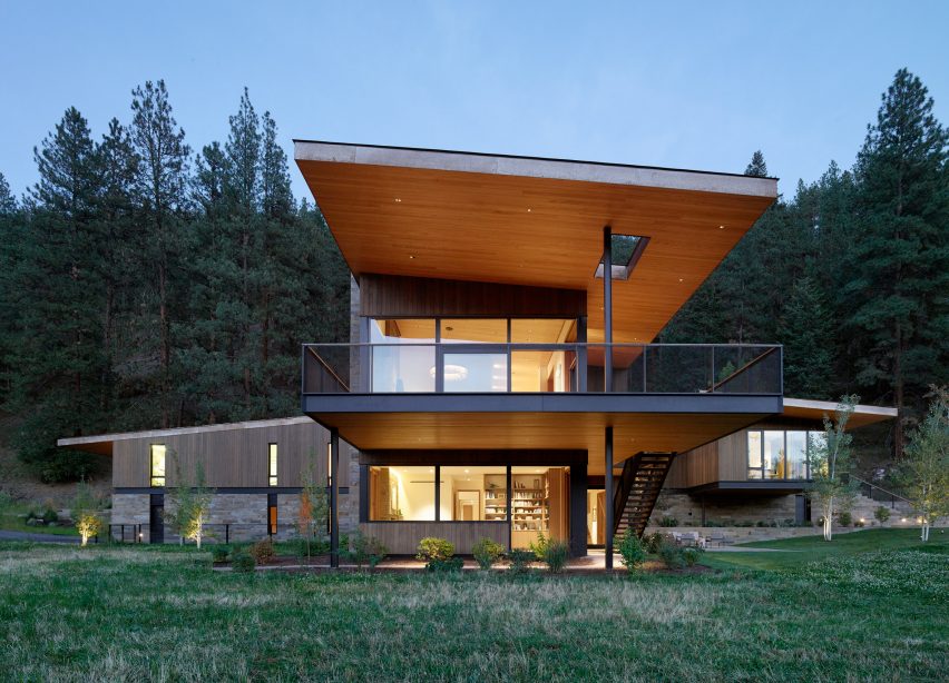
American firm Carney Logan Burke Architects has completed a spacious residence at the base of a forested butte, which consists of linked rectilinear volumes topped with overhanging roofs.
RCR Compound by Carney Logan Burke Architects
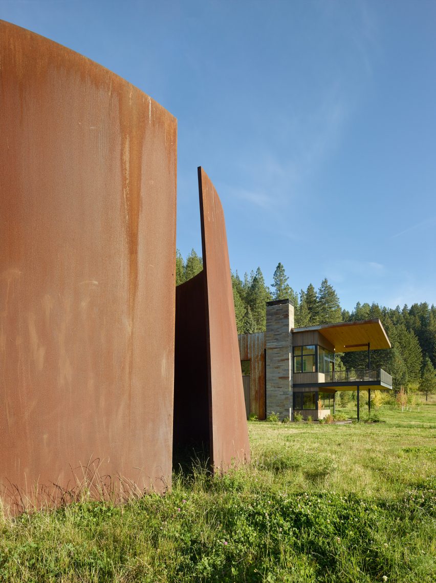
Located on a rural property in western Montana, the RCR Compound was designed for art collectors. The clients desired a home that embraced its natural setting and offered opportunities for the display and enjoyment of their collection, including a large Richard Serra sculpture made of weathering steel.
RCR Compound by Carney Logan Burke Architects
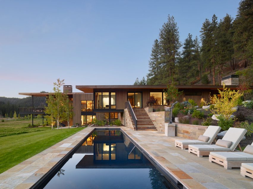
Comprising a main dwelling and a guest house, the compound occupies an eight-acre (three-hectare) property that sits at the base of a forested butte and overlooks a meadow. Providing sweeping views of the surrounding terrain was a guiding concern for the design team and drove the siting of the home.
RCR Compound by Carney Logan Burke Architects
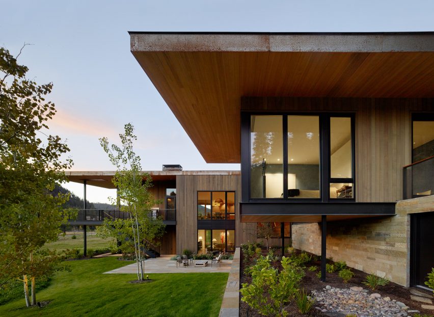
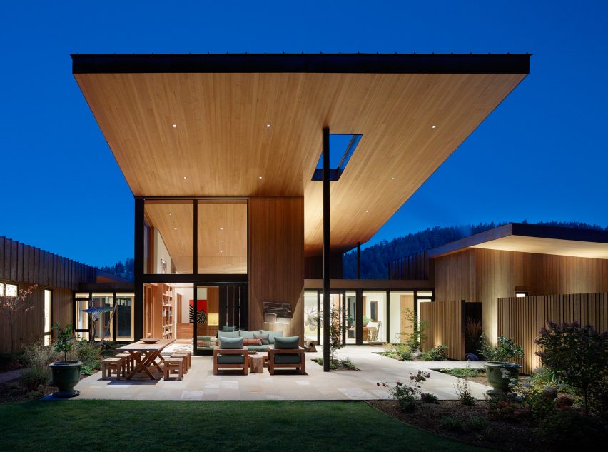
Encompassing 9,000 square feet (836 square metres), the main home is organised as a series of linked, rectilinear volumes that surround a courtyard. A path through the meadow leads to an elevated entrance court.
RCR Compound by Carney Logan Burke Architects
"Carefully detailed wood buildings sit gracefully atop stone walls that extend into the landscape," said Carney Logan Burke Architects, a Wyoming studio that specialises in designing modernist dwellings in remote settings. "Roof forms taper and tilt to visually knit the complex into the site topography."
RCR Compound by Carney Logan Burke Architects
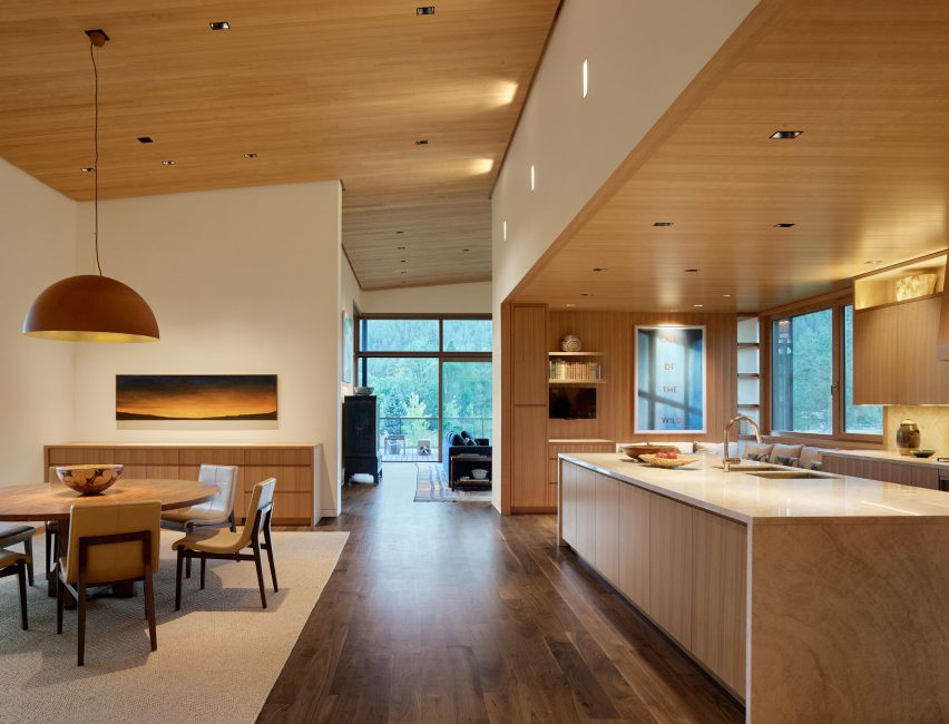
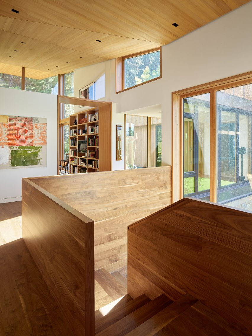
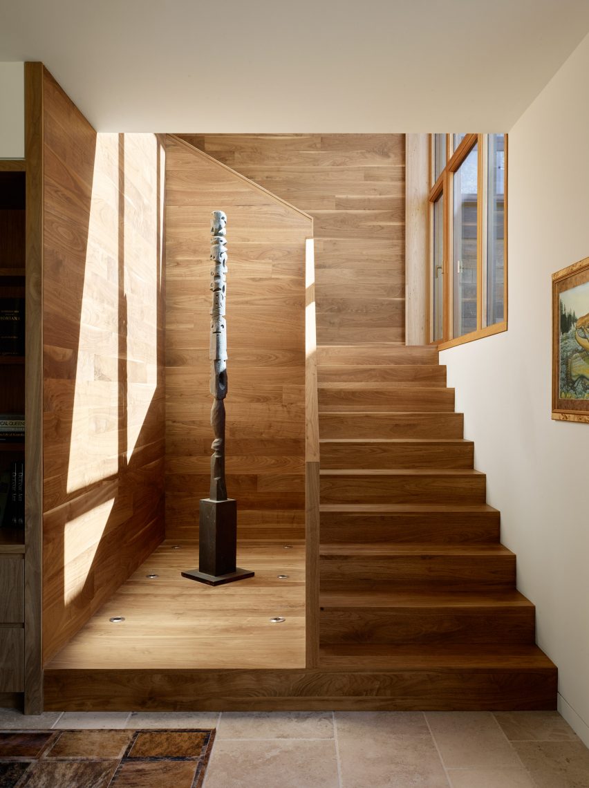
The lower level contains a cosy den, an exercise room and art storage, while the upper floor houses the primary living and sleeping spaces. Rooms are fitted with earthy materials, including cherry cabinets and walnut flooring. Vast expanses of glass bring in light while providing a strong connection to the outdoors.
RCR Compound by Carney Logan Burke Architects
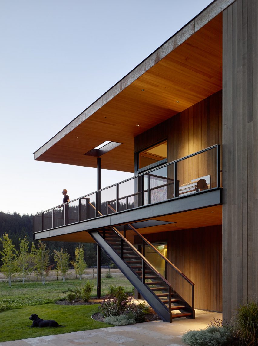
A central volume contains a spacious living room, which opens onto a large wooden deck that cantilevers over the site. The master suite and a meditation area are connected to the main living volume by a glass bridge.
RCR Compound by Carney Logan Burke Architects
"Secluded views into an aspen grove canopy are prominent from the sleeping quarters that project over a private pool and deck," the architects said.
RCR Compound by Carney Logan Burke Architects
The team – including interior design firm Dusenbury Design – used a restrained material palate on both the interior and exterior.
"Wood and plaster surfaces are used throughout the project to engender warmth but not to complete with the art," they said. "Ledger-cut Montana Sandstone, clear cedar and oxidised steel roof and wall panelling speak to the regional vernacular."
RCR Compound by Carney Logan Burke Architects
A similar design vocabulary was used for the guest house, which is situated near the main home. The two-storey dwelling features sleeping quarters, a living space and a covered porch.
Photography is by Matthew Millman.

seven-square-metre extension to small home


My House by MWArchitects

Matthew Wood adds seven-square-metre extension to his small London home

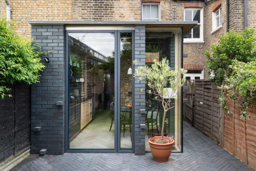
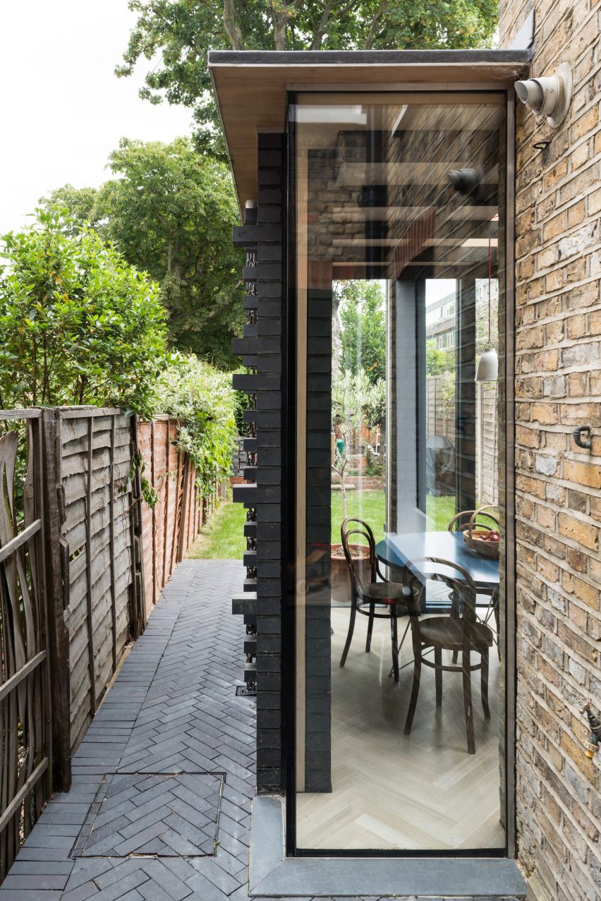
The founder of MW Architects used black-blue engineering bricks to add an extensionof just seven square metres to his renovated London home.
Previously, the central hall of Matt Wood's narrow Victorian house has been used as a dining room. However, as the main circulation point that links the front and back of the building as well as the main staircase, it felt cramped and claustrophobic.
My House by MWArchitects
The idea of extending into the side return was constrained by the position of the house, which tightly abuts the neighbour's property and already receives limited light, as the back of the house faces north.
My House by MWArchitects
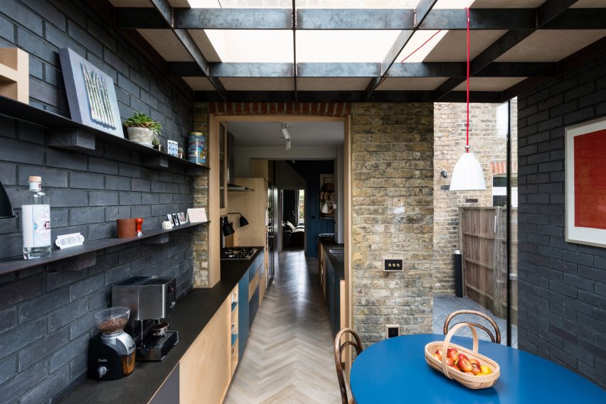
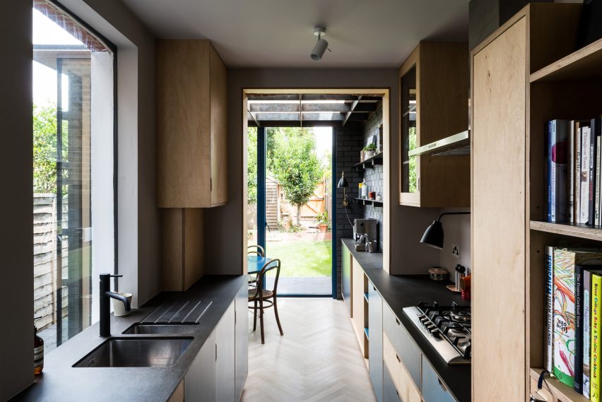
Instead, the kitchen-dining extension was relocated to the very back of the house, leading off the galley kitchen and creating a clear sightline from the hall through to the garden.
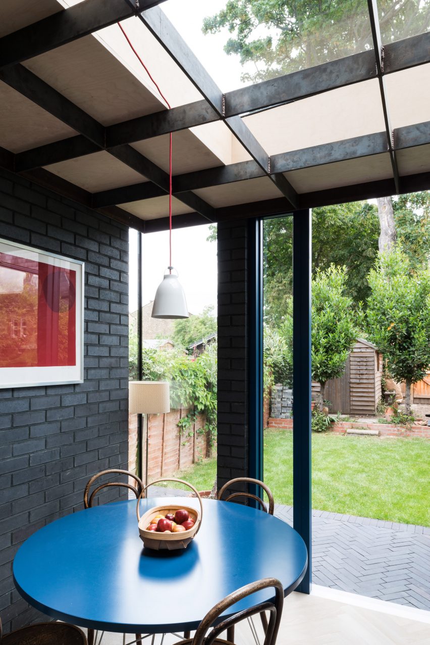
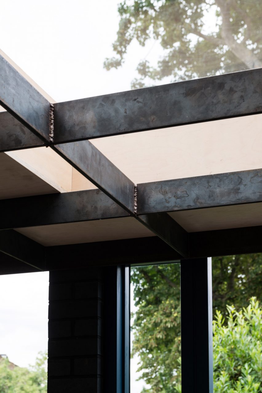
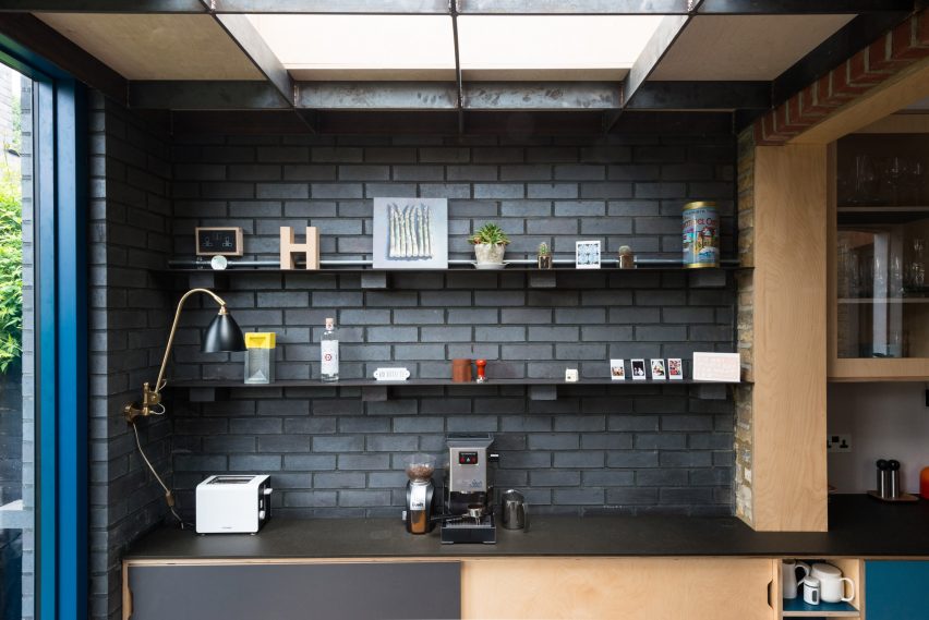
The design maximises the feeling of space, with a frameless, glass-cornered window, and a thin, "visually light" steel-latticed roof. The smooth-fronted plywood and laminate kitchen units were custom made to fit and maximise the narrow space.
My House by MWArchitects
"The size of the extension meant we had to be really precise and rigorous," Wood told Dezeen.
"It's all based around the 120-centimetre dining table, bringing all the dimensions to an absolute minimum, with no wasted space. We had a budget, and you pay per square metre for most materials, so by going for the minimum amount of space, we were able to spend more on finishes."
My House by MWArchitects
To contrast with the yellow brick of the original house, the extension is made from dark Staffordshire blue engineering bricks, which are more commonly used for damp proofing below ground.
"Using dark engineering bricks in a domestic environment is quite a hard sell, but I think it's an interesting idea," said Wood, who founded his firm MW Architects in 2009. "It was really important that [the work] was executed well, as it becomes a tangible surface, so the pointing was very important."
My House by MWArchitects
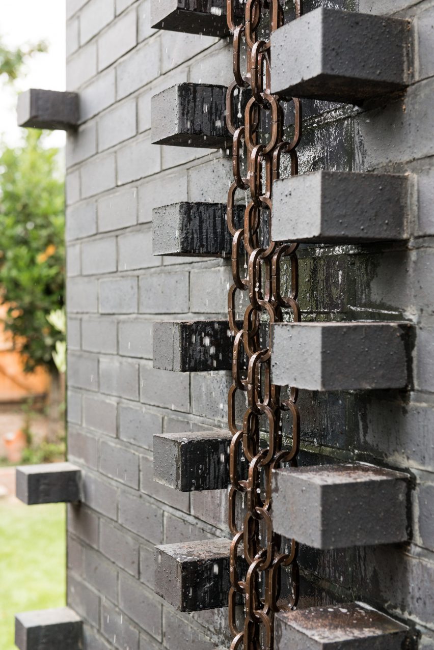
The exterior walls of the extension are enlivened by the occasional brick positioned at right angles to jut out from the wall. The motif serves a function on the side elevation, where a thick copper rain chain has been used in place of a water pipe.
"You see copper rain chains in Japan quite often," explained Wood.
"They stop water getting blown away as it comes off the roof, and the sticking-out bricks placed around it help to contain the splash. It's just quite playful, so we repeated it in other areas, and inside we rested the steel-plate shelves on jutting bricks as well."
My House by MWArchitects
The mix of light and dark materials, as well as the use of colour, have been carefully balanced throughout the house to offset the discrepancies in available light.
The south-facing front room has been painted a deep blue, as has the stairway, and there are accents of blue throughout the ground floor, while the inner hall and galley kitchen have been painted white to reflect the natural light.
By having a dark wall at the end of the space, it makes it harder to perceive the depth, creating a greater feeling of space.
My House by MWArchitects
The indoor floor is covered in a pale herringbone parquet, and the pattern is continued outside on the patio in dark herringbone brickwork.
"We were trying to compensate for the light differences with the material choices and to play with the variations of light," said Wood. "If you use light materials outside, they can be blindingly bright when they catch the sun, and the inside then feels noticeably darker."
Photography by French + Tye