Emma Willard's Maps of Time
In the 21st-century, infographics are everywhere. In the classroom, in the newspaper, in government reports, these concise visual representations of complicated information have changed the way we imagine our world. Susan Schulten explores the pioneering work of Emma Willard (1787–1870), a leading feminist educator whose innovative maps of time laid the groundwork for the charts and graphics of today.
PUBLISHED
January 22, 2020
We live in an age of visual information. Infographics flood the web, driven by accessible platforms that instantly translate information into a variety of graphic forms. News outlets routinely harvest large data sets like the census and election returns into maps and graphs that profile everything from consumer preferences to the political landscape. The current proliferation of visual information mirrors a similar moment in the early nineteenth century, when the advent of new printing techniques coincided with the rapid expansion of education. Schoolrooms from the Atlantic seaboard to the Mississippi frontier made room for the children of farmers as well as merchants, girls as well as boys. Together, these shifts created a robust and highly competitive market for school materials, including illustrated textbooks, school atlases, and even the new genre of wall maps.
No individual exploited this publishing opportunity more than Emma Willard, one of the century’s most influential educators. From the 1820s through the Civil War, Willard’s history and geography textbooks exposed an entire generation of students to her deeply patriotic narratives, all of which were studded with innovative and creative pictures of information that sought to translate big data into manageable visual forms.
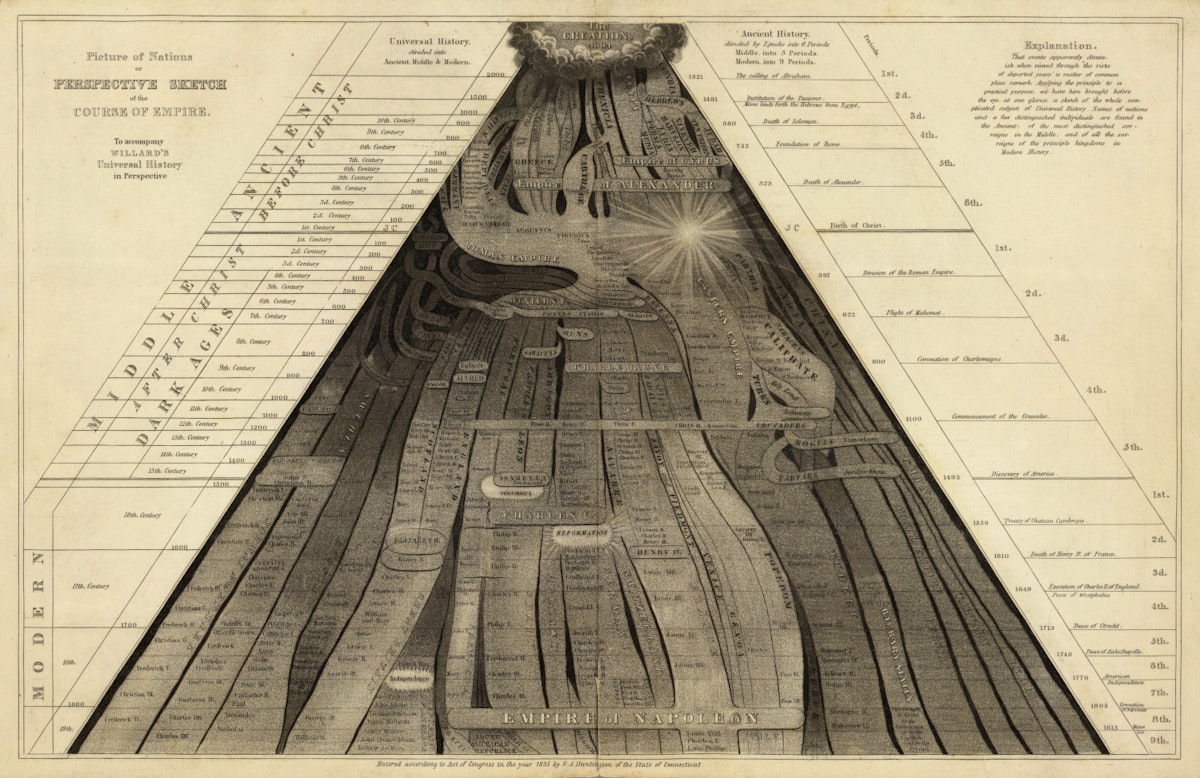
When Willard began publishing textbooks in the 1820s, she knew the competition was fierce, full of sharp-elbowed authors who routinely accused one another of plagiarizing ideas and text. To build her brand, she designed cutting-edge graphics that would differentiate her work and catch the attention of the young. Take, for instance, her “Perspective Sketch of the Course of Empire” of 1835.
"Picture of Nations; or Perspective Sketch of the Course of Empire" (1836) by Emma Willard — Source (Cartography Associates: CC BY-NC-SA 3.0).
By the nineteenth century, timelines had become relatively common, an innovation of the eighteenth century designed to feed growing public interest in ancient as well as modern history. First developed by Jacques Barbeu-Dubourg in the 1750s, early timelines generally charted the lives of individuals on a chronological grid, reflecting the Enlightenment assumption that history could be measured against an absolute scale of time, moving inexorably onward from zero. In 1765, Joseph Priestley drew from calendars, chronologies, and geographies to plot the lives of two thousand men between 1200 BC and 1750 AD in his popular Chart of Biography.
After Priestley, timelines flourished, but they generally lacked any sense of the dimensionality of time, representing the past as a uniform march from left to right. By contrast, Emma Willard sought to invest chronology with a sense of perspective, presenting the biblical Creation as the apex of a triangle that then flowed forward in time and space toward the viewer. Commenting on her visual framework in 1835, Willard noted that individuals experience the past relative to their own lives, for “events apparently diminish when viewed through the vista of departed years.”1 In “Perspective Sketch of the Course of Empire”, she found striking ways to represent this dimensionality of time. The birth of Christ, for example, is marked with a bright light, marking the end of the first third of human history. The discovery of America separated the second (middle) from the third (modern) stage. Each “civilization” is situated not according to its geography, as on a traditional map, but according to its connection and relation to other civilizations. Some of these societies are permeable, flowing into others, while others, such as China, are firmly demarcated to denote their isolation. By studying this map, students were encouraged to see human history as a rise and fall of civilizations — an “ancestry of nations”.2
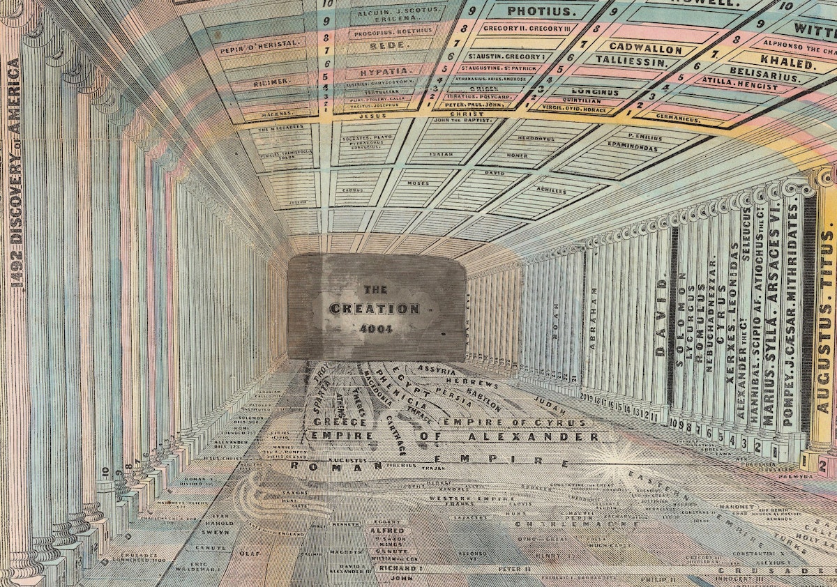
Detail from "Picture of Nations; or Perspective Sketch of the Course of Empire" (1836) by Emma Willard — Source (Cartography Associates: CC BY-NC-SA 3.0).
Moreover, as time flows forward the stream widens, demonstrating that history became more relevant as it unfolds and approaches the student’s own life. Historical time is not uniform but dimensional. On the one hand, this reflected her sense that time itself had accelerated through the advent of steam and rail. Traditional timelines, she found, were only partially capable of representing change in an era of rapid technological progress. Time was not absolute, but relative. On the other hand, Willard’s approach reflected her own deep nationalism, for it asked students to recognize the emergence of the United States as the culmination of human history and progress.
Willard aggressively marketed her “Perspective Sketch” to American educators, believing it to be a crucial break with other materials on the market. As she confidently expressed to a friend in 1844, “In history I have invented the map”.3 She also advocated for her “map of time” as a teaching device because she strongly believed the visual preceded the verbal — that information presented to students in graphic terms would facilitate memorization, attaching images to the mind through the eyes.
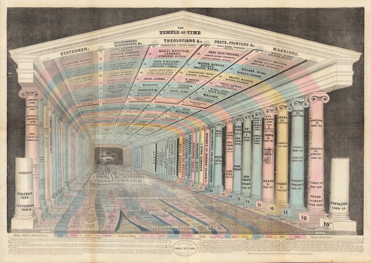
Willard’s devotion to visual mnemonics shaped much of her work. In the 1840s, she published another elaborate visual device, named the “Temple of Time”. Here, she attempted to integrate chronology with geography: the stream of time she had charted in the previous decade now occupied the floor of the temple, whose architecture she used to magnify perspective through a visual convention. Centuries — represented by pillars printed with the names of the era’s most prominent statesmen, poets, and warriors —diminished in size as they receded in time, turning the viewer’s attention toward recent history, as in the “Course of Empire”. But in the Temple of Time, the one-point perspective also invited students in to inhabit the past, laying out information in a kind of memory palace that would help them form a larger, coherent picture of world history. Readers, in other words, were invited into the palace, so they too could stand at moments in world history.
In a map, great countries made up of plains, mountains, seas, and rivers, are represented by what is altogether unlike them; viz., lines, shades, and letters, on a flat piece of paper; but the divisions of the map enable the mind to comprehend, by proportional space and distance, what is the comparative size of each, and how countries are situated with respect to each other. So this picture made on paper, called a Temple of Time, though unlike duration, represents it by proportional space. It is as scientific and intelligible, to represent time by space, as it is to represent space by space.4
Willard’s creative efforts to “map time” stemmed from personal experience. Born just after the Revolution, she was part of the first generation of American women to be educated outside the home, and she chafed at the way “female education” kept more than a few areas of knowledge off limits. One of the few subjects considered suitable for both boys and girls in that era was geography, yet Willard remembered with frustration the degree to which her textbooks lacked maps. It makes sense, then, that as a young teacher in the 1810s Willard became passionate about having her pupils draw maps — not copying them (a common practice in schools for young women at the time) but rather reproducing them in rough terms from memory to demonstrate a grasp of geographical relationships.
Willard’s own artistic creativity as a mapmaker was evident from the start. Her first textbook — a geography written with William Woodbridge and published in 1824 — includes a metaphorical map of the Amazon River and its tributaries which illustrates the evolution of the Roman Empire. (One can see in this early effort the prototype for her elaborate “Perspective Sketch” of the 1830s.)
"Progress Of The Roman Empire, Illustrated By The Course of the River Amazon" (1824) by Emma Willard — Source (Cartography Associates: CC BY-NC-SA 3.0).
Willard’s creativity as an educator was equally immense. In 1819 she published a plan to publicly fund the improvement of female education, which met with more than a little resistance. Two years later, she began to implement this vision by founding the Troy Female Seminary in New York—an institution that quickly became a preeminent school for future teachers and one of the most highly regarded schools for women in the country. At Troy, Willard assumed that females were capable of studying the same subjects as their male counterparts and incorporated “masculine studies”, such as science and history, into the curriculum. Her administration of Troy, and her intensive teaching in the decade prior to and after its foundation, convinced her of the multiple failures of contemporary pedagogy and textbooks.
In 1828, Willard issued the first edition of her History of the United States, or The Republic of America, a textbook so popular it would remain in print until the 1860s. One key element of the book’s success was the atlas that accompanied the text — a series of maps of the eastern US that Willard designed and executed with a former female student. In this series, each map marked particular moments or eras that either led toward or resulted from nationhood, including the landing on Plymouth Rock, the Treaty of Paris, or the late War of 1812 against Britain. Perhaps the most remarkable of these was the “introductory map”, which identified indigenous tribes through a series of geographic migrations, collapsing centuries of movement into a single image. In naming this the “introductory” map, however, Willard situated Native Americans in a prehistorical era antedating the ostensibly more significant events of European settlement. The single image she created was innovative and powerful, but it also rendered the violence of Native displacement as an inevitable prelude that gave way to the real drama of colonialism and the inevitable realization of national independence.
"Introductory Map" (1828) by Emma Willard, illustrating the "locations and wanderings of the aboriginal tribes" — Source.
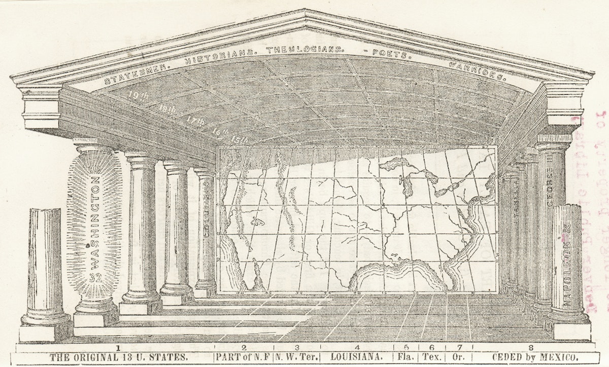
Willard’s commitment to creative cartography, combined with her nationalism, inspired her to create a simplified American Temple of Time in the late 1840s, which revealed a firm belief in Manifest Destiny: the providential progression from the European discovery of North America in the fifteenth century to a continental empire in the present. The concept of the American Temple was interactive, framing the chronological and geographical outlines of American history to aid memorization. Students were to identify the eight geographical entities that made up the continental United States: the original thirteen colonies, New France, the Northwest Territory, Louisiana, Florida, Texas, Oregon, and the area ceded by Mexico in the 1848 treaty that ended the Mexican–American War. Students were then instructed to locate each state and territory in time by shading its existence as it became part of the country (shading the colonies as they were settled, and the states as they joined the union). If the Temple were drawn large enough, there would also be enough space along the “floor” to identify important battles. The design is complex and unwieldy, but the goal is intriguing: an interactive exercise for students to integrate history and geography in order to understand how the past had—quite literally—taken place.
Willard’s final contribution to visual knowledge was perhaps the most straightforward, a “Tree of Time” that presented American history as a coherent, organic whole. There is, of course, a long tradition of presenting time as a tree (family trees being the most enduring), but Willard used the image not to represent ancestors as trunks and descendants as branches, but — rather oddly — to represent time arcing from left to right, like a timeline. She was so fond of the Tree of Time she used it to introduce all subsequent editions of her popular textbook History of the United States and even issued it on a much larger scale to be hung in classrooms.
"Willard's Chronographer of American History" (1845) by Emma Willard — Source (Cartography Associates: CC BY-NC-SA 3.0).
Like the Temple, the Tree presented an encompassing history of the nation that reached back past 1789 to 1492. All of North America’s colonial history merely formed the backstory to the preordained rise of the United States. The tree also strengthened a sense of coherence, organizing the chaotic past into a series of branches that spelled out the national meaning of the past. Above all, the Tree of Time conveyed to students a sense that history moved in a meaningful direction. Imperialism, dispossession, and violence was translated, in Willard’s representation, into a peaceful and unified picture of American progress.
Ironically, it was the cataclysms of the Civil War that challenged Willard’s harmonious picture of history in the Tree of Time. In the 1844 edition of the Tree, President Harrison’s death marched the last branch of history. Twenty years later, Willard added a new branch marking the end of the US war against Mexico and the subsequent Compromise of 1850, seismic events which both raised and temporarily settled the sectional divisions over slavery. Even though the Civil War was well underway by the time she issued her last edition of tree, she marked the last branch as “1860”, with no mention of the bloody conflict that had engulfed the entire nation. Her accompanying narrative in Republic of America brought American history to the brink of war, but no further. Willard had come up against history itself.





No comments:
Post a Comment