These 10 Artworks Tell the Story of Contemporary Art
In “The Big Picture: Contemporary Art in 10 Works by 10 Artists,” Matthew Israel, Artsy’s Curator at Large, examines 10 artworks that trace the development of contemporary art. Below are a series of excerpts from his book, out March 28th from Prestel.
Contemporary art is notoriously difficult to understand and can be quite intimidating. For one, unlike past movements, the range of artistic styles of the present haven’t been digested by critics, curators, and art historians and don’t lend themselves to easy categorization.
The Big Picture offers an approachable and accessible overview of contemporary art since the millennium, through just 10 works by 10 artists. Drawn from the fields of photography, painting, performance, sculpture, installation, video, film, and public art, the works selected range widely—from Andreas Gursky’s large-scale color photograph of the Rhine to Ai Weiwei’s installation of children’s backpacks following the 2008 Sichuan earthquake to Kara Walker’s massive sugar sculpture in Brooklyn’s former Domino Sugar refinery.
Each artwork has its own story, but also reflects larger tendencies in the world of contemporary art. These 10 works are importantly not meant to be a “greatest hits” list, but a strategic choice of artworks in recent history that allow discussion of some of the most influential approaches in contemporary art today. The sharp focus on 10 works is also meant to emphasize the attention needed for contemporary art and show how close looking can reveal the depth and power of works of art.
Andreas Gursky, Rhine II, 1999
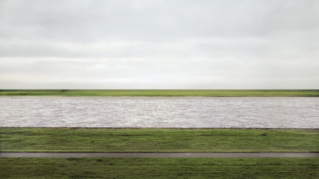 Andreas Gursky, Rhine II, 1999. Courtesy of Andreas Gursky and VG BILD-KUNST, Bonn. Courtesy of Prestel Publishing.
Rhine II, the work of German photographer Gursky, measures almost 12 feet long and 7 feet high. Its enormous size could have allowed for a wealth of compositional possibilities, but the photograph was formally extremely simple. While the actual view (in Germany) was busy with power lines, trees, and livestock, Gursky had removed all of these things through both analogue and digital processes.
Gursky’s use of digital manipulations prompted a lively public discussion about whether photography had now become equal to painting as an art form. His works also felt like a significant paradigm shift to an art public that was not used to seeing color photography at such scale and in such detail. From a distance, the effect was similar to experiencing large-scale canvases by Color Field abstractionists like Mark Rothko or Barnett Newman.
Enigmatic and indelible, Rhine II straddles two worlds. It is a beautiful formal capture of the potential of man in the twentieth and twenty-first centuries—his ability to reshape the world as he would like it to be, for better and for worse.
Olafur Eliasson, The weather project, 2003
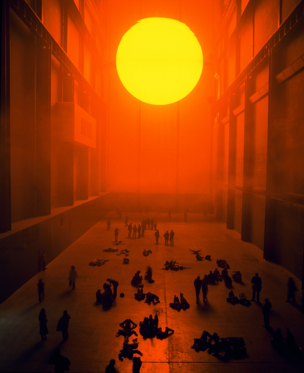 Olafur Eliasson, The weather project, 2003. Tate Modern, London (2003). © Photo by Andrew Dunkley & Marcus Leith. Courtesy of the artist; neugerriemschneider, Berlin; and Tanya Bonakdar Gallery, New York. © Olafur Eliasson. Courtesy of Prestel Publishing.
Upon entering the Tate’s Turbine Hall, visitors to Eliasson’s The weather project were greeted by a huge glowing orb that hovered near the ceiling. A fine mist filled the hall, diffusing its spellbinding glow throughout the room. Because this work by the Danish-Icelandic artist effectively used the entire volume of the space, it was called the largest indoor contemporary artwork ever produced. The installation became a phenomenon, and over two million people visited during its run.
The weather project fits into a wider trend, beginning in the late 1990s, in which museums began to regularly install monumental-scale artworks indoors as exhibitions unto themselves. Critics have compared these installations to amusement park rides and viewed their spectacle and pomp as a frivolous pandering to the masses. Yet seen in a more positive light, engaging and experiential contemporary installations are, for one, a great way to get the larger population into the museum to see other works.
Rachel Harrison, Huffy Howler, 2004
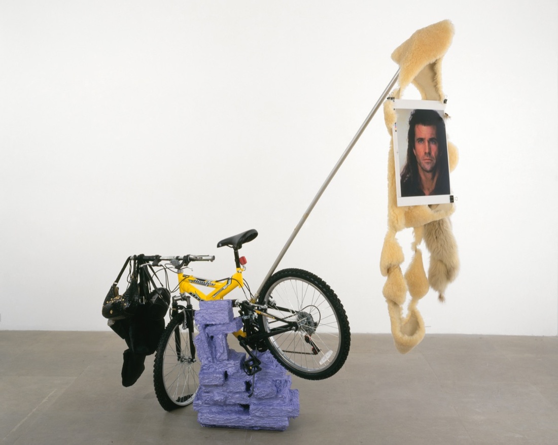 Rachel Harrison, Huffy Howler, 2004. Collection Walker Art Center, Minneapolis T. B. Walker Acquisition Fund, 2008. © David Levene 2015: 44; Courtesy of the artist and Greene Naftali, New York. Photo by Jean Vong. Courtesy of Prestel Publishing.
Huffy Howler upset one’s expectations regarding the materials that could make up a sculpture. Most of its components—including handbags, gravel, and binder clips—were either very close to being garbage, or very cheap. But the New York-based Harrison was able to bring these unusual materials together into a unique kind of cohesiveness that brilliantly teetered between coherence and absurdity. Her sculptures have been labeled “complexes,” and unlike Robert Rauschenberg’s iconic 1950s and 1960s “combines,” which were an integration of painting and sculpture into one, Harrison puts together objects that never entirely seem to combine.
Harrison’s work, and others included in the New Museum’s 2007 opening exhibition “Unmonumental,” offered a counterpoint or even a rejection of the sculpture that dominated the preceding years: the big, brash, Neo-Pop of artists such as Jeff Koons and Takashi Murakami. These artists continually invested substantial time, energy, and money exploring new, ever-shinier materials to fabricate ever-bigger monumental objects to dominate our public spaces. Looking around the New Museum’s show, it was hard to imagine a starker contrast.
Kehinde Wiley, Napoleon Leading the Army over the Alps, 2005
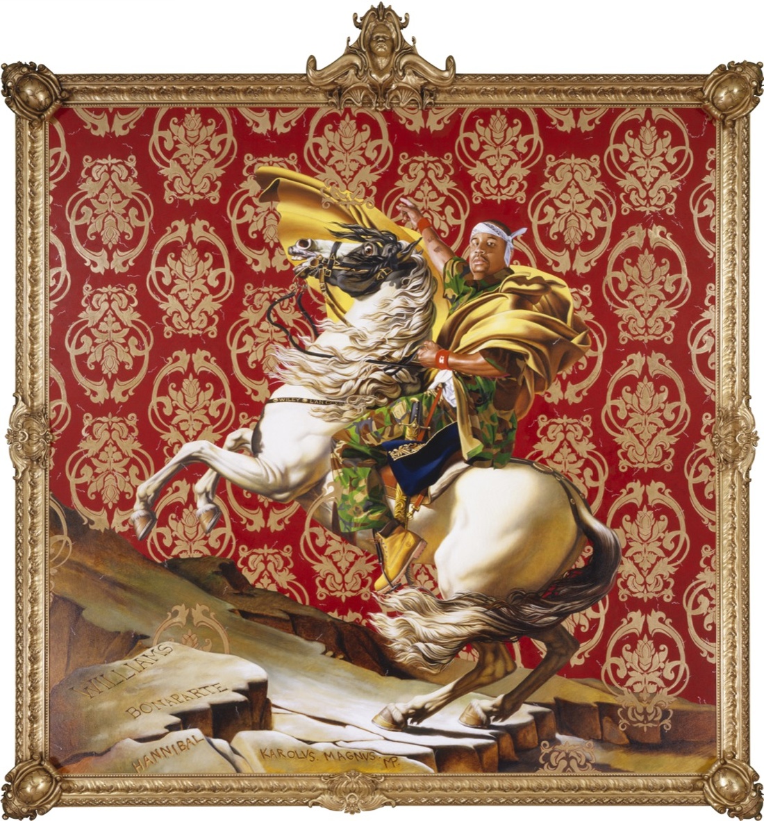 Kehinde Wiley, Napoleon Leading the Army over the Alps, 2005. Courtesy of Brooklyn Museum. © Kehinde Wiley. Courtesy of Prestel Publishing.
Critics often read Wiley’s painting, and his production as a whole, as a powerful questioning of Western art history. As the interpretation goes, Wiley rejects and upends the subjugated or inferior roles in which black or brown men have been represented and places them front and center. Yet as Wiley himself undoubtedly also knows, his work is more complex than this. This work, for example, both lampoons the hyper-masculinity of the original piece (Neoclassical painter Jacques-Louis David’s Napoleon Crossing the Alps from 1801) but also subtly presents male sexuality as a subtext—something rarely seen in Western art history.
Wiley’s success is just one example of how African American art has become much more visible in American galleries, museums, and academia in recent years, after centuries of either exclusion or (at best) inconsistent representation. All the same, major issues remain—the amount of solo shows devoted to African American artists is also still quite small, and while values are increasing for works by historical and contemporary African American artists, this work is still heavily undervalued by the art world compared to the work of white artists of similar accomplishments or career status.
Vik Muniz, Marat (Sebastião), 2008
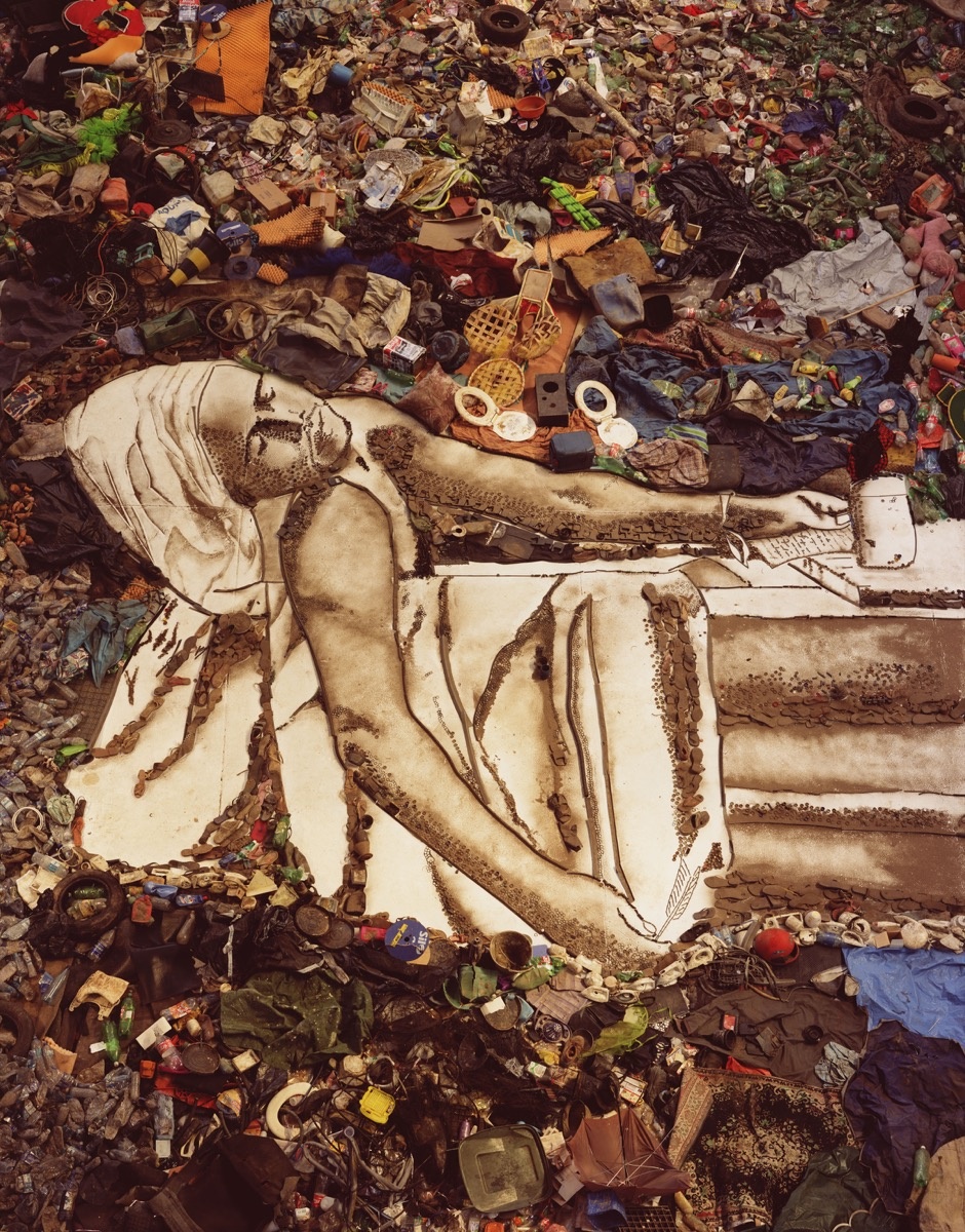 Vik Muniz, Marat (Sebastião), from “Pictures of Garbage,” 2008. Art © Vik Muniz/Licensed by VAGA, New York, NY. Courtesy of Prestel Publishing.
Jardim Gramacho, a 321-acre plot of land on the northern edge of Rio de Janeiro, was the world’s largest garbage dump until it closed in 2012. Between 2007 and 2010, the Jardim became a kind of studio for Brazilian-born, New York- and Rio-based artist Muniz. The artworks created there became a series called Pictures of Garbage, which recreate iconic images from art history using trash collected from the dump.
Muniz’s work prompts a number of important questions regarding contemporary art. Ethics is a good place to start, especially regarding collaborations with “marginalized” or poorer segments of society, which has become a common practice for contemporary artists interested in socially engaged art. Pictures of Garbage also considers the aesthetics of contemporary political art. Muniz’s work is political, but it does so by avoiding straightforward propaganda and retaining various conceptual layers through its complex formal processes. Very broadly, this is characteristic of much politically engaged art today—for it to succeed from a critical and especially market point of view, it cannot be too straightforward or too heavy-handed with its messaging.
Ai Weiwei, Remembering, 2009
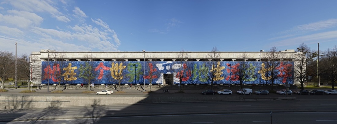 Ai Weiwei, Remembering, 2009. Installation view, Haus der Kunst, Munich (2009). Courtesy of Ai Weiwei Studio. Photo by Jens Weber. Courtesy of Prestel Publishing.
On May 12, 2008, a 7.9-magnitude earthquake devastated Sichuan Province in western China, killing thousands of young students whose schools may not have met country-wide building standards. The government refused to investigate, and Chinese artist and activist Ai was compelled to act. The son of a poet who was denounced and exiled by the Chinese government, he had made a career out of creating artworks promoting freedom of expression and human rights, and in the process, challenging Chinese cultural values and political authority.
Ai’s most celebrated works related to the earthquake were large-scale sculptures that utilized backpacks as their primary medium. Rememberingconsisted of nine thousand of these backpacks arranged so that they spelled out “She lived happily for seven years in this world” in Chinese characters. The highly public and prominent placement of Remembering—it covered the massive front facade of the Haus der Kunst in Munich, one of Europe’s most influential art museums—left little doubt as to the institution’s support of the work. At once minimal, monumental, historical, and very emotional, Remembering stood as a powerful and indelible example of a work of art’s ability to engage directly with ongoing political and social issues.
Ryan Trecartin, P.opular S.ky (section ish), 2009
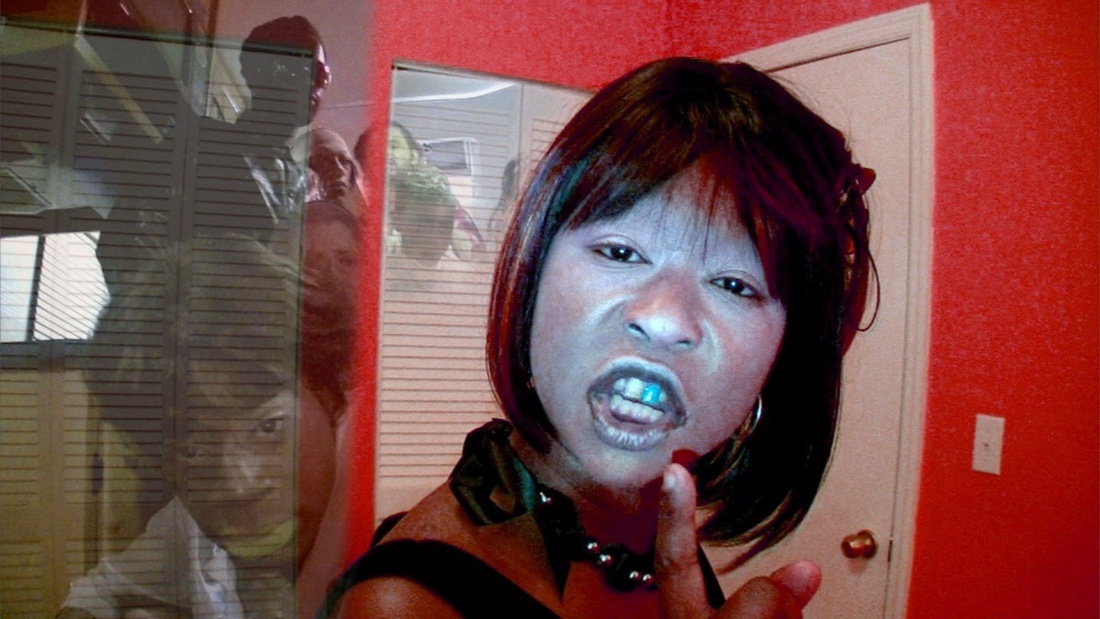 Ryan Trecartin, Still from P.opular S.ky (section ish), 2009, HD Video, 43 minutes, 51 seconds. © Ryan Trecartin. Courtesy of the artist, Regen Projects, Los Angeles and Andrea Rosen Gallery, New York. Courtesy of Prestel Publishing.
P.opular S.ky (section ish)—along with many of Los Angeles-based video artist Trecartin’s works—could be described as a tempest.
One of the first things you notice about Trecartin’s movies is there is a lot of talking, which is unusual for contemporary video art. In many ways everything revolves around dialogue, which in Trecartin’s case is a stacked and highly wrought combination of colloquialisms, pseudo-technical jargon, and philosophical musings. Compulsive audio manipulations heighten the effect of their lines—chopping, looping, and raising their pitch to frequencies recalling Alvin and the Chipmunks or unhinged demons. Visual edits further exaggerate the dialogue’s frenetic energy.
Relative to other contemporary art media, video is one of the youngest. The acclaim for Trecartin’s work and the lack of hesitancy around his chosen medium mark a particular triumph for video art, which in the past twenty years has cemented its place as a medium to be both taken seriously and widely used by artists.
Marina Abramović, The Artist is Present, 2010
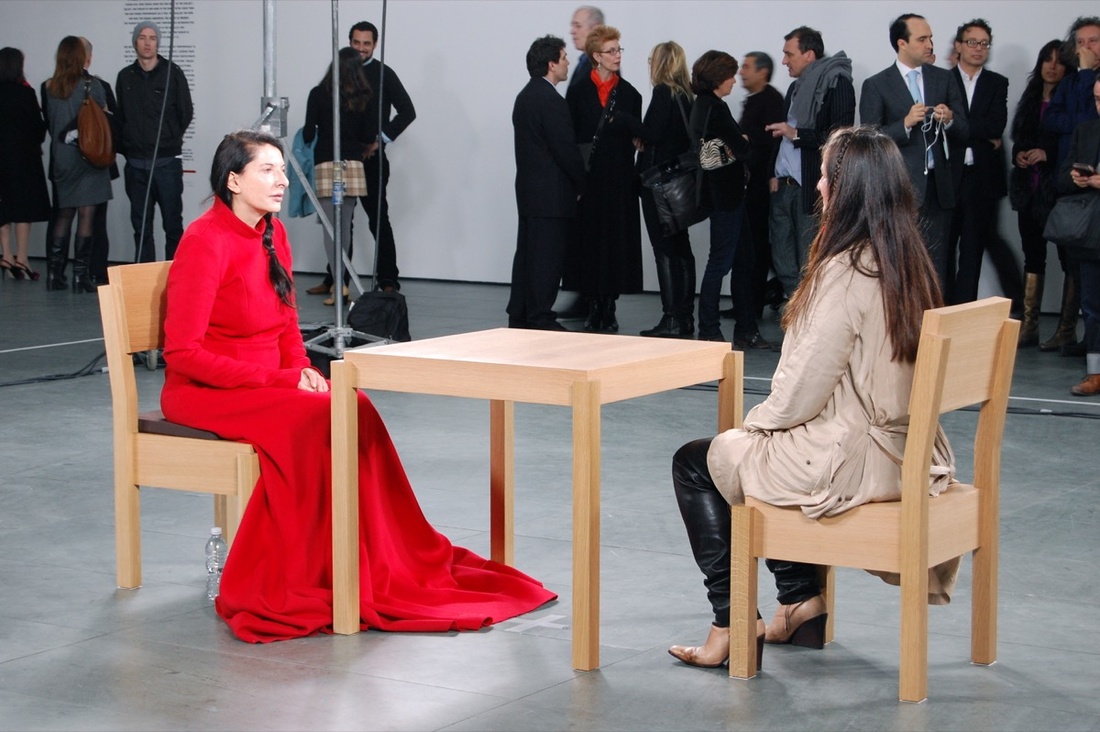 Marina Abramović, The Artist is Present, 2010. Performance, The Museum of Modern Art, New York. Photo by Andrew Russeth, via Flickr.
The Artist is Present was, in some respects, a very simple work. It consisted of Belgrade-born, sixty-three-year-old performance artist Abramović sitting silent and still in a chair across from another chair in which anyone could sit silently (one at a time) for however long they wanted during business hours at the Museum of Modern Art in New York. Abramović sat for the entire run of her 2010 retrospective, which added up to 736 hours and 30 minutes.
Since the millennium, performance—a term currently embraced by some but rejected by other artists who find it too confining or inaccurate—has returned to being considered one of the most progressive art forms of today. Exhibitions such as Abramović’s are undoubtedly one reason for this. Her show drew 850,000 visitors and garnered worldwide media attention, spurring galleries and museums to capitalize on the success.
Tauba Auerbach, Untitled (Fold), 2012
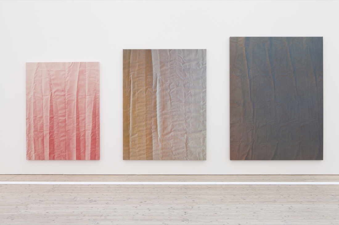 Tauba Auerbach, Tetrachromat, 2012. Installation view, Malmo Konsthall, Sweden (2012). © Tauba Auerbach. Courtesy of Paula Cooper Gallery, New York. Photo by Helene Toresdotter. Courtesy of Prestel Publishing.
Auerbach initially became interested in the fourth dimension through geometry (the artist admits in interviews that she has thought more about math than art history), but also because it seemed a “model for working towards a deeper, more complete, more intuitive experience of being in the world.” The results of her preoccupation were initially her Crease and Crumple paintings, but were best expressed in her Fold series created between 2010 and 2012.
Auerbach did not create an actual four-dimensional space in these works, but tried to suggest it by confusing the observer’s ability to distinguish between two-dimensional and three-dimensional space. The paintings include a kind of in-between space, somewhere between the flat canvas and the peaks of the creases. The Folds were subtle, immaculately produced, mysterious, and gorgeous, and simultaneously elegant abstract paintings—meaning they had no connection to observable reality—and highly realistic representations of folded canvas. They felt otherworldly, unlike any other abstract paintings being produced then or in the recent past.
Kara Walker, A Subtlety, 2014
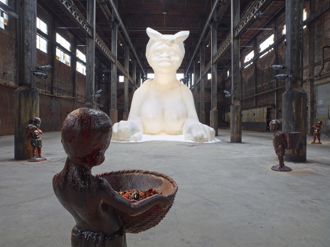 Kara Walker, A Subtlety, or the Marvelous Sugar Baby, an Homage to the unpaid and overworked Artisans who have refined our Sweet tastes from the cane fields to the Kitchens of the New World on the Occasion of the demolition of the Domino Sugar Refining Plant, 2014. Artwork © Kara Walker, courtesy of Sikkema Jenkins & Co., New York. Photo by Jason Wyche. Courtesy of Prestel Publishing.
Visitors to Walker’s A Subtlety, housed in a former Brooklyn Domino Sugar factory, encountered something that was far from subtle. Her enormous bright-white sculpture of a nude woman was 35 feet tall and 75 feet long and covered with approximately 80,000 pounds of refined white sugar. The effect was blindingly white. Yet the woman in the sculpture presented as “black,” her pose and exaggerated features drawing on two racial stereotypes of African American women—as mammies and as hypersexualized—as well as historical sphinx statuary. With this work, the New York artist also reminded us of the innumerable horrors suffered by African slaves in the international sugar trade.
While A Subtlety looked markedly different from Walker’s best-known paper installations, it employed a similar methodology. It drew you in with something pretty, charming, and crowd-pleasing, but a closer examination—of the artwork itself and your thoughts about it—revealed deeply disturbing and unsettling underlying historical references.
—Matthew Israel
Cover image of Kara Walker, A Subtlety, 2014, by Matt, Marie, Luke and Finn, via Flickr.

No comments:
Post a Comment