Unpredictable and accidental combinations are gaining currency in design and textiles. Dominic Lutyens explores a ‘new vocabulary’ of colour.
C
Colour touches us all in different ways – we each tend to favour some over others, perhaps because they trigger emotional reactions or memories. We react to colour viscerally and subjectively – it’s hard to explain why we like a particular hue. But it also appeals to us collectively, which is why colour trends in fashion and the home have such a strong hold on us.
More like this:
Some colour trends are generational, and seem to be inspired by specific artists or design movements. Others last for five years or more: the hottest hue in recent years has been so-called ‘millennial pink’ – seen in countless cool bars, hotels and restaurants – although this trend is finally tailing off.
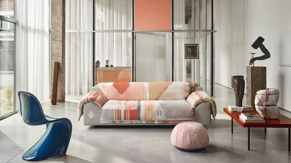
Hella Jongerius believes in the ‘intimate’, ‘subjective’ power of colour, pictured is her Vlinder design for Vitra (Credit: Marc Eggimann)
Colour trends go in cycles. There have been periods when colour was banished from our homes and wardrobes, as was the case in the minimalist 1990s. For years, however, colour has reasserted itself in our homes, although it’s hard to know why. Natural colours, in particular all permutations of green, are popular now – a reflection, maybe, of our concern for sustainability. Green is often cited as everyone’s favourite colour after blue. But what triggered the rediscovery of bright colours? In fashion, maybe our fascination with the red-carpet dress, with A-listers wearing eye-catching outfits, has given flamboyant colours a new-found cachet. Or possibly Wes Anderson’s hit movie The Grand Budapest Hotel unleashed a lust for saturated colour?
And colour trends were once taken for granted with cast-iron certitude. In fashion, these helped to mark the rigid segmentation of the year into quarterly seasons – spring, summer, autumn and winter.
Today many successful designers prefer to work outside rigorous colour systems, following their own taste in colour
In other areas, such as graphic design, product design and homeware, the Colour of the Year is an annual institution embraced by several companies. It has long been associated with Pantone, a printing company founded in New York in the 1950s, famous for its Pantone Matching System (PMS), a standardised colour reproduction system that allows manufacturers in different locations to refer to its range of numbered colours to ensure colours match exactly.
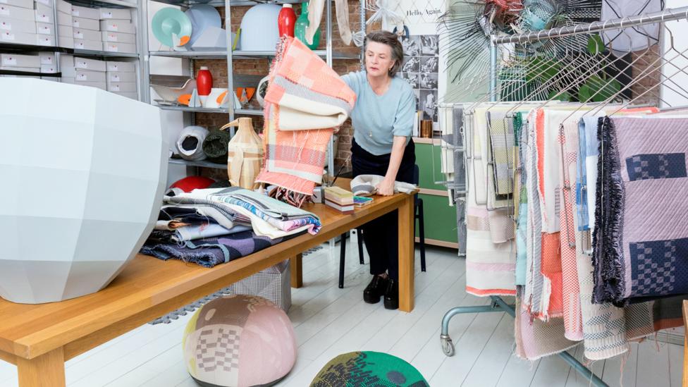
Dutch designer Hella Jongerius is aiming to create a ‘new vocabulary’ of colour (Credit: Vitra)
Launched in 2000, its zeitgeist-capturing Colour of the Year is based on trend-forecasting research conducted by the Pantone Colour Institute. Its choice for 2020 is ‘Classic Blue’, a calming ultramarine shade described as a ‘universal favourite’.
European colour notation systems include Sweden’s NCS, which provides designers, manufacturers, retailers and customers with accurate colour-matching, and German company RAL, used for powder-coating and plastics.
But today many successful colourists and designers prefer to work outside these rigorous systems, following their own taste in colour or challenging the standardisation of colour widely used by industry, which, they argue, delimits and impoverishes the palette of colours we see around us in everyday life. Dutch designer Hella Jongerius, for example, constantly experiments with colour, and displayed the fruits of her research at the exhibition Breathing Colour at London’s Design Museum in 2017.
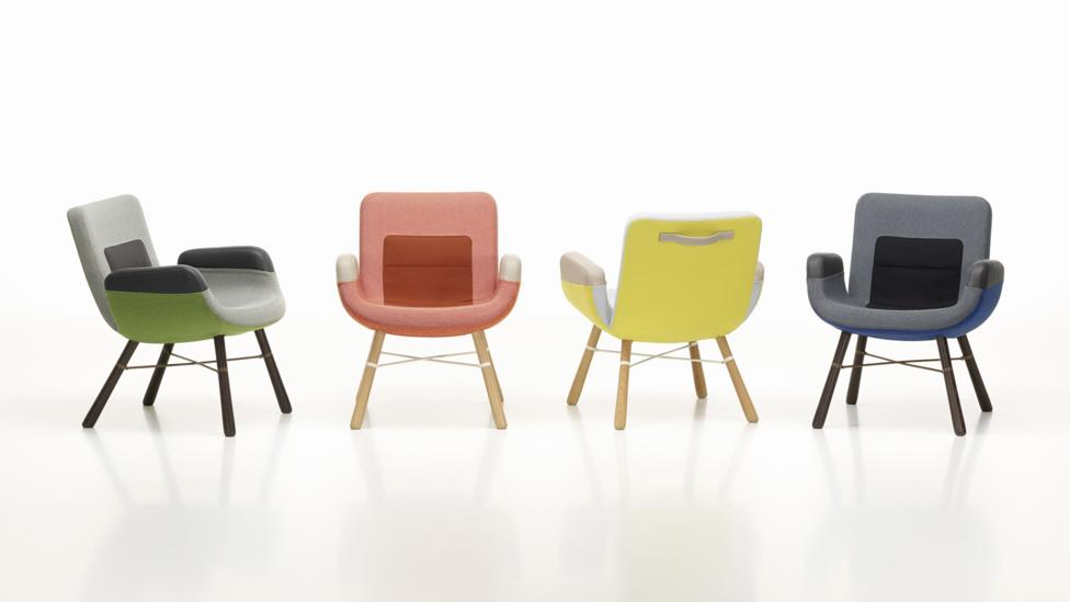
The hues of Jongerius’s East River Chair designs for Vitra are experimental (Credit: Marc Eggimann)
“I aim to create a new colour vocabulary… as a reaction to the globalised industry of flat colours,” she tells BBC Designed. Berlin-based Jongerius develops colours for the furniture company Vitra, and created products for her exhibition that presented colour in fresh ways, shedding light on their mutability. One of these, her Colour Catcher, comprises sheets of folded coloured paper; shadows and reflections hitting its different planes resulted in each one acquiring an individual tone. Another idea was a formulation of 16 shades of black created without resorting to carbon. “Instead, I used handcrafted pigments including ultramarine green, cobalt green, natural umber, ruby red and magenta,” she says. “If industry replaced carbon with another black pigment [it] would have a revolutionary effect on our visual landscape. It would change hundreds of the colours found in the industrial palette.”
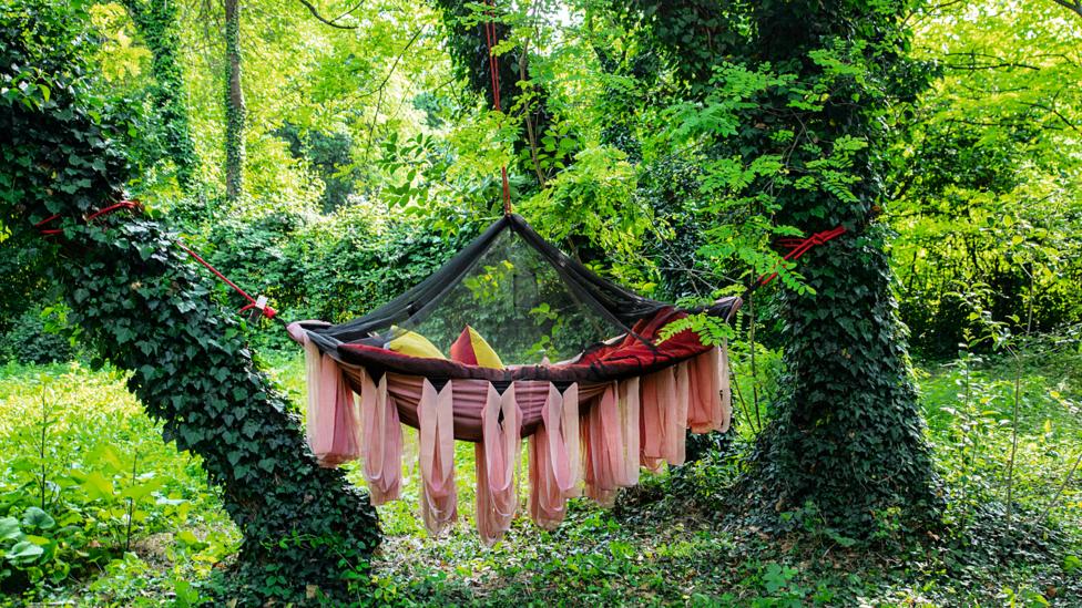
In woven textiles, colours interplay in the warp and weft, giving them a changeability (Credit: Howard Sooley)
“The all-encompassing RAL, Pantone and NCS colour systems offer millions of colours categorised, structured and sorted for us,” she continues. “As a tool, this can be helpful for designers and architects but how can we ever intimately relate to colour and its subjective effect in this scenario?”
Indeed, the colour-forecasting industry originally sprang from practical needs, according to Justine Fox, co-founder with Carolina Calzada Oliveira of Calzada Fox, a London-based consultancy. “We develop colours for our clients beyond forecasting and aesthetics – they’re designed with functionality in mind, whether it’s brand awareness, sustainability or community-building.”
“One of the first colour-forecasters was Carlin, founded in Paris in 1947,” says Fox. “After World War Two, Americans were cut off from France and couldn’t get information about trends from Paris showrooms. So some retailers got together and started creating colour forecasts for the US and other countries. There’s no doubt colour systems have a practical value. The theory is that companies as far-flung as Shanghai and London can be sure to choose the same specific shade. But when the likes of Pantone and trend-forecasting firm WSGN, which has its own colour system Coloro, choose their colours of the year, they don’t create a new colour. They can pluck it from their existing archive of colours. They also hold a lot of information about people’s consumer tastes, and base their colour choices on that. Essentially, the Colour of the Year idea is a PR exercise.”
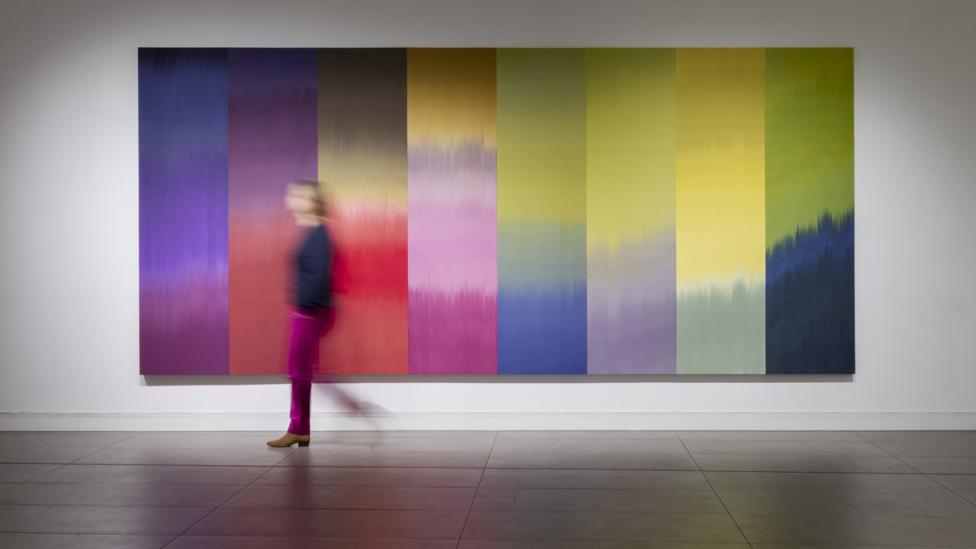
Ptolemy Mann’s artworks in woven textiles explore unusual colour combinations (Credit: Ruth Ward)
“A growing concern for sustainability is seeing a big change in the colour-forecasting industry,” says Calzada Oliveira. “We’ve noticed that fashion and product designers are increasingly emulating the automotive industry – forecasting colours five or 10 years ahead rather than the more ephemeral two to five years ahead. A growing number of consumers are buying fewer clothes – for example, buying a piece from a favourite label’s collection, then gradually building up a wardrobe by selectively buying pieces from subsequent collections.”
Traditional, fixed-colour palettes are set to become less common, with designers experimenting with more organic manufacturing processes and materials, such as bacterial dyes. But, as London-based textile designer Lindsay Hanson notes, the uptake of these on a mass level is negligible: "Bacterial dyes are emerging. They’re great as they use very little water and no chemicals. Some companies intend to commercialise them. But this is a challenge because industry and consumers prefer clothes with hues that are affordable. Natural dyes can’t be used to produce clothes at scale. And the most common colours I’ve witnessed bacteria produce are blue, indigo, purple, pink and red but not green, orange, yellow, black, brown and grey. Natural dyes also fade over time, so they end up in the pastel range. That sets limitations on designers."
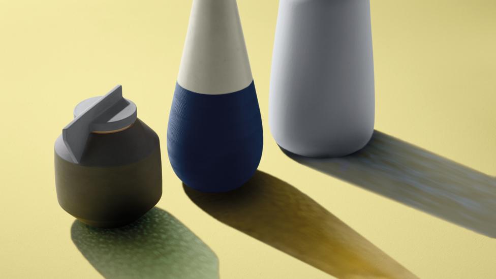
Consultancy Calzada Fox develops colours with functionality in mind (Credit: Alex Wilson/ stylist Sarah McNabb)
Many designers believe colours only come into their own when juxtaposed with others – the antithesis of the colour of the year notion, which focuses on one hue in isolation. One of Calzada Fox’s projects illustrates this – last year it helped Edinburgh-based paint company Craig & Rose to develop a new paint range showcased during the London Design Festival in the form of an immersive installation comprising panels painted different shades that formed a sequence of spaces visually interconnected by openings cut into the panels. Avoiding any hierarchical arrangement of colours, the installation highlighted how the colours interacted.
‘In-between colours’
A similar layering approach is adopted by Italian colourist Giulio Ridolfo, who has worked for many years for Danish upholstery fabrics company Kvadrat and has also advised Vitra and Italian furniture brand Moroso on colour. Indeed, in the field of woven textiles, designers often freely experiment with colour.
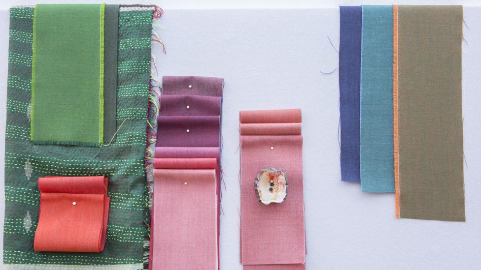
Italian colourist Giulio Ridolfo creates colour combinations for fabric company Kvadrat (Credit: Howard Sooley)
Kvadrat is one company that ploughs its own furrow on the colour front: “We don’t visit trade fairs or observe trends, partly because our production is too slow. On average we bring out eight upholstery fabrics a year, although some are re-colourings of old fabrics,” says Stine Find Osther of Kvadrat. “We’re lucky that we work with creative people, including external designers, who have their own ideas.” Kvadrat, which was founded in 1968, was originally most famous for its two-tone, wool and viscose upholstery fabric Hallingdal by Nanna Ditzel, which daringly interwove zingy pink with green and red with yellow.
Giulio Ridolfo is influenced by the rich, subtly changing autumnal landscape of Friuli in northern Italy where he is from, and also by art and cinema
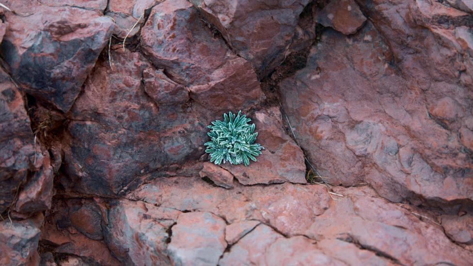
The book Materialising Colour showcases the inspiring hues to be found in the landscapes of northern Italy (Credit: Howard Sooley)
A new book, Materialising Colour: Journeys with Giulio Ridolfo, by design writer and curator Jane Withers, explores his working process, which is mainly influenced by the rich, subtly changing autumnal landscape of Friuli in northern Italy where he is from, and also by art and cinema. He admires filmmakers Pier Paolo Pasolini and Derek Jarman and the layering of colours in the work of artists JMW Turner and Paul Klee, which he says create “vibrancy”. While Ridolfo’s eye dominates the book, this also recounts milestones in the history of colour theory. It ranges from Isaac Newton’s demonstration that a beam of light penetrating a prism separates into seven colours to the discovery by French chemist Michel-Eugène Chevreul that how a colour is perceived is influenced by the other colours surrounding it.
“While industrial manufacture strives for stability and uniformity, Ridolfo introduces subtle changeability and what he describes as ‘in-between’ colours,” writes Withers in the book. “Giulio doesn’t use colour in isolation,” she adds. “It’s always part of a narrative – how it relates to cultural context, nature… In terms of the material itself, Giulio uses different threads to compose the colour of a textile, which gives it an unusual richness.”
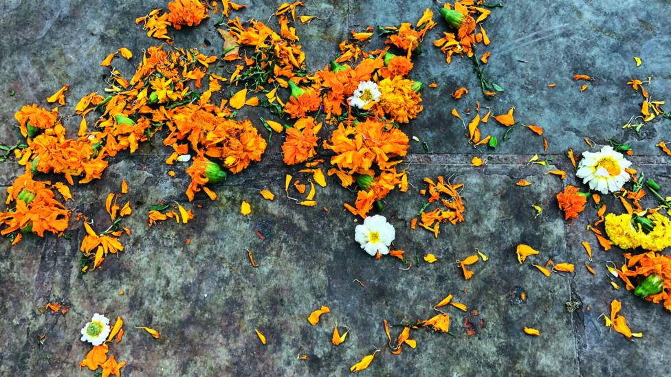
Ridolfo is inspired by how colours relate to each other in culture and nature (Credit: Howard Sooley)
When weaving fabrics, the lengthwise warp yarns are held stationary in tension on a frame or loom while the transverse weft is drawn through and inserted over and under the warp.
One of Ridolfo’s signature fabrics for Kvadrat is Remix, which comes in 72 colourways. It’s made by taking two woollen melange yarns, each containing up to three colours mixed at different percentages, which create subtly irregular shading. Seen from afar the fabrics’ colours look monochrome but, in close-up, reveal colour contrasts. The starting point for Ridolfo’s designs are moodboards in rich shades such as crimson, eau-de-nil and rust, that create a collage of anything from twigs, stones and dried flowers, to postcards, fabric swatches, ribbons, even toothbrushes. “While Nanna Ditzel’s colours were definite, Giulio’s keep changing,” says Find Osther. "There are different coloured fibres in the warp and weft, which create the intertone colours."
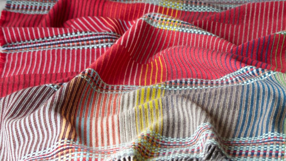
Design duo Wallace Sewell are influenced by the geometry and distinctive colours of the Bauhaus (Credit: Wallace Sewell)
For UK-based woven textile design duo Wallace Sewell, the interplay of the warp and weft opens the door for creativity and unpredictable colour combinations. Strongly influenced by artist Johannes Itten, who taught at the Bauhaus, they are known for their geometric designs for throws, cushions, blankets and rugs with surprising colour combinations.
They have created a moquette fabric for the upholstered seating in London Transport trains, including a complex design for the Elizabeth Line (Crossrail). This teams a bold purple with beige, white and two shades of grey, plus accents of red, blue, brown and aqua, all referencing tube and DLR lines that the new line intersects with. “To date, all the tube-line moquettes featured only four colours but we were allowed to bend the rules and include more,” says co-founder Emma Sewell. “How we combine colours is a mix of decision and accident. We clearly decide on the colour of the warp but when the weft colours are selected and put across the warp colours, there’s a fair amount of chance involved. We can’t predict how warp and weft will look together as we use so many colours for both.”
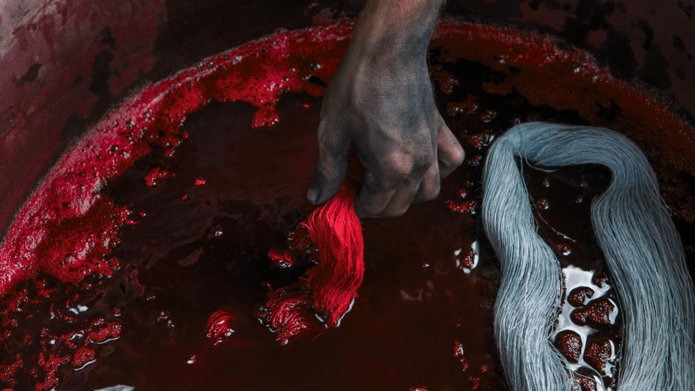
In her book, author Jane Withers writes about colour inspiration and processes (Credit: Howard Sooley)
Asked what she thinks of colour-forecasting, Sewell says: “I’m only interested in it peripherally. It has a place in encouraging discussion of colour but it’s disheartening how reliant the creative industries are on them. It squashes the creative autonomy of individual designers as they’re encouraged to follow trends, not make their own decisions.”
As far as I’m concerned there is no such thing as a bad colour combination – Ptolemy Mann
Looking to the future, the nascent technologies being investigated by Hanson and others are challenging the prescriptive, reductive approach to colour endorsed by the mainstream textiles industry – and are proposing a more sustainable model of consumption in the fashion world. While studying at Central Saint Martins, Hanson initiated her ongoing research project, Digitised Material. This uses digital technology along with 2D materials such as super-strong, flexible graphene and artificial opals that mimic photonic crystals (natural crystals found in insects, such as on butterfly wings and plants).
The non-pigmented opals assume a particular colour when light hits them – a phenomenon called structural colour. Her research suggests that the opals and graphene can be fused to make a power grid that is concealed within clothing. Its wearer can then change its colours and patterns in infinite ways, via an app on their smartphone. “The ability to change colours and patterns like this could offer an alternative to synthetic dye and reduce the volume of new garments produced by manufacturers and owned by consumers,” says Hanson.

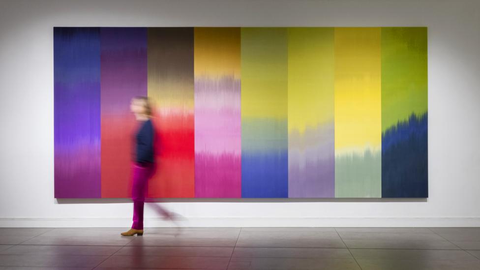
Woven textile artist and colour consultant Ptolemy Mann embraces secondary hues in her work (Credit: Circe Hamilton)
And Sussex-based woven textile artist and colour consultant Ptolemy Mann, who recently created artworks for a restaurant at Tate Modern in London, is equally ambivalent about standardised colour systems and the Colour of the Year tradition. “I think it can help designers and companies navigate through colour choices, and the Pantone system helps us to communicate colours globally,” says Mann, who embraces bold yet sophisticated secondary colours, such as green, pink, violet and turquoise in her work. “But I’m not keen on selecting one colour and saying it’s the colour of the year. Colour needs context. And as far as I’m concerned there is no such thing as a bad colour combination.”
Materialising Colour: Journeys with Giulio Ridolfo by Jane Withers will be published by Phaidon.
If you would like to comment on this story or anything else you have seen on BBC Culture, head over to our Facebook page or message us on Twitter.
And if you liked this story, sign up for the weekly bbc.com features newsletter, called The Essential List, a handpicked selection of stories from BBC Future, Culture, Worklife and Travel, delivered to your inbox every Friday.
No comments:
Post a Comment