Advertisement
Creativity
The Painting Techniques of 5 Famous Artists, from Botticelli to Vermeer
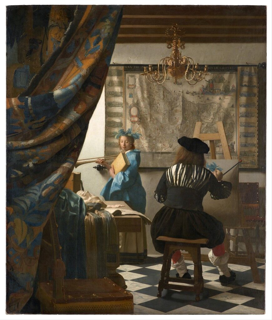
Johannes Vermeer
The Allegory of Painting, ca. 1666
Museum of Fine Art, Vienna
In her new book Painting Masterclass: Creative Techniques of 100 Great Artists, author Susie Hodge investigates the artistic processes behind celebrated paintings of art history. Looking at such famous works as Diego Velázquez’s Las Meninas (ca. 1656) and Johannes Vermeer’s Girl with a Pearl Earring (1665), Hodge examines the techniques behind these works and the lessons their makers can still teach us today. Below, we share excerpts, delving into the works of five iconic artists.
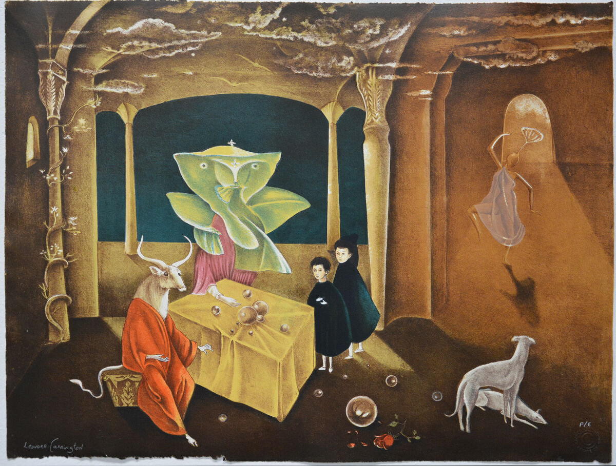
Leonora Carrington, And then we saw the daughter of the minotaur, 2011. © 2019 Estate of Leonora Carrington / Artists Rights Society (ARS), New York. Courtesy of La Siempre Habana .
In tight white jodhpurs and a cloud of brown hair, Leonora Carrington sits on a small blue chair in the centre of a room, wearing a short green jacket and looking directly at viewers. At the time she painted this, she was twenty years old and living with the
painter
(1891–1976), who was twenty-six years her senior and already established in the art world. Sometimes entitled The Inn of the Dawn Horse, this painting was largely unknown until 1976, when two retrospectives of Carrington’s work were held in New York City and Austin.
Passionately sympathetic towards animals, Carrington often used the hyena to represent herself in her art and writing, as shown in this painting, where she extends her hand towards a female hyena, who imitates her posture and gesture. She also used horses—especially white ones—as embodiments of herself, and here in the background, a white horse gallops in a forest, while a white rocking horse in a similar position seems to be floating on the wall behind her. The tiled floor appears almost like a squared-up painting. This painting seems to represent the grandeur of her aristocratic upbringing (regal-looking gold curtains and throne-like chair) and the break she made with her family when she was conducting her affair with Ernst, of which they didn’t approve (he was married, but he and Carrington lived together in France).
Distorted perspectives, strange juxtapositions and symbolism—depicting her parents’ wealthy world, childhood memories and, of course, her grownup, artist self—are Carrington’s attempt to explain her life experiences and explore her own identity. Her painting style remained more or less the same throughout her life: she created dreamlike, detailed compositions featuring fantastic creatures in supernatural environments, which she painted with meticulous brush marks and fluid paint, carefully considering every mark, line and colour—which explains why her output was quite limited.
Space
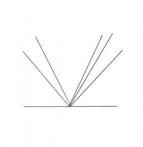
In 1937, Carrington began painting this image in Paris. It was her first major self-portrait and features many of the themes she explored in later paintings, including women with wild hair, animals symbolizing her, but also representing freedom and sexuality, and all set in an equivocal interior space created with distorted perspectives. Overall, the painting is in dramatic one point perspective, that converges towards a single vanishing point on the horizon line (as seen left). One-point perspective is usually appropriate when the subject is viewed from directly in front of it.
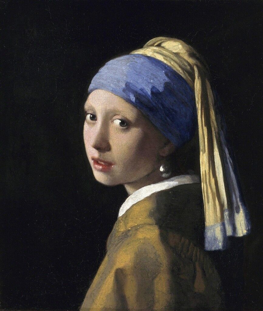
Johannes Vermeer
Girl with a Pearl Earring, ca. 1665
Mauritshuis, The Hague
Originally called The Girl with a Turban, this painting is probably a tronie: a character portrait created as a reference for other paintings—although not all tronies were then used in other works, as seems to have been the case here. The model may have been Vermeer’s daughter Maria (ca. 1654–after 1713) or the daughter of his patron, Magdalena van Ruijven (1655–82), but her identity is almost irrelevant as the painting is generally seen as a study in facial expression and exotic costume rather than a portrait. The plain dark background helps to visually project the girl’s head forward, and concentrate the focus on her blue and gold turban, the huge pearl earring and the gold jacket with stark white collar. Unlike many of Vermeer’s subjects, she is not busy, but seemingly caught in a fleeting moment, turning her head to look over her shoulder at viewers. Her eyes are wide open and her lips slightly parted, as if she is about to speak.
Like many artists of the Dutch Golden Age, Vermeer was fascinated by the depiction of light, and this work demonstrates his technical proficiency in capturing the radiant effects of light on various fabrics, the girl’s face and the large pearl earring that reflects light on to her cheek. He creates highlights with touches of opaque white paint on the collar, in her eyes and on her lips, while half-tones and deep shadows are progressively translucent. Vermeer usually painted images of fashionable figures in interiors, using a meticulous, precise style, and he was greatly admired locally, although he worked so slowly and carefully that, as far as is known, he produced only thirty-six paintings. To create this work, he used dexterous brush marks, alternate warm and cool flesh colours, and a broad range of tonal contrasts and expensive pigments. For instance, the blue turban was made from costly ultramarine, which was extracted from the semi-precious stone lapis lazuli.
Tone
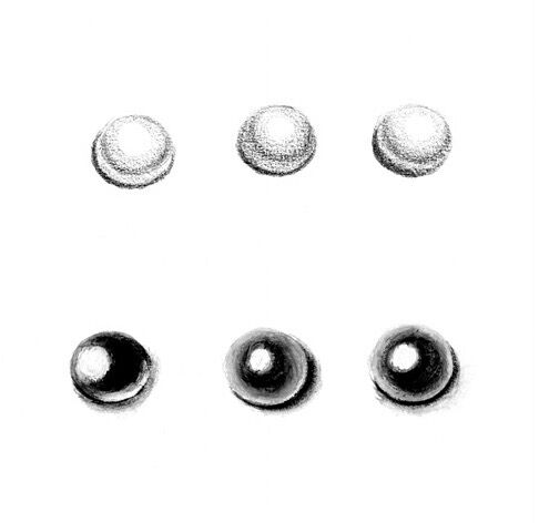
This painting was so carefully planned and painted, it might seem surprising to know that Vermeer modelled some of his tones using the alla prima method; in other areas, he built up layers of thin glazes. Pearls can be depicted with a simple circle, then a dark arc on the edge opposite the light, and a medium arc around the white blob of brilliant white to convey highlight. Try different methods, but remember that the tonal contrasts are soft. If you create hard transitions, you will convey a shine that is more brilliant than pearlescent.
Light and Form
The camera obscura began to be used by artists in the 16th century. It consisted of a darkened box or room containing lenses and mirrors that projected an image from which detailed drawings could be traced. It is known that Vermeer was familiar with it, but not whether he used one. His renderings of light and form are extremely lifelike, with a great range of tones, highlights and halftones. The latter, also known as transitional tones, lie between light and shadow: where illumination and darkness meet and blend.
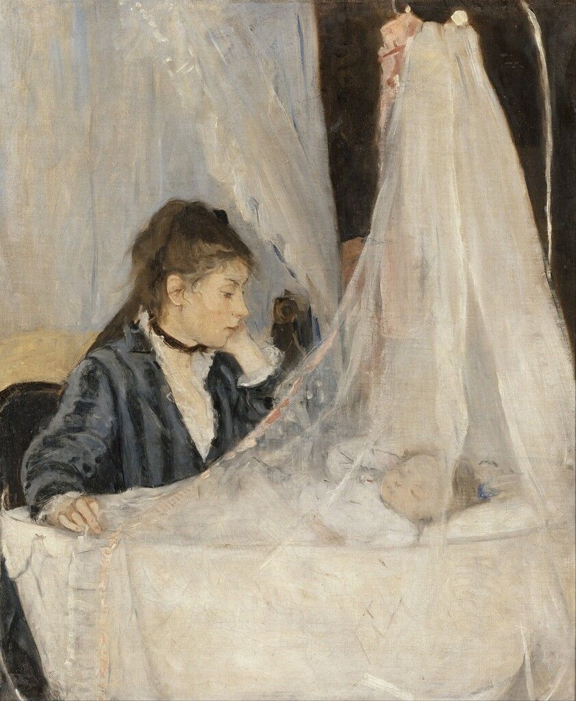
This is a celebration by Berthe Morisot of her sister Edma with her new baby, Blanche. Tenderly watching her sleeping daughter, Edma draws the translucent curtain around the cradle; her left arm is bent, which echoes the position of the baby’s arm beneath the voile canopy. The composition is cropped—the edges of the cradle are cut off at the sides, creating a sense of closeness—and forms a series of diagonal lines (from Edma’s head to her baby’s, the bent arms and the voile canopies, both over the cradle and behind Edma) which add to the impression that mother and daughter are in their own intimate, protected world.
Morisot displayed this painting at the first
exhibition of 1874 and although many of the works there by other artists were prominently derided, this was more or less ignored. However, one critic noted its “grace and elegance.” Yet, Morisot could never sell it.
Using the short, sketchy brush marks that became one of the hallmarks of Impressionism, diffused light shimmers across the image. There are no jarring colours to draw the attention away from the main figures, which adds to the sense of peace. In the main, black and white are used in a sort of pattern across the composition: the white in the cradle, the baby’s clothing, the lace on Edma’s clothing and the voile curtains is balanced by Edma’s dark dress, her dark hair, the black choker she is wearing and the background wall. It is the first example of Morisot’s treatment of the theme of motherhood which, because of social limitations, was one of the few artistic subjects she could explore as a woman.
Space
Morisot’s composition here relies on two interlocking triangles—one encompassing the visible part of Edma’s body and the other, slightly taller, formed with the veil—that create a balanced composition which visually links mother and baby harmoniously. When you are deciding on a composition, try to link the space with some sort of invisible or implied shapes, as it will help viewers to negotiate the elements within your painting.
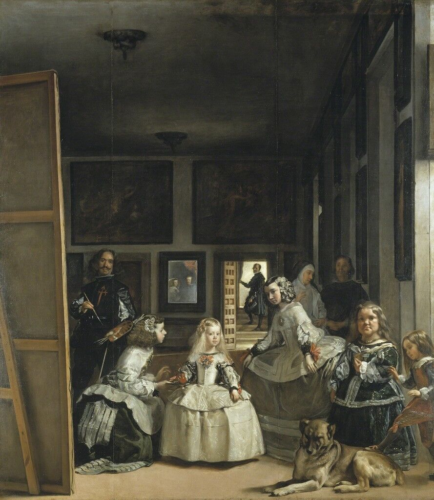
Five years before he painted this, Diego Velázquez had returned from a two-year visit to Italy, where he had studied the art of the
artists up close. Breaking all precedents of European art, he painted this portrait of the Spanish royal family by capturing an intimate and relaxed moment in time, when stiff etiquette was usually adhered to. The little five-year-old child is the Infanta Margarita (1651–73), who is dressed in the ornate costume expected of a Spanish princess; she is the daughter of Philip IV of Spain and his second wife, Mariana of Austria (1634–96).
Velázquez used strong
to make the main figures seem prominent. Bathed in clear light, Margarita’s blonde hair and face almost glow; she is the focal point of the painting as she stands with her ladies-in-waiting (meninas) in Velázquez’s studio. One kneels before her, offering her a drink from a red terracotta jug (bucaro) on a golden tray, while the other seems about to curtsey to her.
Two light sources illuminate the picture: one comes from an unseen window on the right-hand side and the other is the doorway in the centre, at the back. To the side, the small court jester is trying to rouse the dozing pet mastiff with a gentle touch of his foot, and behind the group, the Infanta’s chaperone is talking to a bodyguard. At the vanishing point of the picture, Don José Nieto Velázquez (no relation)—the Queen’s chamberlain and head of the royal tapestry works—pauses at a doorway at the back of the room. Light floods in where he holds open a curtain, and nearby, reflected in a mirror, are tiny images of the king and queen themselves. Behind the huge canvas is the only known self-portrait of Velázquez, who is holding a brush and palette—boldly situated within the royal family.
Composition
Las Meninas is arranged on a grid. It is also a straightforward image in one-point perspective. At the vanishing point is Don José Nieto Velázquez in a doorway. Basically, nine figures form a line inside a cube, with the king’s and queen’s reflections making eleven. All occupy only the lower half of the canvas, where the focal area is (to the left-hand side), including around the Infanta. The activity in the bottom half of the composition is compensated for and balanced by the empty top half.
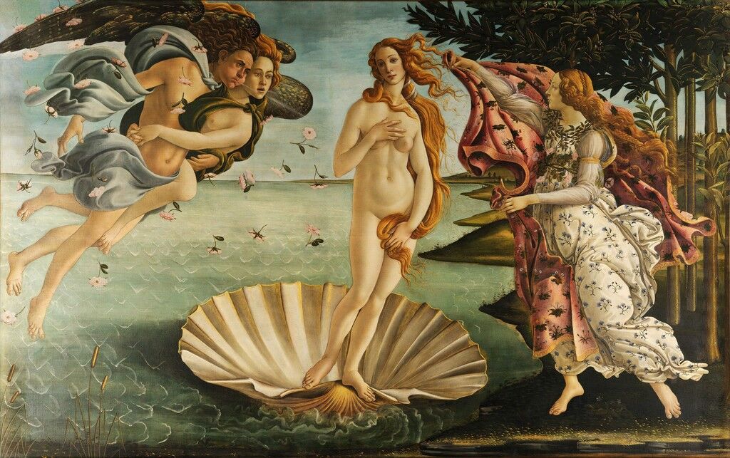
Sandro Botticelli
The Birth of Venus, ca. 1486
Uffizi Gallery, Florence
Sandro Botticelli was the first artist since the time of the ancient Romans to depict large-scale mythologies, and this is one of the first paintings on canvas created in Tuscany. It tells the story of Venus that derives from Ovid’s Metamorphoses and a poem by the scholar and poet Angelo Poliziano (1454–94).
In what may have been a posthumous portrait of Botticelli’s muse Simonetta Vespucci (1453–76), who had died at just twenty-two, with her long neck, pale skin and flowing golden hair, Venus conveys the 15th-century Italian ideal of female beauty. Representing the Roman goddess of love, beauty and fertility, she stands on a giant scallop shell, as pure and perfect as a pearl. According to the myth, Venus emerged fully-formed from the sea and was met by a young woman, who is sometimes identified as one of the Graces or as the Hora of spring, holding out a cloak covered in flowers. The roses symbolize Venus and are also a reminder of spring. Two figures blow Venus to the shore: Zephyr, the Greek god of the west wind, holding the nymph Chloris—although this might be Aura, the goddess of the breeze—who according to mythology is abducted by him and turned into Flora, the goddess of flowers and spring.
Botticelli applied thin layers of tempera and scumbled the top ones so that some of his previous paint layers would show through. He used the tip of his paintbrush like a pen to subtly outline his figures. He was attempting to meet the ideals of ancient
, which set a precedent for the entire
period. Botticelli was perfecting the skills he had learned with
(ca.1406–69) and Antonio del Pollaiuolo (ca.1432–98), and blending them with his own ideas. These methods included an understanding of linear perspective, graceful lines, soft tonal contrasts, and a preference for soft colours.
Sources
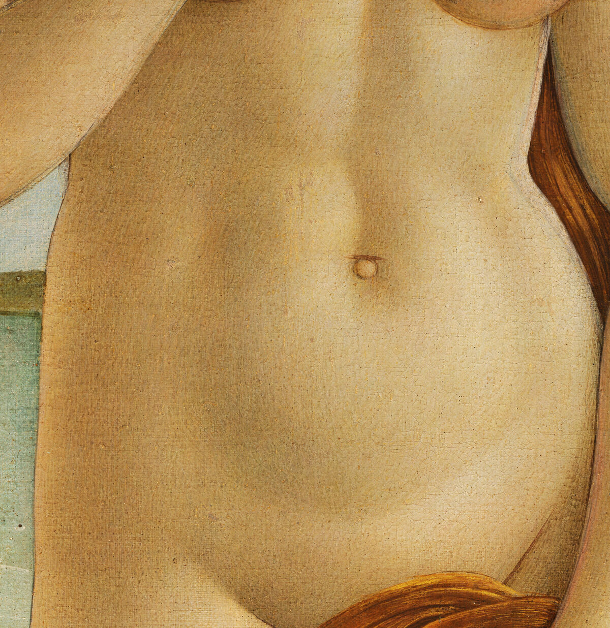
Sandro Botticelli, The Birth of Venus (detail), ca. 1486. Image via Wikimedia Commons.
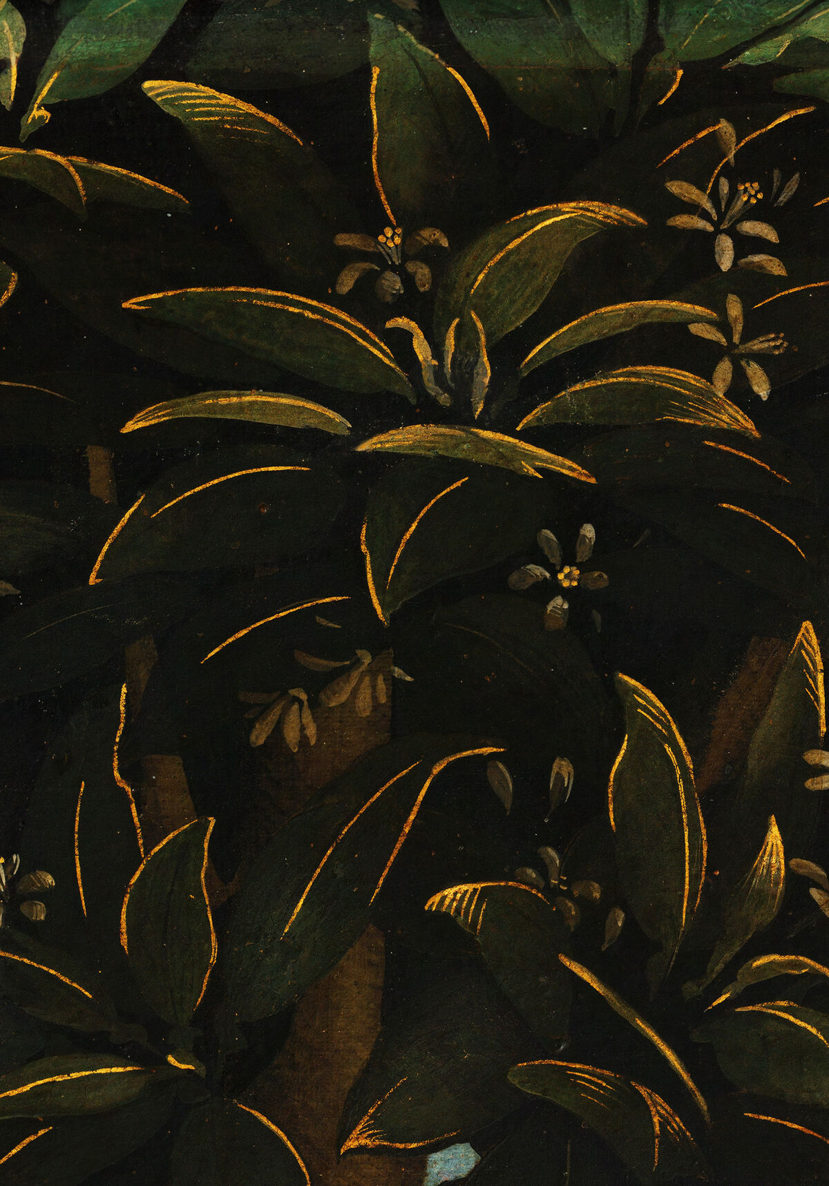
Sandro Botticelli, The Birth of Venus (detail), ca. 1486. Image via Wikimedia Commons.
As she approaches land on her seashell, Venus becomes self-conscious and tries to cover her nudity with her hands and hair in the Venus pudica (modest Venus) stance, taken directly from antique statues that were being discovered at the time, such as the Aphrodite of Cnidos and the Medici Venus. Both hold themselves in modest poses, aiming to hide their naked body, thus demonstrating their chasteness.
Gold-tipped orange trees suggest that the work was commissioned by a member of the Medici family, since oranges were part of their emblem because the tree’s botanical name—malus medicus (medicinal apple)—was a pun on their name. Additionally, at the time, oranges symbolized wealth, power, love and marriage. Drawing on his early apprenticeship to a goldsmith, Botticelli often used powdered gold mixed with egg white—a method known as shell gold or conchiglia.
Materials
Botticelli used the finest pigments available, including ultramarine from lapis lazuli, verdigris, copper resinate, cinnabar, azurite, ochre, red lake and white lead. The skin tones were built up with semi-transparent applications of ochre, white, cinnabar and red lake, layered painstakingly with small brushstrokes.
Susie Hodge is the author of over 100 books on art, art history, and artistic techniques, including the bestselling Why Your Five Year Old Could Not Have Done That and How to Survive Modern Art.

No comments:
Post a Comment