ON TREND
Color Palettes by Decade: 10 Artworks to Give Your Home a Blast from the Past
Choosing art for your home involves a number of factors. First, you have to fall in love with a piece. That's the easy part. Then you have to think about where you're going to hang it, and whether it will either match or clash with your lamp, your couch, or your dog. Ultimately, it all comes down to color palettes. Color can change the energy of a space immensely. It can make a room feel warm or cool; funky and energetic or calming and soothing. (Just think of how that cool-toned ocean landscape painting at your dentist's office makes you forget for a moment about your impending discomfort).
Contemporary interior design trends are increasingly making moves towards minimalism: clean, neutral-toned, functional spaces are in. But if you're longing for the days when design was wacky and weird like say, Alex's parents house in A Clockwork Orange, fret not. Uncluttered space is actually a good thing. Think of it as a blank canvas upon which to express your inner spirit, with art!
A great way to bring color into your space is to look to the color palettes of the past for inspiration. (VH1's I Love the '70s/'80s/'90s anyone?) In honor of their 50th anniversary, Pantone studied the trends in color palettes over the past 50-ish years. We surveyed their picks along with the historical milestones of each period, looking at the links between color, culture, mood, and psyche. To make it fun, we chose a few works that reflect the color schemes of each decade, to help brighten up your space with a bit of historical inspiration.
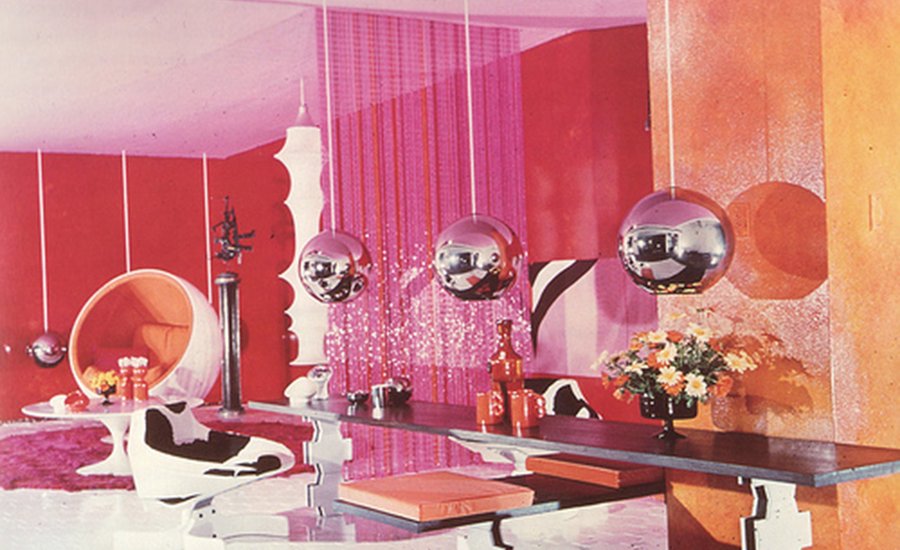
The '60s

 Images courtesy of Pantone; Huffington Post
Referred to by some as "The Acid Aesthetic," '60s design was undoubtedly influenced by the counterculture movement and the rise of hallucinogenic drugs, namely LSD. The era was marked by experimentation and mysticism, and vivid and bright kaleidoscopic colors. Design harkened to late-19th century Art Nouveau graphic design elements and surrealist subject matter. Bold prints, color blocking, and repetitive, optically stimulating patterns were popular design elements. Social revolution and youth culture meant the more saturated, the better.


The '70s

 Images courtesy of Pantone; Pinterest
Reflecting the mood of a post-Vietnam, recession-era America, '70s color palettes dialed down the bright tones of the '60s. Fashion and interior design took on an earthy, rich warmth, with mossy greens, rusty browns and reds, and deep, muted oranges and yellows. However, despite their muted tones, the color palette of the '70s was far from drab. (Hello, Soul Train!) It was a move back to nature, literally and aesthetically. People started talking about the environment, discussing issues like pollution and oil consumption.


The '80s

 Images courtesy of Pantone; Pinterest
Oh, the '80s. It's hard not to have a certain fondness for the over-the-top design elements of the decade. Designs of the decade prove that people were most certainly not afraid to use as much and as garish a color as possible. Regarded by many as "so bad it's good," '80s design was lavish, excessive, and utilized a whole lot of purple. Think neon, kitsch, glass and glam. It was the peak of Madonna's career, after all.


The '90s

 Images courtesy of Pantone; The Real Estate Conversation
The '90s were pretty weird. It's like everyone simultaneously got a scrunchie headache and woke up from a neon fever dream into an angsty teenage sitcom where oversized ripped denim and flannel are in, the couches are plaid, and everyone's hopped up on coffee, cereal, and cartoons. When I think of the '90s, I think first of the iconic pre-teen bedroom; the walls covered in band posters, VHS tapes, and beanbag chairs. Youth culture aesthetics derived from the neon '80s, while interior design moved towards more muted tones.


The '00s

 Images courtesy of Pantone; Fresh Home
Let's face it, technology has made, for lack of a better word, a complete clusterf*ck of contemporary design. Chrome and glass buildings are erected daily; silver and grey cars line the roads; minimal interior design is equated with luxury; while Forever21 rips off popular trends of the past five decades faster than teen girls can get to the mall.
It's difficult to speculate exactly what the design aesthetic of the modern day would reduce to in time, but from a brief review of interior design catalogues, it seems that contemporary luxury aesthetic abides by the good old KISS rule, i.e. "Keep it simple, stupid!" Colors are largely associated with branding: McDonald's Red, Starbucks Green, Victoria's Secret Pink, Apple Grey, Facebook Blue, Chanel Black, Dunkin' Donuts Orange, Shell Yellow. Contemporary artists respond to this in a number of ways: some reclaiming color as a facet of counterculture and expression; and some embracing neutral, muted tones which reflect the digital lexicon of the age.


---
At the risk of sounding terribly cliché: Color tells a story. Popular color schemes of each decade are telling of the over-arching socio-political psyche at the time. They reflect post-war anxieties; counter-cultural energy; sexual liberation; vivacious spirits and youthful playfulness; and let's be honest, popular drug culture. It's what makes watching old color films, from The Wizard of Oz to Videodrome, so exhilarating. Don't be afraid to bring some color into your life. Collage it up, and make it your own.
No comments:
Post a Comment