How the White Cube Came to Dominate the Art World
In 1976, artist and critic Brian O’Doherty set the art world abuzz with a three-part essay published in Artforum. Titled “Inside the White Cube,” it gave a catchy new name to a mode of display that had long ago achieved dominance in museums and commercial galleries. As the story goes, copies of the magazine flew off the shelves. O’Doherty himself has said that the level of response shocked him: “It was a huge wave, and I said, ‘What is this?’... It struck a nerve, to the point where several people came up to me and said, ‘You know, I was about to write that.’”
While O’Doherty deserves credit for coining the phrase “white cube”—a label that has since become a staple of the art-world lexicon—the actual display strategy was invented decades earlier. Today, New York’s Museum of Modern Art is widely credited with institutionalizing the approach in the 1930s. But the evolution of the white cube goes back much further, with MoMA representing the culmination of a long stretch of experimentation and debate by museum directors and curators spanning continents and centuries.
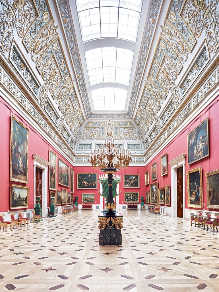
Major public museums began to spring up in the 18th century, most notably the British Museum in 1759 and the Louvre in 1793. These institutions had largely grown out of private collections, in which artworks were displayed in dense, symmetrical arrangements that connoisseurs believed allowed for a better comparison of styles and movements. They were also influenced by the Paris salons, where paintings jostled for space on walls hung floor to ceiling with art. Artists were captivated by these new public spaces, and museum galleries were a frequent subject of early 19th-century painting.
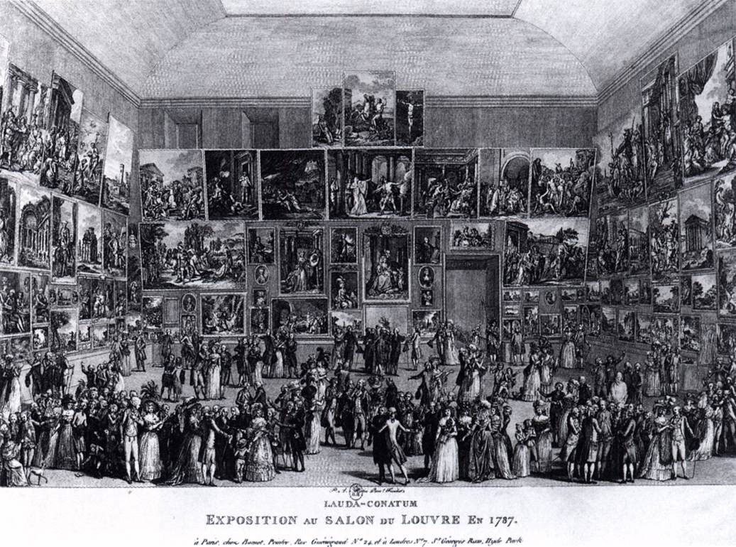
Martini, Pietro Antonio, Exposition au Salon du Louvre en 1787, 1787. Wildenstein Institute, Paris.
It wasn’t just artists who were fascinated by these institutions. Attendance swelled throughout the 19th century, with London’s South Kensington Museum (now the Victoria & Albert Museum) reporting 456,000 annual visitors in 1857, compared to over a million in 1870. Collections also grew over time, and soon the museums of the Victorian era were dealing with issues of overcrowding in terms of both people and paintings.
“Even in the middle of the 19th century, it was generally recognized that museums should isolate works of art on walls to avoid overcrowding and to accentuate quality for visitors,” Andrew McClellan, a professor of art history at Tufts University, told me. “It was recognized that crowded walls hampered proper appreciation of individual works of art.” As English economist William Stanley Jevons put it in an 1881–82 essay, “the general mental state produced by such vast displays is one of perplexity and vagueness, together with some impression of sore feet and aching heads.”
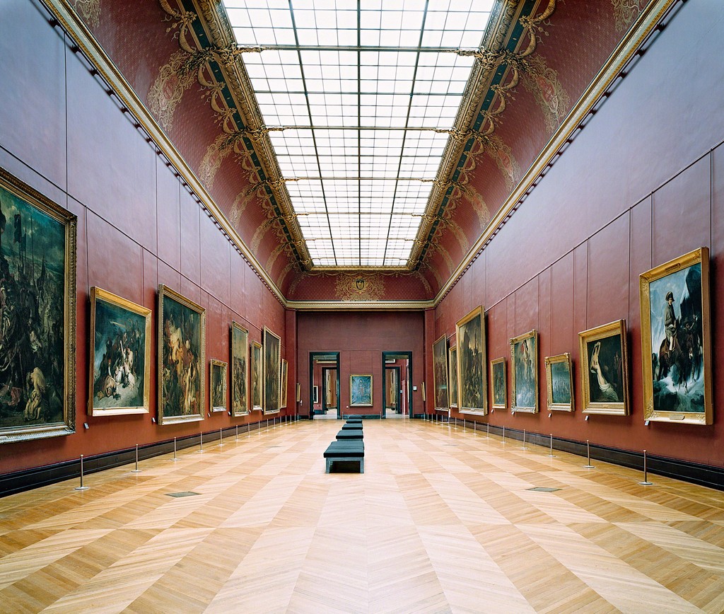
Taking note of these criticisms, the National Gallery in London began to experiment with picture placement in the mid-1800s. Instead of forcing visitors to crane their necks or crouch down to see the art on display, director Charles Eastlake began to hang the works at eye level. “This resulted in the gallery wall suddenly being emptier and its own colour scheme playing a more important role,” noted art historian Charlotte Klonk in an interview published by the Tate. “For the first time, the colour of the walls was explicitly up for discussion.”
So it was that Eastlake replaced an earlier grayish-green hue with red, based on the latest research into sensory physiology. “The interaction with the golden frames and the mainly cooler colours of the paintings themselves led, according to this research, to a harmonious effect in the beholder’s visual experience,” Klonk claimed.
But these were small shifts. More sweeping changes were limited by certain factors. For one, museums hadn’t considered the problem of storage when they were first built, which meant there was no place to put the art except the walls. Then there was the question of selection—who would be responsible for deciding which works remained hanging and which did not? Professional curators didn’t exist in the 19th century; in fact, it was this issue of overcrowding that led to the creation of the job in the early 20th century.
So, while these issues had been first aired in Europe, it fell to American museums at the turn of the century to put solutions into practice. In 1909, Boston’s Museum of Fine Art moved into a new Beaux Arts building that displayed only the most significant artworks, with lesser ones stored in the basement and accessible only to scholars. The galleries were well-lit and generously sized. While paintings were still stacked on top of one another in symmetrical arrangements, the MFA limited itself to two rows instead of floor-to-ceiling displays. Each work was given room to breath, separated from the others by a strip of empty wall.
“In addition to being more selective in what works of art went on display, there was a lot of interesting discussion in the early 20th century about what conditions should prevail inside the museum to heighten appreciation,” said McClellan. “There was an interesting round of experimentation with lighting in particular, but also other configurations of pictures on walls to arrive at what was thought to be the most successful overall approach to display.”
This was epitomized by Benjamin Ives Gilman, the secretary of the Boston MFA from 1893 to 1925, who published the first empirical study of museum-going in 1918. He had a number of suggestions to combat what he termed “museum fatigue,” including changes in display that would keep visitors crouching or bending over to see works clearly. Gilman also recommended avoiding the “perpetual variety of wall coloring, found in many newer museums” in favor of a uniform light gray-brown or dull yellow-gray.
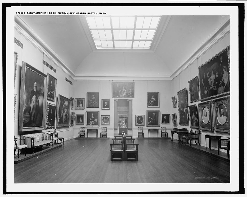
Early American Room, Museum of Fine Arts, Boston, Mass. Image via the Library of Congress.
Although U.S. museums became a testing ground for new methods of display, they were certainly not the only places of experimentation. Across the Atlantic in Germany, white was gradually becoming the accepted wall color for galleries. For some, it evoked the contemporary Bauhaus-style interiors that were popular at the time. For others, it served as a neutral background that made it easier to transition between temporary exhibitions—a phenomenon which was becoming more and more important to museums as the 20th century progressed.
But it wasn’t until the Third Reich took hold of the country during the 1930s that white became the standardized color for German gallery walls. “In England and France white only becomes a dominant wall colour in museums after the Second World War, so one is almost tempted to speak of the white cube as a Nazi invention,” Klock said. “At the same time, the Nazis also mobilized the traditional connotation of white as a colour of purity, but this played no role when the flexible white exhibition container became the default mode for displaying art in the museum.”
Developments in both the United States and Germany were drawing museum professionals closer and closer to today’s conception of the white cube, but it was MoMA’s first director Alfred Barr who finally cemented its strategy for display. That’s not to say that the New York museum was the first to pull together these various threads; as McClellan notes, the Harvard Art Museum and the Wadsworth Atheneum both mounted exhibitions in the early 1930s that utilize the white cube approach. “But MoMA, because of the attention that was given to it, did institutionalize and help publicize standards that were already being put into place elsewhere,” he explained.
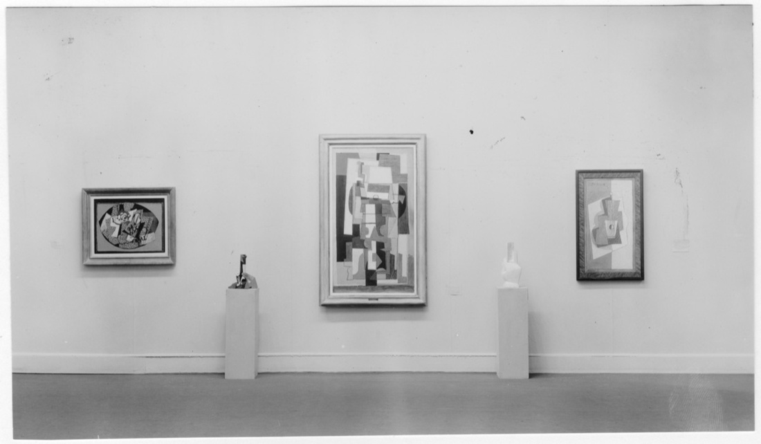
Installation view of the exhibition “Cubism and Abstract Art,” on view at The Museum of Modern Art, March 2–April 19, 1936. The Museum of Modern Art Archives, New York. Photo: Beaumont Newhall
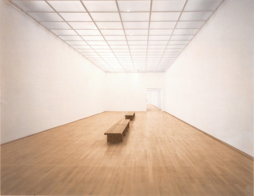
It was in 1936, with Barr’s “Cubism and Abstract Art” exhibition, that the white cube really came together. Although the museum was still operating out of a Rockefeller townhouse at that point, walls and ceilings were painted white and decorative light fixtures were simplified. Wooden flooring was exposed and the works were hung sparingly, some even on walls of their own. The works were arranged to trace an art-historical narrative that ignored any political or social context; Barr wanted the visual impact of each painting or sculpture to speak for itself. The neutral walls, controlled lighting, and lack of ornamentation helped to isolate and elevate the artworks.
Changes in museum architecture starting in the 1920s had also set about to privilege the art. “Museums from the 19th century were judged to be ineffective,” McClellan explained. “There was too much emphasis on monumental spaces and not enough emphasis on creating the ideal conditions for the viewing of art. A certain new breed of curators said museums really need to be designed from the inside out, rather than the other way around.”
MoMA’s new 53rd St. building, which opened its doors in 1939, perfectly reflected this sensibility. Its design was commercial rather than monumental, taking cues from the department store with its glass-fronted first floor. Inside, the building featured small, intimate galleries that focused attention on the artwork rather than the architecture.
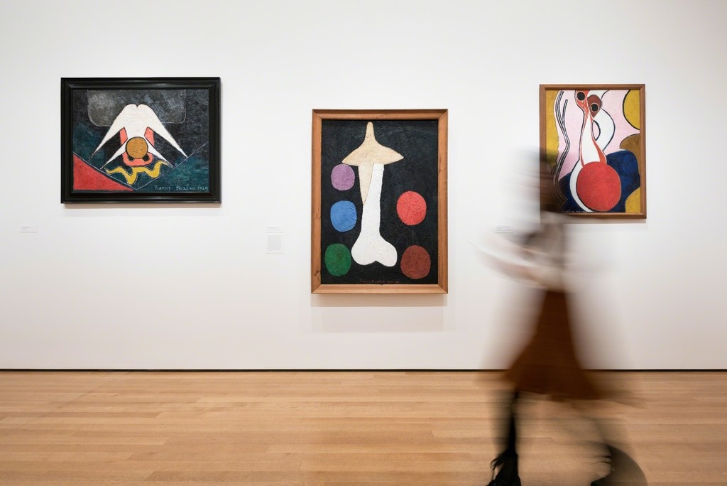
Installation view of “Francis Picabia: Our Heads Are Round So Our Thoughts Can Change Direction” at the Museum of Modern Art, 2017. Photo courtesy of MoMA.
“If you look at the original installation shots of 1939 through the ’40s, you’re looking at a picture that could have been taken yesterday,” McClellan said. “It’s really not changed much since then.” Instead, the white cube has widened its hold on the New York art world. “It’s become ubiquitous. By the time you get to the ’50s, if not earlier, there’s a complete crossover from the white cube at MoMA to commercial galleries in New York City, and then the apartments of the people who were buying the art from those galleries and then giving it to the museums.”
Today, the history of the white cube and modern art are more or less inseparable. Formalist painting from the 1960s, for example, is “isolated from the world,” noted art critic David Carrier, on the phone from Berlin. “The work is complete in itself. You want it in that enclosed space, you don’t want to be able to look out the windows. It’s a very different sensibility from an Impressionist painting, which is connected to the world.” But even as we’ve moved beyond modern art into the 21st century, McClellan believes there’s still no viable alternative for displaying art in a gallery. As the 80 years since MoMA’s first revolutionary show make clear, it’s no easy feat to think outside the cube.
—Abigail Cain

No comments:
Post a Comment