How to Design for the Modern Web
Best Practices of Modern Web Development
Every now and then I see a page that hasn’t jumped on the bandwagon; we just can’t have that so lets run through how to design for the modern web.
These practices are immutable, you must follow them because I’m a developer advocate. They’re also in effect on quite a few of the top websites as ranked by Alexa, but most importantly, developer advocate.
Let Users Know About Your Mobile Application
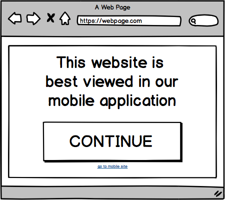
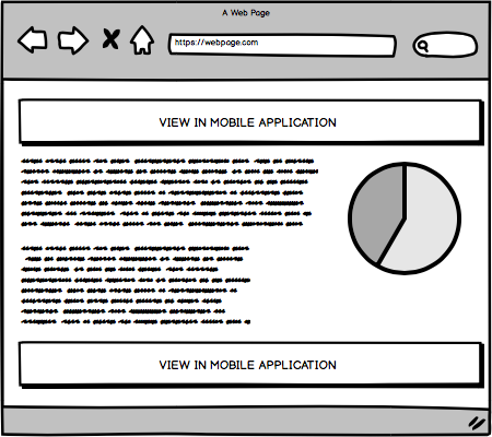
The very first thing you must do when a user visits your website is to show them a big modal dialog telling them that they should just install the mobile application instead.
A neat little trick is to make the link to close the modal small and put it very close to the link that lets the user install the application. This will make users much more happy as it’s so easy to install the application and not accidentally close the dialog!
Let Users Know About Cookies
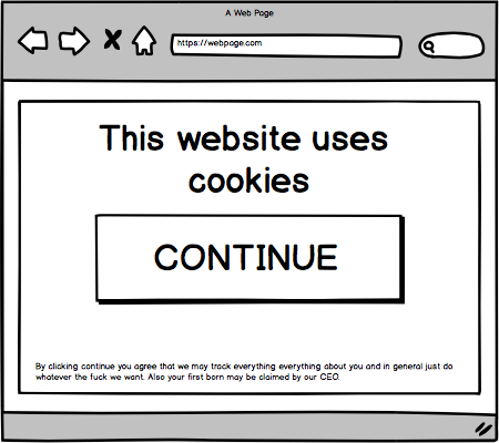
Should the user continue and insist on using the web version we need to let them know that we use cookies to track them.
Let Users Know They Can Sign Up
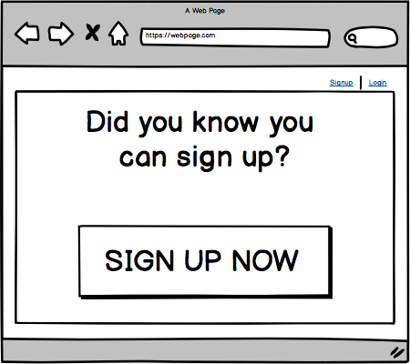
Sometimes a link is not enough, a modal can be pretty helpful here in letting the user know they can actually sign up for your website.
Research has shown that modals that cannot be closed have the best conversion rate.
Block Users from Europe
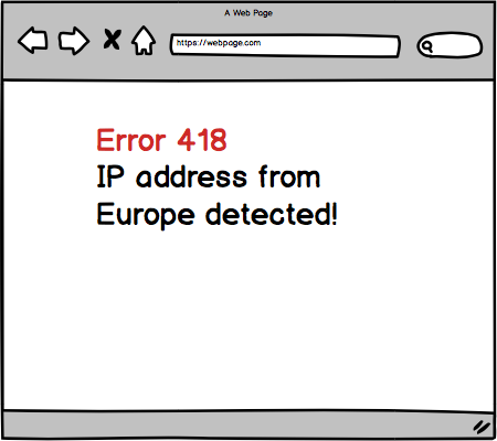
Europeans nowadays have these pesky laws which muddy the waters on what we are allowed to track. The best practice here is just to do nothing, continue tracking everything about your users and just block Europeans from accessing the site.
Denmark is a failed socialist cup cake state anyway, its users are not worth the effort.
Let Users Know About Your Mobile Application
It’s good practice to show the user the dialog again when a user clicks on any link, most likely they just accidentally clicked away the first time.
Again we need to help our users out here, so we make the cancel link very small to minimize the chances of it accidentally being tapped. Happy users everywhere!
Allow Users To Opt-Out
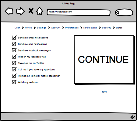
Now it’s very important that we are not intrusive to the user, so we must allow them to opt-out of the mobile application modals.
Best practice is to put it somewhere the user will easily spot it, like inside one of the account preferences pages.
Advertise Your Application
If the user should opt out of the prompt’s for the mobile application, we can till get them in the long run. Advertising the mobile application somewhere on the website works great.
Eventually the users will give in and convert!
Always Bet on JavaScript
These modals obviously require JavaScript, and of course it’s important to have endless scrolling but make sure you future proof yourself by using the latest framework. You may think “oh it’s only a couple of modals” today. But in the future, it may be many many more modals and oh boy! When that happens you’ll regret you did not make an isomorphic application with React and code splitting!
Conclusion
Now that you know these best practices for modern web development, make sure you apply them everywhere. You are now also certified and ready to apply for top ranking sites like Reddit and Medium as long as you remember these simple rules during the interview process.
Don’t know anything about web development at all? Don’t worry you can just take a week long bootcamp!

No comments:
Post a Comment