Saturday, July 8, 2017

Exhibition joins the dots between Seurat's pointillist paintings and the psychedelic genius of Bridget Riley


Liz West, Our Spectral Vision, 2016. Photo: Hannah Devereux.


5:13 pm /
The First Art Newspaper on the Net Established in 1996PortugalSaturday, July 8, 2017


Exhibition joins the dots between Seurat's pointillist paintings and the psychedelic genius of Bridget Riley
Georges Seurat, La Luzerne, Saint-Denis, © Scottish National Gallery.


2
  
COMPTON VERNEY.- Compton Verney’s summer season opens with one of the first exhibitions of its kind in the UK.

From the Impressionists onwards, artists have been inspired by historical and contemporary colour theories -most famously seen in the pointillist work of Georges Seurat and his associates, where colours other than those actually painted on the canvas are generated in the eye of the beholder.

Seurat to Riley: The Art of Perception explores one of the most exciting threads running through the art history of the past 150 years: the ways in which the viewer’s visual perceptions, themselves dependent on the close interaction of eye and brain, are used in art.

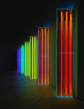
The exhibition includes ninety works ranging from painting, sculpture, light-based, prints and drawings from public and private collections across the UK, plus exciting new commissions created especially for the exhibition.

"This exhibition has been on my mind for a number of years as I recognised that a multi artist show of 'Op Art' hadn’t really been done in the UK. It is very timely, as since developing the show over the last two years Op Art has been more reconsidered by curators, with key shows in New York and Copenhagen in 2016” says Compton Verney’s Penelope Sexton, who is curating the show along with Dr Frances Follin.

In the 19th century artists developed an interest in how the eye responds to visual stimuli, so as to produce optical illusions. Artists from the Impressionists onwards were inspired by the colour theories of scientific thinkers such as Michel Eugène Chevreul. During the 20th century, this interest in perception extended to ways of communicating movement in static art forms, seen in works of Vorticist Helen Saunders. Artists as diverse as M.C. Escher and Josef Albers looked at using form, and often colour, to convey the sensation of movement, or find a static equivalent for this.

This interest and perception of movement intensified through the 1950s and ’60s, in what came to be known as ‘Op art’ and ‘Kinetic art’. Victor Vasarely, Bridget Riley, Julio Le Parc, Jeffrey Steele, Jesus Rafael Soto, Carlos Cruz-Diez, Peter Sedgley and Liliane Lijn were its leading lights and are all represented in this Compton Verney show.

Key loans to the exhibition include Georges Seurat‘s La Luzerne, Saint-Denis (1885, Scottish National Gallery) where flickering brushstrokes in response to the landscape of alfalfa and poppies are placed with an almost mathematical precision, showing the artist considering the ideas of perception.

Bridget Riley’s early interest in Seurat convinced her of the importance of finding a distinctive methodology for her own painting, and there will be twenty-two works by her in the exhibition, including highlights such as Fall (1963, Tate), Blaze IV (1963, Government Art Collection) and Achaen (1981, Tate). Penelope Sexton - “’Fall’ is one of the most optically active produced by Riley with effects including movement and colour, even though the work is in monochrome. In ‘Blaze IV’, the centre is just white paint but seems to blaze with light, after about 20 seconds of looking, the whole surface comes alive, and optical effects appear to occur between the viewer and the canvas.“

The 1965 Peter Segley work Cycle (Birmingham Museums Trust) plays with the notion that the human eye is designed to focus on a particular object in one’s field of vision. Cycle subverts this natural tendency – the work is apparently ‘out of focus’ so the eye struggles to find a point of purchase, creating a disorientating effect on the viewer. BIDIM-MC by Victor Vasarely (1988, Wolverhampton Art Gallery) is a three-dimensional work that combines painterly and sculptural effects in one piece.

Seurat to Riley also features new work by Lothar Götz. Götz is creating a new site specific wall-based work referencing and engaging with ideas about architecture and space. His work is characterised by the juxtaposition of abstract geometric forms, fields and lines of intense colour.

Compton Verney’s Director, Professor Steven Parissien says “Optical Art explores a range of effects and emotions, using complex geometry and advanced mathematics to communicate with the viewer in a way that is simultaneously mentally challenging and visually appealing. This wonderful exhibition demonstrates just how exhilarating, electrifying and (quite literally) eye-opening Op Art can be.” 


An eye-popping journey through pointillism, pattern and perception.

One of the first exhibitions of its kind in the UK, Seurat to Riley: The Art of Perception explores how artists have exploited the ways in which the human eye and mind perceive what we see. Containing over ninety works including painting, sculpture, light works, prints and drawings from public and private collections, the exhibition will also feature a gallery-sized mural by German abstract artist Lothar Götz commissioned by Compton Verney.
The journey begins in the 19th century when artists were eagerly experimenting with the new exciting colour theories of the day. Discover how they began to use colour in ways that simulated our real world experiences, replicating the colours of nature and even movement. Learn how this desire to create art that conjured up the world around us evolved throughout the 20th century to the mesmerising Op art of today. Includes works by twenty three artists including Georges Seurat, M.C. Escher, Josef Albers, Victor Vasarely, Bridget Riley, Peter Sedgley, Daniel Buren, Liz West and more.
FREE entry for Members  
Find out more by joining an Exhibition Tour (daily at 12 noon & 2.30pm from 15 July): Explore key themes and works of Seurat to Riley with a 45 minute tour led by our expert Gallery Interpreters.  Sign up on the day.  Tours are included in exhibition admission.
Click here to find out about our Gold Member Preview.

Exhibition of works from Thomas Ruff's latest press++ series opens at Sprüth Magers Berlin


Thomas Ruff, press++32.58, 2016. C-Print, 231 x 185 cm (framed) 91 x 72 7/8 inches (framed) © Thomas Ruff / VG Bild-Kunst, Bonn, 2017. Courtesy Sprüth Magers.


5:06 pm /
The First Art Newspaper on the Net Established in 1996PortugalSaturday, July 8, 2017


Exhibition of works from Thomas Ruff's latest press++ series opens at Sprüth Magers Berlin
Installation view, Thomas Ruff, 'New Works', Sprüth Magers Berlin, July 7 - September 2, 2017. © Thomas Ruff / VG Bild-Kunst, Bonn, 2017. Courtesy Sprüth Magers. Photography by Timo Ohler.


6
  
BERLIN.- Sprüth Magers is presenting Thomas Ruff’s first exhibition at the gallery with works from his latest press++ series, all of which are exhibited here for the first time. In a multi-faceted practice that examines the ever-changing possibilities of photography, Ruff’s investigations into visual and cultural phenomena are indebted to an interest in how technology makes us see. This is evident in his vast array of subjects and methods, from portraiture and astronomical documentation to photograms and digital abstractions created by algorithms.

Images that have been published in American newspapers and magazines from the 1920s to 1970s are Ruff’s source material for his press++ series, images that in themselves have even more diverse archival origins; the police, NASA, press agencies and press departments of institutions, to name a few. From the 1930s onwards, most of the photographs were no longer sent by mail from the press agency to the newspapers but instead sent as a wire and were then printed out by the newspaper, therefore showing the structure of the wire transmission.

To produce these works, Ruff scans the front and back of each photograph and combines them digitally, taking into account the original image as well as crops, touch-ups, date stamps, scribbles and smudges. Each of these marks varies in line, colour, and implement used; a red stamp, an inky blue fingerprint, a biro squiggle. Ruff has commented how photo-editors at the newspapers had little respect for the photograph, significantly altering the look and meaning of the original with their retouching and comments. Despite how invisible the hand of the editor is typically made to seem, here they are placed front and centre.

The unmistakable porcelain skin and sultry glare of silver screen sirens redolent in their inimitable Hollywood glamour populate the main gallery space. The source photographs for these works are the publicity shots used by casting agencies to promote the actresses on their books, with names scrawled on the reverse to identify them; Portland Mason, Connie Russell, Rosemary Clooney. Their faces are interrupted by paint enhancing contours or attached clippings of their final published version, for example the announcement for a new play starring the actress, creating a ghostly repetition within the image. Other images are more sparse, just a handwritten name to identify the subject or a frantic tick to indicate the approval of the editor.

Another collection of works examines the images handed out by press departments of museums. A large stamp across a Joan Miró painting identifies its source as the Guggenheim, this textual addition intermingling with the artist’s own, meandering marks. The text may also detail the route of the photograph; a stamp reads ‘Please return to the Baltimore Museum of Art’, and a pencil note ‘Sunday Sun Feature Sect.’ tells us where it was published. The credibility of annotations and printed text on the image cannot always be trusted however, with a Chuck Close image labelled as Jasper Johns. Was this published incorrectly, or is this just a mix-up on file?

Changes made by editors compromise the original image but also add the relevant context and show how it has been changed for its purpose, allowing the study of the historical, political and social context in which an image is produced and how it’s meaning can be interfered with and altered. There is also a strong resemblance to the Dada photomontages of the 1920s but without the surrealistic effects and political intent of these forbearers. For Ruff, the redistribution and rearchiving of the photographic image, which has been a core premise of his practice for many years, presents a number of problems in terms of truth and integrity. In these latest works, which make their debut in the exhibition, the image comes to be considered in terms of artistic value when it is slowly severed from its source, the information contained in it as a press image ebbing away.

Thomas Ruff (*1958 in Zell am Harmersbach, Germany) lives and works in Düsseldorf. He studied at the Staatliche Kunstakademie, Düsseldorf from 1977 to 1985. Recent solo exhibitions include the the National Museum of Modern Art, Tokyo, travelled to the 21st Century Museum of Contemporary, Kanazawa, (both 2016); Art Gallery of Ontario, Toronto (2016); S.M.A.K., Gent, travelled to the Kunsthalle Düsseldorf (both 2014); and the Haus der Kunst, Munich (2012). In September 2017 a major exhibition of his work will open at the Whitechapel Gallery, London.